Wells Fargo Logo
Wells Fargo is a Fortune 1000 banking company providing diversified financial and insurance services in the United States, Canada, and many other major countries. Just like many major companies, Wells Fargo had its share of scandals. Nonetheless, the bank managed to maintain the customer’s trust and has been ranked at the top of the World’s Best Internet Banks ranking by Global Finance magazine.
Meaning and History
Its story, which began in 1841, is remarkable because the bank was opened by two young men who had absolutely nothing to do with banking. Henry Wells decided to open a postal company and hired a young William Fargo. The company was opened in 1844, it was called Well & CO. Fargo was offered a small percentage in the newly created company that was offering the delivery of gold and other valuables services. Now, this is a bank that provides services that a modern customer is demanding.
What is Wells Fargo?
Wells Fargo is the largest US bank with huge assets. The bank is in 4th place in the list of American banks, seriously competing with other financial giants. Wells Fargo’s largest shareholder is Warren Buffett.
1852 – 1960
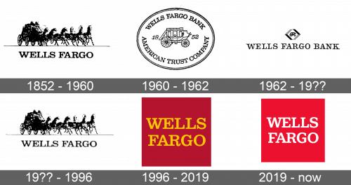
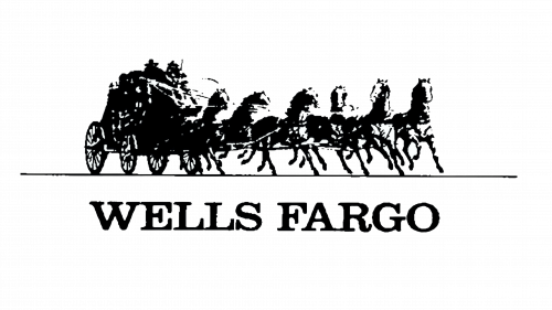
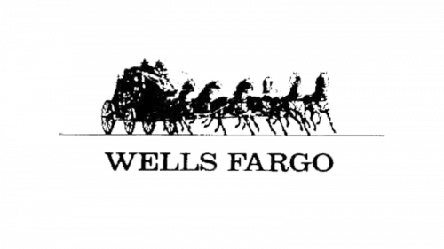
The original logo of a bank with a long history reflected its original line of services, which was delivery services. A stagecoach with six running horses and two men sitting on the coach itself. It was a very realistic drawing done in black and white. The road was drawn as a thin straight line and right below it, the emblem had “Wells Fargo” written in bold capital letters using a traditional typeface.
1960 – 1962
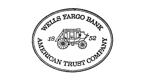
After a merger, the bank recreated its logo to reflect these changes. It still had a stagecoach, but now it was drawn as an outline of one. The foundation date has been specified on either side of the coach. Above the stagecoach, it stated the name of the bank using the same style of font as in the original logo. Below, the name of the company it merged with was added. Both portions of the name were slightly arched to go along the lines of a double border in the form of an ellipse that completed the emblem.
1962 – 19??
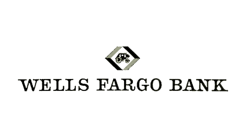
The bank has undergone a name change again, which had to be reflected in its emblem. It stated the new name, Wells Fargo Bank, in capital bold letters. The same font was kept most likely for brand recognition purposes. Above the wordmark, there was a relatively small element in the form of a diamond inside of which there was a stagecoach from the previous logo, which traced back to the company’s origins. This symbol was also used on its own.
19?? – 1996
The original logo with a stagecoach and a simple wordmark has been used by the company even after the introduction of new versions. It ceased to be used only in 1996.
1996 – 2019
A new era has begun for the Wells Fargo company as it presented a completely redone company logo. It was no longer limited to black and white colors. In fact, it featured bright yellow lettering with “Wells Fargo” written in two lines and having the same width. One thing stayed the same and it was the font that the company has been using for so many years. The name was set on a deep red-colored square. The original stagecoach was also redrawn in color and closely resemb0led the original one. It was used along with the company’s new slogan, which was also written in red.
2019 – Today
In 2019, the bank has made some adjustments and instead of yellow, the name was printed in white for even better contrast and presentability. It did not get rid of yellow for good because it was used in combination with white to draw the stagecoach, which no longer looked so realistic.

