Westpac Logo
Westpac is an Australian bank and financial services provider, one of the country’s largest banks. The Bank of New South Wales originally established it. The founders set it up in Sydney to support the colony’s economic development. It was created primarily to offer financial services, facilitating commerce in the growing colony.
Meaning and History
Westpac began as the Bank of New South Wales in 1817. Through the 19th and 20th centuries, it underwent significant transformations, including mergers and name changes. It adopted the name Westpac in 1982, following its merger with the Commercial Bank of Australia. The name represents a blend of “Western” and “Pacific”, indicating its aim to expand its operations beyond Australia into the Pacific region. Key milestones include launching Australia’s first credit card in 1974 and being the first bank to introduce an ATM in Sydney.
What is Westpac?
Westpac is a major Australian bank providing a broad range of banking and financial services. These include retail, commercial, and institutional banking, as well as wealth management services. It operates primarily in Australia and New Zealand, serving millions of customers.
1931 – 1974
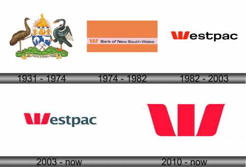
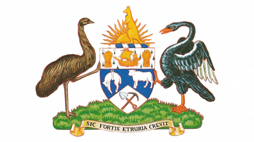
The emblem features two birds, one dark with an arched neck, the other light and standing tall. They flank a shield bisected diagonally. The top section shows a sailing ship and sheafs of wheat, symbols of trade and agriculture. Below, a lamb and a sheep represent livestock farming, with mining tools hinting at resource extraction. Above the shield, a rising sun over a golden kangaroo signifies hope and progress. Beneath, a scroll reads “SIC FORTIS ETRURIA CREVIT”, suggesting growth through strength, a nod to historical Etruria. The imagery collectively represents the foundational industries of the economy.
1974 – 1982
The new logo pivots to modern simplicity. Gone are the detailed birds and shield, replaced by stark geometry. A bold ‘W’ emblem stands out, formed by three upward-pointing chevrons. They symbolize stability and growth. The backdrop is a vivid orange, signaling energy and change. Below, a rose band carries the bank’s name in crisp, contemporary type. This design reflects a shift to a more abstract, universal branding strategy.
1982 – 2003
This logo discards the full name, favoring a stark abbreviation, “Westpac”. The ‘W’ emblem remains, now in fiery red, suggesting vigor and passion. It’s more than a letter, it’s a symbol, hinting at sails or wings propelling forward. The text is minimalist, with a bold sans-serif font asserting modernity and clarity. The design strips away excess, focusing on a future-forward identity, embracing brevity and impact in a monochrome palette.
2003 – Today
The evolution continues with a more balanced, serene color palette. The ‘W’ symbol remains red, a nod to tradition and strength. Yet, the typeface softens, adopting a gentler gray, conveying reliability and professionalism. The letters of “Westpac” now line up horizontally, suggesting stability and equality. The red and gray contrast speaks of a blend of passion and wisdom. This design encapsulates a mature, confident brand in the modern banking landscape.
2010 – Today
Stripped to its essence, the logo now champions the ‘W’ symbol, radiant in red. It stands alone, unaccompanied by text, confident in its identity. This minimalist approach speaks volumes of the brand’s evolution and its recognition. The chevrons, sharp and dynamic, suggest upward motion, prosperity. There’s a stark departure from the textual, the logo embraces the power of pure symbolism. It’s bold, it’s distilled, it’s Westpac in its most concentrated form.


