ALDI Logo
Aldi, a leading global discount supermarket chain, specializes in offering a wide range of grocery items at competitive prices. Originating from Germany, it has extensive reach in Europe, the USA, and Australia, emphasizing cost-effectiveness and efficiency. Aldi is divided into Aldi Nord and Aldi Süd, two separate groups, with each operating independently but under the umbrella Aldi brand. The company continually evolves its product range, focusing on quality and sustainability, catering to millions of consumers seeking value-driven shopping experiences.
Meaning and history
Aldi, with its roots in Germany, emerged in 1946 when brothers Karl and Theo Albrecht took over their mother’s small grocery store. The brothers shaped Aldi by introducing a low-cost, high-quality approach to grocery retailing. The name “Aldi” originated in 1961, a portmanteau of ‘Albrecht’ and ‘Diskont,’ reflecting their discount model. In 1966, due to disagreements, Aldi split into Aldi Nord and Aldi Süd, each managed independently.
Aldi Nord expanded to France, Spain, and Portugal, while Aldi Süd ventured into the UK, Australia, and the USA. Despite distinct territories, both entities maintained the founding ethos of quality and value, centralizing purchases to maintain competitive pricing.
While the ownership remains within the Albrecht family, Aldi continues to revolutionize grocery retailing, sustaining its commitment to quality, simplicity, and customer value, holding steadfast in its founding principles, even amidst the evolving retail landscape.
1970 – 1983
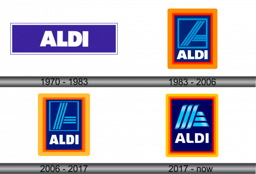
In 1970, the ALDI designation found its initial representation within the brand’s emblem. Enveloped in a dark blue rectangular setting, the emblem delivered a succinct visual expression. The typographic elements, rendered in block letters and encased within a slender white boundary, subtly communicated the essence of the organization’s guiding ethos. This illustrative symbol, blending simplicity with understated elegance, remained in its original form for a span of 13 years, underscoring the company’s commitment to a consistent and restrained branding approach, reflective of its foundational principles.
1983 – 2006
In 1983, a significant brand transformation took place, resulting in a logo that sustained for 23 consequential years. The incorporation of two distinct colors, orange and red, marked this transformation. Presumably, the orange, known for its eye-catching properties, was intended to serve its pivotal role in attraction, while red was perceived as ALDI’s foundational color.
These vibrant hues were integrated within the structural framework of the logo, with the orange composing a broader outer frame, contrasted by a narrower, red inner frame. This amalgamation, against the blue backdrop, was esteemed by numerous designers as a remarkably harmonious and successful visual integration.
The emblematic representation was characterized by the left portion of the letter, structured with three parallel stripes. Analyzing this, experts perceived it as a symbolic representation of progressive movement. Such illustrative conceptualization, depicting paths or roads, finds its resemblance in branding strategies utilized by certain airlines and automotive sectors. The blue-hued stylized “A” remains encased and prominent.
Beneath the graphical integration, the corporate designation is distinctly positioned. The typographic elements mirror those in its predecessor, retaining the bold, uppercase lettering in white, resonating with the company’s enduring and conventional branding ethos, thereby creating a harmonious blend of tradition and modernity in the company’s visual identity.
2006 – 2017
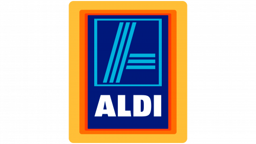
The firm made subtle modifications to the logo’s design, rendering the internal blue rectangle more streamlined. Consequently, the lettering underwent a condensation, becoming more compact. Experts deemed the readability enhanced, particularly when the logo is minimized for website utilization.
The visual depiction underwent minor transformations as well. Despite the retention of the original color palette, the linearity saw a reduction in thickness. Presently, the left segment of the letter “A” originates not from the lower left boundary of the frame but extends from three-quarters of the rectangle’s base to its top center.
The most prominent alteration in this rendition was the modulation of the orange and red hues. The frames broadened slightly, and to maintain aesthetic balance, the designers opted to mute the color intensities, bestowing the logo with a more subdued and gentler appearance.
This nuanced redesign focused on maintaining visual coherence while addressing contemporary aesthetic demands. The slight refinement in color tones and structural elements underscored the brand’s attention to detail and its pursuit of maintaining a delicate equilibrium between visual prominence and subtlety. The refined coloration and streamlined elements encapsulated the brand’s evolving identity, ensuring its resonance with varying audience preferences and diverse application contexts, thus solidifying its visual impact in the multifaceted digital landscape.
2017 – Today
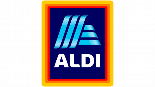
The most recent metamorphosis of the company’s branding ignited a flurry of discussions among design aficionados. This transformation was not a harmonious dance with prevailing trends; rather, it seemed to defy them. In an era where many corporations are leaning towards emblem simplification, primarily due to the ease of layout and enhanced legibility on mobile application interfaces, ALDI opted to tread a path of increased complexity in design.
The creatives embarked on a journey to elevate the logo from a flat silhouette to a design with a three-dimensional feel, achieved by layering a gradient over the blue in the letter “A.” The lines morphed to resemble gentle waves, with their contours softening and rounding. The internal blue structure was dismissed in this new iteration, and the letters evolved to exhibit softer and more rounded angles.
The delineation process saw an introduction of intricate layers – the logo is now enveloped by three frames of uniform width. This intricate framing strategy raised eyebrows among the design cognoscenti. They contend that such a framing technique does not hold merit in the realm of mobile device utility, where the three distinct boundaries seemingly fuse, losing their individual visibility.
This unconventional approach to branding, prioritizing complexity over simplicity, highlights ALDI’s willingness to experiment with visual identities, even if it means going against the grain of contemporary design philosophies. The nuanced alterations, though sparking debates, reflect a meticulous effort to balance aesthetics and functionality in a continually evolving digital landscape, underscoring the brand’s adaptability and its commitment to maintaining relevance amidst shifting consumer preferences and technological advancements.
