Amazon Logo
Amazon is the leading brand in the information sphere. What they are most known for is their business as an online retailer service that sells everything from books to hardware. It’s a rapidly growing brand, and it’s currently the only viable choice if you want to quickly order several various products at one time online.
Meaning and History
The choice behind the name is really not far-fetched. Jeff Bezos (the founder) only chose it because he thought at the time that online marketing would be an exotic and unexplored endeavor. It also sounded catchy, although didn’t relay the company’s purpose as a book-selling store (which it was founded as in 1994).
1994 – 1997
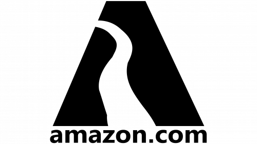
The first ever logo featured a company domain ‘amazon.com’ beneath a large and narrow black trapezoid. The figure was supposed to inspire something unfamiliar and undiscovered, while Amazon itself was shown as a light-bearer in this industry.
That’s why there’s also a road-like wavy line starting in the bottom and diminishing into the left side of the figure.
1997
It was a last attempt to reimagine the initial design. Several other similar lines have been added on both sides to emulate hillsides of sorts, but the idea was quickly scrapped in favor of a more concise image.
1997 – 1998
The third attempt saw the trapezoid shape and all therein removed, and they instead focused on the writing elements. They focused of a large domain name – ‘amazon.com’ written in a plain black type. Beneath it was the description – ‘the world’s biggest bookstore’ written in small wording, but also in uppercase.
1998
In 1998, the company started experimenting with the orange color – simply to increase attention span of anyone who’d look at the logo. This time, they elected to simply use the domain part and scrap the slogan.
They basically took a more friendly- and soft-looking type and put a wide orange ring where the letter ‘O’ would normally be. That’s how the new color scheme was born, but the experimentation didn’t end there.
1998 – 2000
For this evolution, the domain was given another new type, where the brand name itself switched to bold, while the ‘.com’ element remained as usual.
The orange moved from being a substitute ‘O’ to acting as an underline. They added an uneven curved line beneath the text. It later was transformed into an arrow/smile.
2000 – 2024
In 2000, the designers finally settled on a long-term decision. They scrapped the ‘.com’ part and turned the curve into an orange arrow that started on A and fell on Z. It was supposed to have a symbolic value, as well as just look friendly – if you look at it from another angle, you might see a smile.
2024 – Today
In 2024 the Amazon logo was slightly refined, yet kept its iconic concept and style. The changes were made only to the arrow part. It became slightly bolder and gained a more intense orange shade, so now the graphical element underlining the stable black lettering, became the main accent of the composition.
Emblem and Symbol
The arrow sign soon became an iconic image. People could recognize Bezos’ product simply by noticing this symbol. It also featured on an abridged version of Amazon’s logo – a square with a small letter ‘a’ and a tiny orange arrow beneath it. Moreover, it’s used in tons of other Amazon-related products and services.


