Amazon Prime Video Logo
Amazon not only distributes third-party movies and series but also has its own exclusives. Most of the videos on the platform are in English, but there are subtitles in French, Italian, Portuguese and Spanish for some of the videos. The service is available on Android, iOS, browsers, and popular Smart TVs. There is also an option to watch content offline. For new users, Amazon Prime Video offers a 7-day free trial. To watch movies, one needs an Amazon account with a bank card linked to it for payment.
Meaning and History
![]()
Amazon started offering this new service many years ago, in 2006. Initially, it was named Amazon Unbox, but as the Prime membership became an option, this service was added to the subscription. To mark the new milestone, the company now referred to it as Amazon Instant Video on Demand. The company was expanding not only the content but also the locations it was offered in. At the end of 2016, for instance, Amazon Prime Video announced the launch of this service in 200 new countries, which made it a truly global platform.
What is Amazon Prime Video?
Amazon Prime Video is a platform where one can watch popular movies and series by subscription. It is part of the Amazon Prime membership but has been offered separately since 2016. Prime Video’s key global competitor is Netflix and Hulu.
2006 – 2015
![]()
The logo was done in the same style as the logos for other Amazon products. The main line of the logo said “Amazon Unbox” in all lowercase, sans serif letters. The words were joined but separated by color. The first half was black, while the second got a calm orange, which was also used for the arrow or smile, as many call it, under the “Amazon”. “Video Downloads” was written on the second line. It was done using a basic, sans-serif font of a gray color. Indented to the right and featuring smaller lettering, it looked almost as if it was just a little note.
2008 – 2010
![]()
The name change brought a new logo while preserving the brand style. Unlike the “Unbox” part in the original, the word “Video” was done in black, just like the smile. It also was not bold and there was a bit of spacing between the two words. The “on demand” note was tacked right underneath. The only colorful and bright detail in this logo was the green play button, which replaced the “o” in the word “Amazon”.
2011 – 2015
![]()
The company decided to use its main logo as the central element for its Prime Video service. The green play button acquired some volume and got bigger in size, but otherwise, this word was only a bit stretched out vertically. The details were placed on the second line and featured a much smaller font size. The word “Prime” was placed right below the button and featured a cursive, bold font. The “Instant video” followed right after but used a slightly different font. This inscription was going far beyond the first line.
2015 – 2017
![]()
Amazon not only brought back a flat version of the button but also made the second line look more important than it did before. It was shorter as it only said “Prime Video”. This allowed using a larger and bolder font. The logo now appeared more balanced out and good-looking.
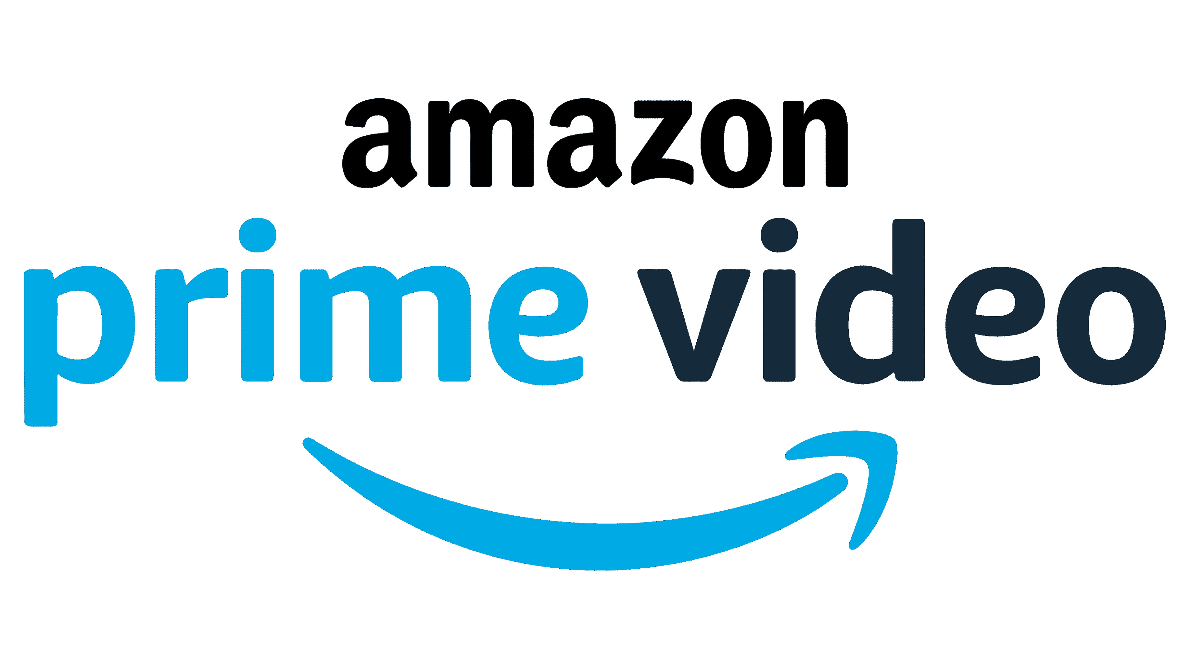
2017 – Today
![]()
There is no “Amazon” in the new logo as it was now offered apart from Amazon Prime. Accordingly, the “Prime Video” portion of the previous logo became the main element of the emblem. To draw a connection to Amazon, the designers wrote two words in two different colors and added that recognizable smile underneath. The first word and the arrow were a sky blue color, while the second half featured black.
Font and Color
Along with some basic, sans-serif fonts for the second line of the logo, Amazon used a font that is very similar to Sana Sans Alt Bold for the main line. For almost ten years, black and light orange were the main colors of this service. Later, the orange gave way to a just as pleasant green. Only the latest logo features a new color palette – sky blue and black.


