Google Photos Logo
Google Photos is a Google-created platform for storing and sharing of photos. It’s integrated heavily with the other Google products, so it’s very easy to send your photos in and out of here. It was created in 2015 as part of the major expansion by the company, but nowadays it’s considered one of Google’s lesser services.
Meaning and History
2015 – 2020
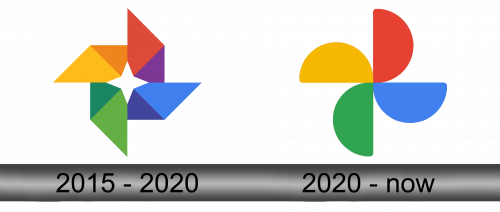
The first emblem of Google Photos was a sort of slower consisting of several elongated rectangles and arranged into the form of a star. The remaining space in the middle also resembled a 4-tip star. This image is supposed to look like a camera lens, but also like a flash.
Each rectangle had one of Google usual colors: red, blue, green & yellow counterclockwise. Notably, they all looked like paper, but it was a general aesthetic of Google logos back in the day.
2020 – Today
In 2020, they decided to remodel the logo into a more fluid, softer look. They basically turned angular rectangles from the previous design into something like flower petals or smudges of paint. They were now complete semicircles of the same colors. Previously, each part had two parts and shades of the same color. Now they are all uniform.
They also got rid of the star shape in the middle. This logo can now be interpreted simply as collection of good memories born by photography.
Emblem and Symbol
These 4-way emblems aren’t the only imagery this platform used as logotypes. There were also writings saying ‘Google Photos’ either to the right or directly below the main emblem. Usually, they’d be completely grey to draw attention to the main emblem, but sometimes they were given the usual colors of the Google logos (except for the ever-grey ‘Photos’ part).


