Android Logo
The effort of Android’s contribute cannot be underestimated. This OS has been grown from software for digital cameras to an operational system which is being used with all the telephones available today (except iPhone), and it shares two thirds of the market. The developer of the system is owned by Google.
Meaning and History
The beginning of the history of Android as an operating system can be considered October 2003. The founders of the company were Andy Rubin, Rich Miner, Nick Sears, and Chris White. At the beginning of its existence, the company planned to develop an operating system for digital cameras but later switched to creating operating systems for smartphones, which could compete with the then-popular Symbian and Microsoft Windows Mobile.
Already in 2005, having recognized the potential of a small company, it was bought by Google, and the amount of the deal was about 50 million dollars. The operating system was originally designed to work on devices with a physical keyboard, but the release of the first iPhone in 2007 forced Google to change plans and focus on the new market trend.
One of the first smartphones released with Android was the HTC Dream, also seen as the T-Mobile G1. The smartphone was announced on September 23, 2008, and had a somewhat unusual look. It took Android not that much time to conquer the market, so about 85% of smartphones sold in the world today run Android.
The word ‘Android’ itself means ‘Human-like robot’. This name is very suitable for the brand, as well as the logo designed according to the concept of a robot assistant, which helps you use your phone (even though the logo itself isn’t terribly human-like in appearance).
What is Android?
Android is the world’s most popular orphaned cell phone operating system based on a modified Linux kernel. Android was originally developed by Android Inc. founded by Andy Rubin in October 2003 and acquired by Google in 2005.
2008
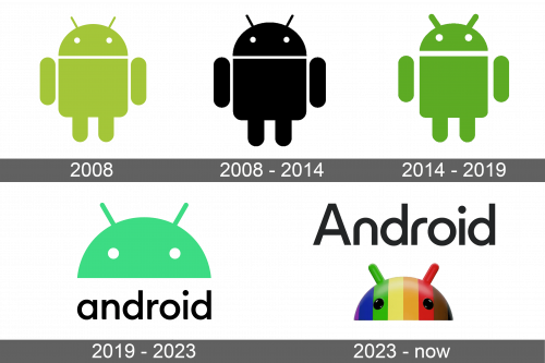
The original Android logo, introduced in 2008, boasted a light-green image of a stylized human-like creature, drawn in solid fragments with a half-round head slightly detached from the body. The head of the Android was decorated by two straight antennas and two white rounded eyes. The original logo had no lettering on it.
2008 – 2014
The redesign of 2008 has kept the original style and shape of the Android logo, but switched its color from green to black, to add more seriousness and professionalism. The black creature looked more concrete and evoked a sense of expertise and trustworthiness. This version of the Android badge was used by the OS for more than six years.
2014 – 2019
In 2014 green came back to the official Android visual identity, but in a more intense and darker shade. There were several more small changes, applied to the new badge this year: the figure of the creature became narrower, with more space between the Jody and the hands of the Android. The distance between the head and the body was also enlarged. The antennas became thicker and slightly shorter, while the eyes — larger.
2019 – 2023
The current logo of the brand depicts the bright-green head of the robot placed above the black inscription. It was made in the simple and minimalistic font with a fluid and soft look.
2023 – now
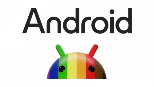
The version of the Android logo, introduced in 2023, is the most colorful and voluminous of all. The head of the Android was redrawn in 3D, and its plain solid color was replaced by a bright striped pattern, with the vertical stripes colored in the rainbow palette, with the addition of brown on the right. The eyes are now black, which makes the creature look more vivid and cool. The wordmark was also significantly changed — now it is a title case inscription in a bold and sleek sans-serif font, As for its color — it remained the same, black.
Emblem and Symbol
The industry of the off-site logos of the Android system has a long history. Almost every year, designers of the brand make the logotype with some sweet on it. For example, with the first primal logo, Google introduced an apple pie. A year after the company added the banana bread and cupcake. This pretty tradition remained until today.
Font and color
The redesign of 2023 has brought a new official typeface to the logo of the Android OS. The new wordmark is written in the title case of a bold custom sans-serif, which looks quite close to such commercial fonts as Harry Heavy, or Horatio Medium, but with some significant modifications.
As for the colors palette of the Android visual identity, it has been based on green for years, but in 2023, the company decided to add more color, and adopted a rainbow scheme, with gradients and additional shades, creating a unique look and showing all the endless possibilities of the operating system.
