App Store Logo
App Store is an app marketplace developed by Apple for their iOS products. App Store is where most people who use iPhone, iPad or other Apple products will come to in order to download applications or other software. The platform came out in 2008, and it’s been one of the first centralized app store services for mobile.
Meaning and History
App Store is a digital distribution platform founded by Apple Inc. in July 2008. It has been a revolutionary platform for mobile applications, offering developers a way to reach millions of iPhone and iPad users worldwide. Since its inception, App Store has achieved significant milestones. In 2009, it surpassed 1 billion app downloads within just nine months of its launch. By 2012, the number of available apps had reached 650,000, covering a wide range of categories such as games, productivity, entertainment, and more. In 2016, the App Store generated over $28.5 billion in revenue, highlighting its lucrative nature for developers.
Today, the App Store remains a dominant force in the mobile app industry. It continues to expand with more than 2 million apps available, providing users with a vast selection of high-quality applications. The platform has undergone several updates and improvements to enhance user experience and ensure app security. App Store’s strict review process and curated selection contribute to its reputation for hosting reliable and trusted apps. With its strong user base and robust ecosystem, the App Store continues to be a thriving marketplace for both developers and users, driving innovation and shaping the mobile app landscape.
What is App Store?
The App Store is a digital distribution platform developed by Apple Inc. It allows users to browse and download applications for their Apple devices, such as iPhone, iPad, and Mac. It offers a wide range of apps, including games, productivity tools, social media platforms, and more.
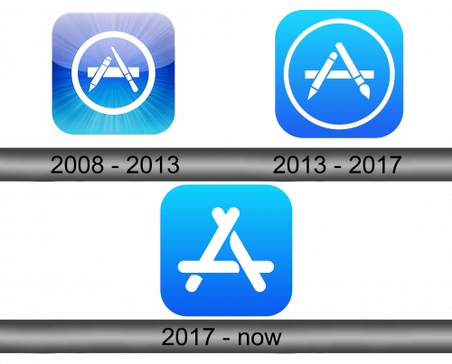
2008 – 2013
Originally, the App Store emblem (also used as its icon for mobile devices) was a blue square with several white symbols on it. The blue background was enriched with lighting and shading effects, gradient color specter and also pale rays radiating from the shape’s center.
The white imagery consisted of three crossed elements in the middle (a ruler, a pen and stylus) arranged to look like the letter ‘A’. These were then encircled by a ring of the same color.
2013 – 2017
A few years later, they decided to simplify the logo. Firstly, the background got rid of most effects. It was now an almost uniform turquoise square with just some shading in the bottom. Secondly, the symbols got bigger, while the ring part is also further away from the center and slimmer.
Lastly, the stylus was replaced by a brush for this one.
2017 – Today
In 2017, they got rid of the ring altogether and simplified the remaining symbols. They were now just three white sticks resembling the letter ‘A’.


