Ariat Logo
Ariat International is one of the leaders in the production of riding shoes. The company’s representative offices are located in 14 countries, including Great Britain, Germany, and Switzerland. Although the original goal of the founders was to create the world’s best shoes for professional riders, the company’s product range is very wide and includes many styles. Ariat is an official partner of the US Equestrian Federation and sponsors a number of tournaments. In addition, the company is the official supplier of shoes and clothing for professional rodeos, including bull rodeos.
Meaning and History
In 1990, two American women, Elizabeth Cross and Pamela Parker, set out to create shoes ideal for equestrian athletes. Since each of them previously had significant experience in equestrian sports, they were aware of the features of most types of shoes. The result of their efforts was the first batches of shoes released in 1993 under the Ariat brand, as well as a set of patented technologies that allowed this extremely young company to maintain leadership in the field of equestrian footwear by an enviable margin. Its products are now sold in over 10 countries.
What is Ariat?
The Ariat company produces clothing and accessories for equestrian sports. Ariat Shoes, Inc. often has an unusual, controversial, or even outright pretentious design, especially when viewed in the vein of the cowboy classics. People of all ages enjoy Ariat shoes, clothes, and accessories.
1993 – 2005
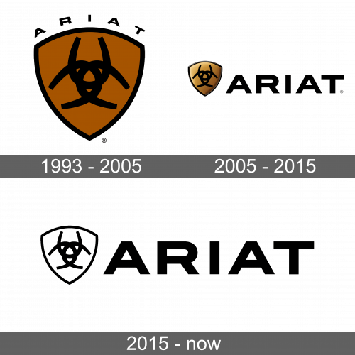
Three horseshoes were intertwined to create a symmetrical, intricate pattern in the center of a crest. The latter had a triangular shape and was done in brown with a black border to match the black lines used to draw the horseshoe. Given that it was a shoe brand, the horseshoe was a great symbol choice. The logo also had the actual brand name that was printed outside the crest, arching above it. The designers used a black color and bold, sans-serif font with wide characters featuring clean lines and straight cuts to match other elements in the logo.
2005 – 2015
The logo of the company was modernized by giving the crest shading that created an appearance of volume. The border around it also had volume, while the symbol in the center remained flat. The “Ariat” inscription not only featured a new font with an “R” having a straight leg instead of curved but also moved to the right of the emblem. It was done using a significantly larger size of font to create a balanced look. It still featured a serious, professional, and solid black color. The designers were able to transform the logo into something more stylish by making minimal adjustments.
2015 – Today
The brand moved towards an even more minimalistic image. The brown color was gone and was replaced by white. Unlike the earlier version, the logo looked flat. A black and white color palette of the logo made it more universal as it would look great on any background. It also gave the logo a more timeless appearance, allowing the company to use this version for as long as desired without having it look outdated. Besides an updated color palette, no changes have been made.
Font and Color
The original logo used a bold, sans-serif font similar to the Flexible H200 W700. The designers turned to Organetto Extra Bold Semi Ext or ITC Blair Pro Bold font to print its name in logos created after 2005. Both font versions had a lot in common as they featured straight, clean, thick lines with straight cuts and no serifs.
The color palette was quite unusual initially, it is not often that you would see a company use a combination of black and brown in its logo. The brown color is a neutral and natural color that is thought to evoke wholesome feelings and is associated with warmth and comfort. Later the company moved on to a more golden shade of brown, adding a touch of sophistication. The latest logo is done in a more minimalistic black-and-white color palette.


