Uniqlo Logo
Uniqlo is Japan’s largest specialized retailer. It is known for its clothing collections for adults and children. One can find ultra-light down jackets and other clothes that fully correspond to the Japanese values of simplicity, comfort, quality, and durability. Uniqlo draws on this to create timeless clothing. The shelves of the store, according to the idea of the founder of the brand, resemble a bookstore. All things are neatly folded and organized by color and size to look like they are books. It has a special attitude when it comes to making the production environmentally friendly.
Meaning and History
![]()
In May 1984, Yanai Tadashi expanded his father’s business and launched a casual clothing store in Japan. It was called “Unique Clothing Warehouse”. Initially, the name was supposed to be shorted to “Uni-Clo”. In 1988, though, employees accidentally replaced the “C” with a “Q”. This is how the name was born and the brand was registered. Ten years after the opening of the first store in Japan, there were already more than a hundred of them. In an effort to strengthen its reputation as a world-class brand, Uniqlo continues to open large stores in major and strategic cities around the world.
What is Uniqlo?
The Uniqlo brand belongs to Fast Retailing Co., the world’s leading Japanese holding company. It is the largest of the eight brands of this company. It is also one of the largest Japanese chains that offer minimalist design, quality materials, and, most importantly, low prices.
1984 – 1998
![]()
The original logo was in English only and was wine-red. It depicted silhouettes of two joyful individuals, a man and a woman, holding hands and raising the other one up in the air. They are wearing comfortable clothing and happily jumping or running. The illustration was accompanied by the full name printed in three lines using the same wine-red color. It used a sans-serif typeface and all capitalized letters.
1991 – 1998
![]()
In 1991, it becomes more bright red. The shape and appearance also change. The whole emblem has a red square base, while the figures and the inscription are done in white. This version features a shortened name that was accidentally misspelled. It also used a noticeably bolder typeface.
1998 – 2009
![]()
The color of the updated version was closer to the original one, although more saturated. The shape was no longer perfectly rectangular. The figures that stayed with the brand for over 10 years were gone and the emblem had only the name. It was printed without the hyphen. Instead, it was split between two lines. The font was updated once again. Richard Seireeni and Sy Chen from The Brand Architect Group designed this logo.
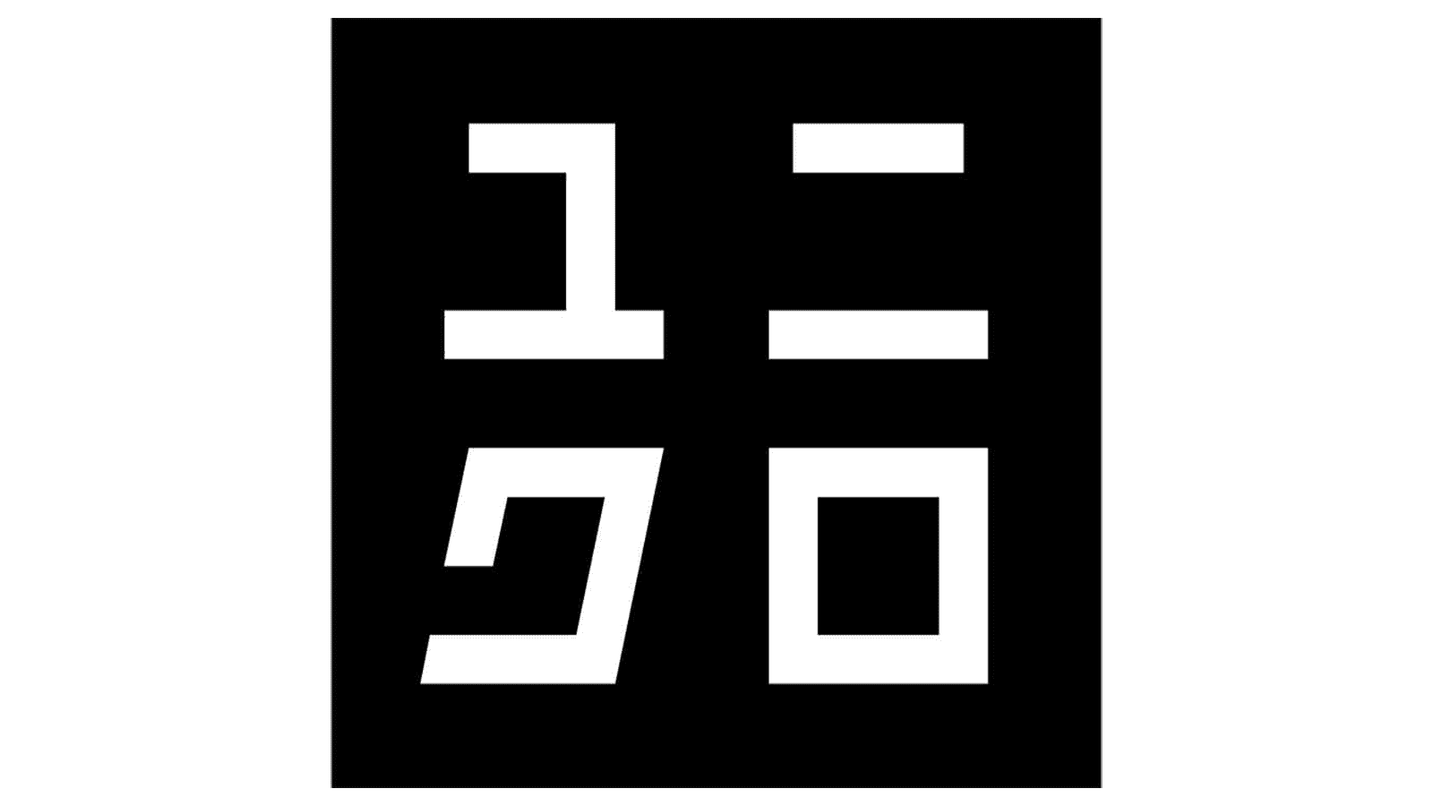
2006 – Today
![]()
First of all, the logo designed by Kashiwa Sato, the business’s lead designer, was done in both Japanese and English, which is quite rare for brands’ emblems. It brought back the bright red square and kept the white for the inscription. Both name versions had their own square background and the same logo style.
Font and Color
Red and white are taken from the Japanese flag. Thus, it is not surprising that the company went for this color palette. Red is also a generally powerful color that instantly attracts attention. Originally, the founders used a rather fine sans-serif font. All the letters were based on a square shape with rounded corners. All the other logos had a bolder sans-serif typeface with straight cuts. The logo introduced in 2006 features a custom Uniqlo Sans font.


