Versace Logo
Versace is one of the top fashion houses to come from Italy, although they aren’t particularly old in the trade, only being launched in 1978. They key product is clothing, but it’s also uncommon for them to produce fragrances, accessories, and even home appliances.
Meaning and History
![]()
Like a lot of Italian brands, the name is also a family name of the founder – Gianni Versace in this case. In 1978, Versace launched the first shop that sold clothing of his own design, and this company quickly grew to an internationally recognized name with brand stores on all continents.
What is Versace?
Versace is a luxury fashion brand from Italy, created in 1978. Besides a vast collection of clothing and accessories, they offer fragrances and even furnishings. Their products are notable for exquisite patterns, their lively color palette and high-class materials used in production. Their iconic Medusa logo is now closely associated with luxury worldwide.
1980 – 1990
![]()
The first official logo appeared in 1980, and it was simply the founder’s name written in tall thin letters with a lot of fluidity. They didn’t add a lot of space between the letters, which made it look like a solid block of text.
1990 – 1993
![]()
In 1990, the design of the letters changed a bit. The overall parameters stayed the same, but some stuff changed. Notably, they made the letters a bit thicker and more rounded, although their general look didn’t really change. They also elevated them to uppercase and broke the words up.
The intervals between the words stayed as short as before, but the words are now further apart. The way these words were positioned also could change – sometimes they stacked them one over the other, and sometimes they are just put on the same level.
1993 – 1996
![]()
1993 was the first time Versace introduced the iconic black-n-white seal icon they’ve been using ever since. It depicts Medusa from Greek myths, and this choice is solely justified by Versace’s personal memories, it has nothing to do with the brand.
The head of Medusa is painted with thin like, and they also put the usual Ancient Greek mosaic on the frames of the seal.
1996 – 1997
![]()
For a year, Versace used simply the surname from the 1990 text design, and that’s about it.
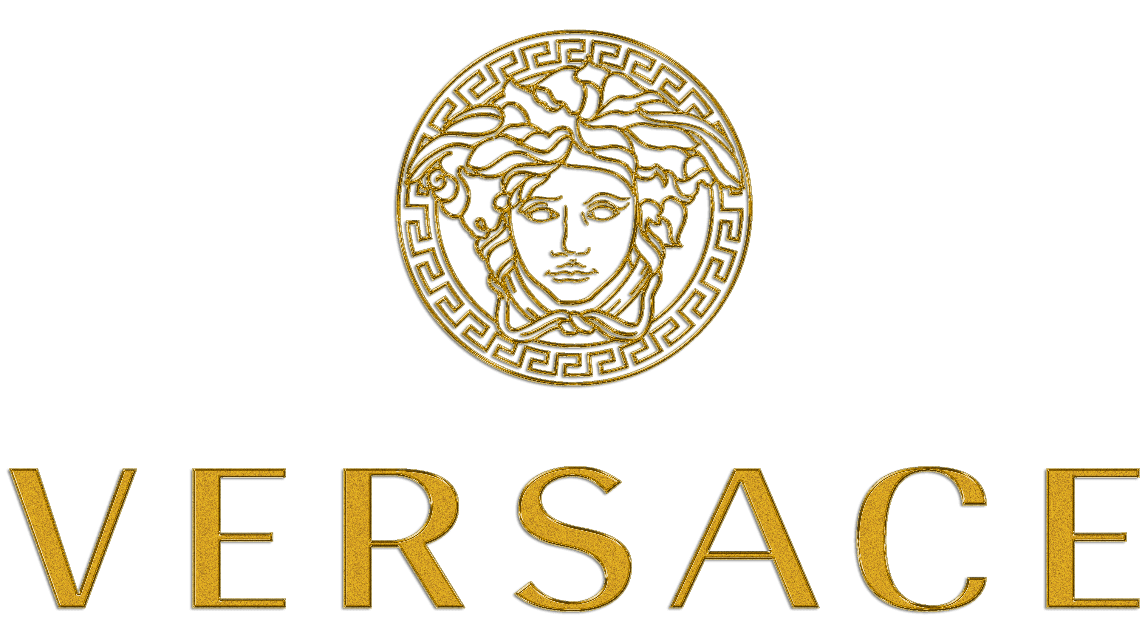
1997 – 2008
![]()
For this design, they took the iconic Medusa emblem and painted it gold. In this period, they also sometimes used the usual white emblem, and in addition, sometimes they added the company name from the 1996 design below the emblem. They curve it to fit the curvature of the seal.
2008 – today
![]()
In 2008, they returned to the black-n-white Medusa design, but this time it was reduced in size so that the company name would be more prominent by comparison. The company name itself unstuck from the seal, got rid of the curvature and added space between the letters.
Emblem and Symbol
Versace have an interesting way to signify their products. On handbags, for instance, they put the volume gold badges that resemble the face of Medusa with all the prominent features, as well as the hair and leaves that stick out of it. The patterned circle is usually not featured.


