Balenciaga Logo
Balenciaga is a French brand of high-level fashion, which was established in 1919. Balenciaga produces luxury quality footwear, clothes, and accessories for men and women. This is one of the most successful brands of high-performance fashion products, which products are notable for their impressive yet simple design as well as compact and thought-out shapes. However, the business operations of the brand didn’t go well all the time: in the 1970s the company was closed, restructured, and soon went under new management which holds the company since then.
Meaning and history
Throughout its history, it had several major redesigns of its brand identity. As happens with most luxury design brands, the Balenciaga logo depicts a compact and at some point typical yet extra slim and stylish logotype, made of a watermark with the name of the brand. Their no less elegant name derives from Cristobal Balenciaga – a stylist who gave the world this brand of top-class clothes in 1919 and developed it in the years to come.
What is Balenciaga?
Balenciaga is one of the most recognizable brands of high fashion clothes for men and women. It was founded in France, 1919, and grew rapidly to the world brand of top-quality shoes, clothes, and accessories. However, because of financial difficulties, Balenciaga was closed in 1972 and then re-launched under new management in the 1980s. The new owners didn’t rename the brand to honor its first founder – Cristobal Balenciaga. Despite all trouble, legal and financial issues, the brand continues to exist as one of the top fashion labels and world leaders in the sphere of leather wares production.
1919 – 2013
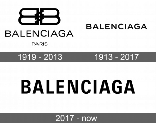
The first logotype of the brand depicted an emblem of two ‘B’ characters drawn back to back. They were connected to each other by three diagonal lines, representing something looking like a lock or stitches. The whole emblem was supposed to slightly remind a handbag – the core product of the company. Below the emblem, we can see the name, written in a somewhat bold sans-serif type with larger gaps between uppercase letters, colored black. Sometimes, they also placed a ‘Paris’ tagline at the bottom of the emblem, but it was rather optional.
2013 – 2017
The next logo was just a wordmark with a bolder font than in the previous variant. It didn’t have any emblems or special elements. There was also no background, as it wasn’t necessary to build an elegant, smooth and clean image of the brand logo.
2017 – today
Then, in 2017, they fully renovated the watermark. Now it got an extra-bold sans-serif typeface with way narrowed and heightened lines. Due to all these additions, the logotype became modern and fresh, as well as more compact and stylish.
Font
The font used for the name was closed to a way condensed style in comparison to the 1919 and 2013 versions. The letters became narrower and taller, which make the whole nameplate extremely eye-catching and stylish. Throughout their history, the main principle according to which the brand design team chose a font for the name is that it must reflect simplicity, fashion, and clearness.
Color
The color scheme also reflects that principle: it’s a classic black and white palette, easy to put on the different backgrounds, signboards, and advertisement blocks of the sites and magazines, as well as in various situations, whether it’s a company shop or business meeting.


