Nike Logo
Nike has been one of the most prominent sneakers producers. They’ve been in this business since 1964, when the company was started in Oregon, USA. Alongside Adidas, these guys have been the instrumental in promoting running apparel across the world. They are the reason why people throughout the world wear sneakers now.
Meaning and History
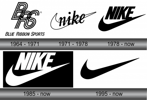
The company was first known as ‘Blue Ribbon Sports’, or ‘BRS’, for short. It was not until the 70s that they started to use the word ‘Nike’ as indicative of their brand. First, it was simply part of the brand, but in 1978 the name was changed completely. Nike is the name of the Greek goddess of victory, which fits the style of this brand neatly.
1964 – 1971
The very first logo was just a stylistic acronym of the first name – BRS. It wasn’t written plainly. The letters were thrown all over the place and drawn with three wavy lines. No doubt, they were meant to signify shoe cords. It wasn’t very easily readable, however – especially from afar.
Pretty soon, the bosses thought of a single image to identify their brand.
1971 – 1978
That’s when the first iteration of the famous Nike stroke was brought into light. It’s officially called ‘Swoosh’, and is meant to symbolize the wing of the goddess Nike. For those not terribly familiar with the Greek mythology, it’s just an interesting energetic symbol.
In this iteration, it was white with just a thing black outline. Right on top of that, the designers put a work ‘nike’ (all letters in lowercase) in black. They didn’t adopt the name yet, mind you, they just thought to adopt the victory goddess as a mascot of sorts.
1978 – today
In 1978, the name was officially taken and they produced a new logo to congratulate themselves. It was the same ‘Swoosh’ symbol, but black. They also took the word, made it into uppercase, gave it a more serious-looking font and put it right above the symbol and not in the same place.
1985 – today
It’s basically an inversion of the previous logo. The standard color was changed to white for both elements, and they were also put inside a black (usually square). The color scheme is not substantial, because it’s the same design as before, and Nike experimented with colors a lot since then, trying out various other colors.
1995 – today
It’s just a standalone ‘Swoosh’. There’s nothing else to it. The usual color would be black, although it’s not set in stone, as you understand. The shape is what’s important.
Emblem and Symbol
Not a lot of people know that a familiar ‘Swoosh’ symbol is supposed to be a wing of some goddess. In all fairness, the symbol is supposed to represent the movement that the wing would do in action. It fits the name, and that’s what most people think of anyway – well, more or less.


