Arizona Cardinals Logo
The Cardinals are one of only four active NFL teams that play home games in a city other than the city they were born in, so they’ve changed stadiums along with their location and even their original name. By the way, there are not so many teams in the NFL that bear the name of the state and not the city in which they play.
Meaning and History
The history of the team begins in the distant 1898. The club was not called the Cardinals, but the Morgan Athletic Club. For most of their history in Chicago, the Cardinals have spent at Comiskey Park. The 1950s were a tough time for the Cardinals as they had only 33 victories in ten years. The Cardinals were practically bankrupt when the league gave them the go-ahead to move to St. Louis. Unfortunately, that did not help much. The move happened during the 1960 season. In 1988, the team was allocated a stadium in the suburbs of Phoenix, so the name was changed to the Phoenix Cardinals. In 1994, the team got its current name, the Arizona Cardinals. This decision was made in favor of the fans.
What is Arizona Cardinals?
The Cardinals are the oldest American football franchise in existence today. In 1920, the team joined an association of clubs, which two years later was transformed into the NFL. As such, the Cardinals are considered one of the founding members of the league.
1920 – 1934
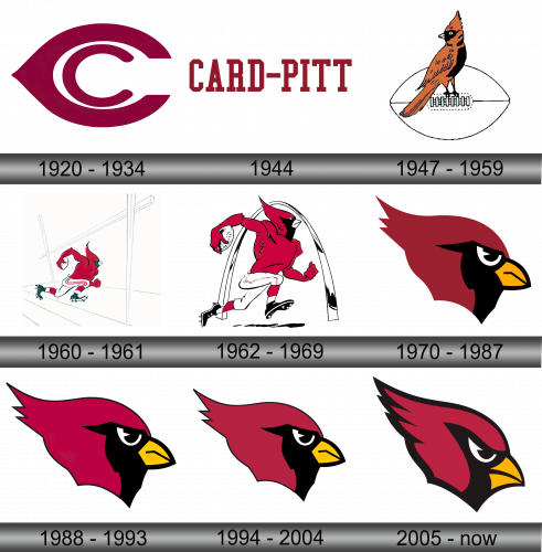
The first emblem reflected the original name. It was a large and thick “C” with a smaller “C” inside. Both letters were done in crimson color. The larger letter had an elongated element on the left, which made the whole emblem resemble an eye in some way.
1944
In the year 1944, an intriguing fusion occurred between the Steelers and the Chicago Cardinals, leading to the moniker “CARD-PITT.” Colloquially, they garnered nicknames such as the “Car-Pitts” and amusingly, the “Carpets.” Emblazoned prominently on their emblem was the distinctive label “CARD-PITT.” However, this union was short-lived. As the calendar turned to 1945, the Steelers chose to revert to their standalone identity, parting ways with the combined branding and charting their independent path once again in the sporting arena.
1947 – 1959
In 1947, a bird appeared on the team’s logo, after which the owner named the color of the uniform the players were wearing. It was a drawing of a brown cardinal bird with black details. It was perching on the seam lines of a football. The football itself was white with a very thin black line being used to outline the ball. There were no words or initials, but the logo was easy to associate with the team.
1960 – 1961
For the inaugural time, the emblem showcased a figure, uniquely blending human and avian elements. While the body exhibited human attributes like arms and legs, the head was distinctly that of a cardinal bird. This amalgamated character was dynamically depicted, seemingly in action, evoking the fervor of driving the ball towards the target. This fusion of human and bird elements served as a symbolic representation of the team’s spirit, capturing both the agility of the bird and the athletic prowess of a human, embodying the passion and determination the team brings to the field.
1962 – 1969
In 1960, the bird was added to the helmets of the players besides being part of the logo. The emblem itself had a running football player done in a white, black, and red color scheme. The red top transitioned into a red head of a cardinal bird. The character is holding a football in its right hand. There is a black and white outline of the St. Louis arch in the background.
1970 – 1987
The next logo featured only the cardinal’s head. It is a bold red color with black, a bit of white, and yellow accents. The bird is facing right and has a very serious, even angry, look. There are not a lot of details and the lines are very clean and the coloring is done in one even color.
1988 – 1993
The angle at which the head of a cardinal is drawn has been adjusted just a bit. The other change was an addition of a thin outline around the bird. It was done in black and created even more contrast. The shape of the bird has been changed as well, but the change is not very drastic.
1994 – 2004
In a nuanced shift reflective of broader regional representation, the city-centric identity of Phoenix was transitioned to encompass the entire state in 1994. Consequently, the Cardinals, in a bid to resonate with this expanded territorial allegiance, rebranded themselves as the “Arizona Cardinals.” Accompanying this name transformation, the team also unveiled an updated logo, underscoring their commitment to evolve and embrace the wider community. This modification not only symbolized geographical inclusivity but also aimed to strengthen the bond with fans across the state, ensuring the team’s emblem was in harmony with its renewed identity and broader Arizona heritage.
2005 – Today
The bird got an even bolder look with a black outline that varied in thickness but overall was significantly thicker than before. The shape of the head was stretched diagonally and had a sleeker look. There was even more determination and energy about this logo. It also had a more modern feel.


