Armani Exchange Logo
Armani Exchange is a youthful sub-brand of the renowned Italian fashion house, Giorgio Armani. Focused on modern trends, it caters to a younger audience with its urban-style clothing and accessories. The brand operates globally, with significant presence in markets like the United States, Europe, and Asia. It’s owned by Giorgio Armani S.P.A., showcasing the founder’s vision for accessible yet high-quality fashion. Armani Exchange emphasizes casual, street-savvy designs, differentiating itself from the more upscale Armani labels.
Meaning and history

Armani Exchange emerged in 1991, born from the innovative vision of the renowned Italian designer, Giorgio Armani. This new venture was designed to meld the exclusivity of high fashion with the energy of street style, creating a unique niche in the fashion world. Aimed at a younger, style-conscious demographic, A|X distinguished itself by offering designer flair at more accessible price points, a departure from the more opulent Giorgio Armani and Emporio Armani lines.
The essence of Armani Exchange lies in its ability to blend the elegance associated with the Armani brand with a casual, contemporary edge. The brand’s portfolio includes a diverse range of clothing, accessories, and eyewear, appealing to those who yearn for designer labels but seek a more relaxed aesthetic.
The brand’s expansion was rapid and global, with the United States quickly becoming a stronghold. The A|X brand also spread its wings across Europe and Asia, establishing itself as a significant player in the international fashion arena.
In a strategic move in 2014, Giorgio Armani consolidated his control over A|X, which had previously been a collaborative venture. This realignment brought the brand more directly under the Armani Group, ensuring a more unified brand philosophy and creative direction.
Armani Exchange has since ventured into collaborations with various artists and designers, injecting innovative and fresh designs into its collections. In response to a shifting consumer landscape, the brand has increasingly focused on sustainable and ethical fashion, aligning with modern values of environmental consciousness and social responsibility.
Armani Exchange stands as a testament to affordable luxury, merging Italian design finesse with a modern, dynamic style, and continues to attract a wide audience with its fashion-forward offerings.
What is Armani Exchange?
Armani Exchange, often stylized as A|X, represents a youthful and vibrant sub-label of the prestigious Italian fashion house Giorgio Armani. It’s renowned for blending high-end sophistication with urban, contemporary style, offering an array of fashion-forward clothing and accessories tailored to a younger, trend-conscious demographic. This brand stands out for its unique fusion of designer luxury with accessible, street-inspired designs.
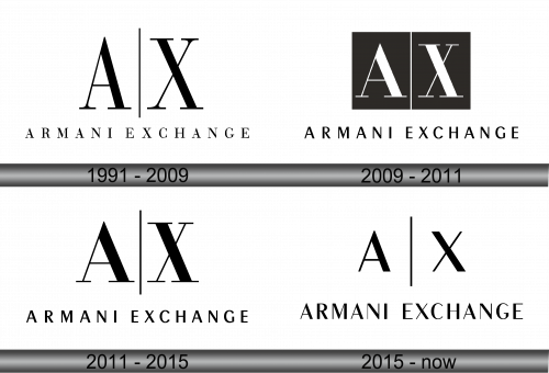
1991 – 2009
The logo exhibits a stark, minimalist design, epitomizing a modern and refined aesthetic. It features the initials “A” and “X” prominently, representing the Armani Exchange brand. These letters are rendered in a bold, sans-serif typeface, standing tall and symmetrical. Beneath this, the full name “ARMANI EXCHANGE” is spelled out in a more subdued fashion, providing a grounding contrast to the dominant initials above. The color scheme is monochromatic, employing a simple yet powerful black on a white background, reinforcing the logo’s timeless elegance. This design communicates the brand’s luxury heritage and its accessibility to a fashion-forward audience, encapsulating Giorgio Armani’s vision of affordable designer wear.
2009 – 2011
The updated logo portrays a sleek, sophisticated refinement. The “A” and “X” are now encapsulated within two separate squares, enhancing the visual impact. These squares are shaded, providing a backdrop that contrasts starkly with the bold, white letters. This encapsulation creates a sense of structure and modernity. The typeface of the initials remains sans-serif but appears more streamlined, reflecting a contemporary vibe. Next to the squares, the brand name “ARMANI EXCHANGE” is spelled out in a clean, unadorned font, which suggests a chic, understated elegance. The overall effect of this logo redesign is a refined, urban look that communicates the brand’s evolution while maintaining its core identity as a purveyor of accessible designer fashion.
2011 – 2015
In this iteration of the Armani Exchange logo, there is a return to a more streamlined and open design. The “A” and “X,” previously boxed within individual squares, are now free-standing, conveying a sense of liberation and openness. The removal of the shaded background squares simplifies the aesthetic, focusing the viewer’s attention on the clean lines of the letters. These letters retain their bold, sans-serif font, which stands out starkly against the white background, emphasizing the brand’s strong identity. The full brand name, “ARMANI EXCHANGE,” displayed beneath the initials, remains in a plain, unembellished font, ensuring that the attention remains on the commanding initials above. This design shift suggests a blend of classic elegance with modern minimalism, reflecting an evolving brand that values both its heritage and contemporary appeal.
2015 – Today
The contemporary version of the logo features a notable shift in typography for the brand name “ARMANI EXCHANGE.” The font presents a more refined and modernized style, with cleaner lines and a more uniform weight throughout the letters, providing a sleeker and more contemporary feel. This typographic update reflects the brand’s evolution, emphasizing a forward-thinking and sophisticated identity while maintaining its legacy of elegance and accessibility. The initials “A” and “X” continue to stand out, with the vertical bar between them serving as a symbolic bridge, uniting the brand’s heritage with its modern aspirations. The overall design retains a minimalist approach, ensuring the logo’s adaptability and recognition across various mediums and platforms.


