Army Black Knights Logo
Army Black Knights is one of the many American football teams that compete in various college ball tournaments. They were created back in 1890 to represent the Military Academy – basically, the future officers of the United States Army. They aren’t too successful, but that doesn’t stop them.
Meaning and History
Until 1999, the team was officially called ‘Army Cadets’, which clearly represents them as a team of cadets in the Academy. For the longest time, however, they were unofficially called ‘Black Knights’, seeing how their main uniforms are black, and that they use a lot of warrior aesthetic (initially Antique imagery, but ‘Knights’) sounds better.
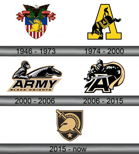
1946 – 1973
Until 1946, the Cadets didn’t have any official emblems. The branding wasn’t really crucial for college football back then. In 1946, they started using just their Academy’s own emblem – a golden Antique helmet with a sword set against a shield painted in American colors (stripes below, blue part above).
A bald eagle was perched on top of this composition, and there was also a rather long scarlet ribbon flying to the left and right. There are some words related to the Academy, such as ‘Duty’, ‘Honor’, ‘West Points’ and so forth.
1974 – 2000
In 1974, some rebranding attempts followed.
There was a black horse in the middle. There were golden elements on it – such as the saddle (and the letter ‘A’ on it), reins, and more. The most interesting thing is that it’s not rearing, but standing on its front legs. The implication is simple: the team will kick your teeth out on the field.
They also set a giant yellow ‘A’ outlined in black right below the horse – for ‘Army’, no doubt.
2000 – 2006
In 2000, they rebranded the emblem again.
The color change is notable – instead of the yellow the parts that aren’t black or grey now sport beige coloring, which has actually been their other main color aside from black for many years.
The logo features a black medieval knight that charges somewhere to the right atop his horse (which is also black). Some elements are silvery grey, such as the armor, the sable (held like a lance, for some reason) or the hair on the horse.
The bottom half is the beige shape tilted to the side that features the giant word ‘ARMY’ followed by a smaller ‘BLACK KNIGHTS’ addition below it, all written in black.
2006 – 2015
The 2006 variant features the same knight, although he’s no longer astride. This time, he faces the onlooker with the same sword, armor and the color palette. The only real addition is the large beige cloak he’s trying to swipe away.
Right in front of him is the letter ‘A’ written in black and doubly outlined in white and beige. It’s actually the same design as in the 2000 logo.
2015 – today
In 2015, the Knights decided to make homage to their Academy by placing a beige ancient Greek helmet and a sword (directly behind it) on top of the black shield outlined in beige (and then in black again) that also sports a little beige star right below the main imagery.
Emblem and History
The team members mostly use the latest logotype on their uniforms, although they also sometimes include parts of the Army or Armed Forces symbols either onto their shoulders or close to the chest. The players often use the symbols from their regiments, as well.
