AutoZone Logo
AutoZone is an American auto parts and accessories retailer. It owns a network of thousands of retail locations. It is present in various countries besides its home location, including Mexico, Puerto Rico, and Brazil. The company’s products are mainly sold in the Mexican market. The company also plans to expand its influence in Brazil through the opening of new outlets. Besides growing the number of new stores, its growth of operations is attributed to the online sector. It also provides customer service through its website and mobile applications. Over time, AutoZone grew to become the prime choice for most American car users.
Meaning and History
It was created in 1979 in the city of Arkansas. Back then, it was registered as ‘Auto Shack’ and was a wholesaler. This corporation was part of the Memphis company. In 1986, the current version of its brand name appeared in connection with a judicial settlement of claims with the Radio Shack brand. Along with the company’s name change, it changes the direction of its business, selling grocery departments and focusing on automobile parts and accessories. Over the following decades, many outlets were opened selling automotive parts both locally and internationally. The brand became a large trading holding, which was listed on the New York Stock Exchange in 1991. This brand sponsors a wide variety of automotive sports competitions, such as the AutoZone Liberty Bowl. The first sponsorship was signed with NASCAR in 2004. For example.
What is AutoZone?
AutoZone is a large chain of stores. It sells auto parts in the United States and beyond its borders. In addition, AutoZone rents out special tools to vehicle owners and sells vehicle diagnostic and repair software. AutoZone also owns private label brands. This company is quite stable and profitable and holds its position very firmly in the automotive market.
1979 – 1987
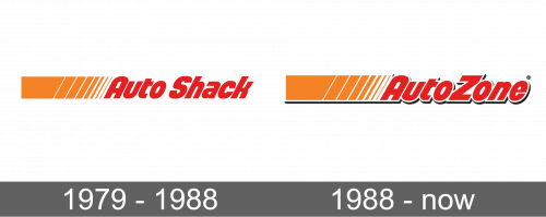
The brand used this logo during their ‘Auto Shack’ period. It depicts their name written using tall, round letters. The wordmark was a bright red color. Right on the left of this writing, they placed an orange rectangle that broke down into several vertical strokes tilted to one side to go along with italicized letters. They grew slimmer the closer they got to the name part, while the white spacing between them grew wider. Sometimes, the logo is presented in a black and white color palette with the name being written in two lines and the rectangle adjusted accordingly.
1987 – Today
In 1987, they redesigned the logo to fit the new name – ‘AutoZone’. That being said, the idea changed little. The font used with the writing stayed the same. Although, the letters along with the rectangular element on the left acquired a white border and a thin black shadow. This shadow gave the whole emblem a 3D feel and made it stand out even more. As with the previous version, the company sometimes uses a logo that features the name written in two lines to make it shorter.
Font and Color
The primary colors of the logo are bright red, orange, and white. There is also a little bit of black introduced as a shadow in the 1987 version, although the original logo was also sometimes printed in black and white. These are all confident, powerful, and strong colors that instantly grab the attention. The sans-serif font is italicized and has many rounded lines, although the ends have sharp, pointed angles. Only the first letters are capitalized. The second logo also features a border and a shadow that gives a 3D appearance.
