Back to the Future Logo
“Back to the Future” is a groundbreaking 1985 sci-fi adventure film directed by Robert Zemeckis, co-written with Bob Gale. Crafted in the United States, it’s a vibrant tale of teenager Marty McFly, who, with the eccentric scientist Doc Brown’s time-traveling DeLorean, journeys from the 1980s to the 1950s. There, Marty’s actions risk altering his future. Created to blend comedy, science fiction, and family drama, it explores themes of destiny, friendship, and the impact of the past on the future.
Meaning and history
“Back to the Future”, a cinematic gem, emerged from the minds of Robert Zemeckis and Bob Gale in the early 80s. Dreamed up by Gale, inspired by his father’s yearbook, it pondered if they’d be friends in high school. Spielberg, enchanted, backed it after initial rejections. Universal Studios green-lit it, 1984. Michael J. Fox, despite a tight schedule, was cast as Marty McFly, replacing Eric Stoltz. Filming juggled Fox’s TV commitments, often at night. Zemeckis’ vision, blending time travel and teen angst, became reality. Alan Silvestri’s score and a DeLorean made it iconic. Released in 1985, it soared, becoming a beloved trilogy, etching its legacy in pop culture.
What is Back to the Future?
“Back to the Future” unfolds as a riveting journey where Marty McFly, aided by Doc Brown’s ingenious DeLorean, navigates the intricacies of time, altering the course of history. This cinematic marvel, blending wit, science, and heart, invites viewers to ponder the fabric of destiny and the echoes of our actions across time.
1985
In this logo, bold, angular letters leap forward, capturing a sense of velocity and adventure. Vivid orange fades into a sunny yellow, evoking the energy and optimism of a journey. The typeface, stylized with sharp cuts and forward slant, suggests swift motion towards the horizon of the future, mirroring the film’s time-travel theme. The trailing “R” extends into a dynamic shape, hinting at the excitement of the unknown that lies ahead. It’s a visual promise of thrilling escapades through time.
1989
The “Back to the Future Part II” logo crackles with the energy of a time-skip thrill ride. A bright, fiery gradient from warm yellow to deep orange encapsulates the title, while a sharp, electric blue outlines the characters, providing a cool contrast that pops. The “II” and “PART” are prominently featured, with an arrow piercing through “PART”, symbolizing the movie’s leap forward into new temporal territories. It’s a visual burst of the 80’s aesthetic, promising high-octane temporal escapades.
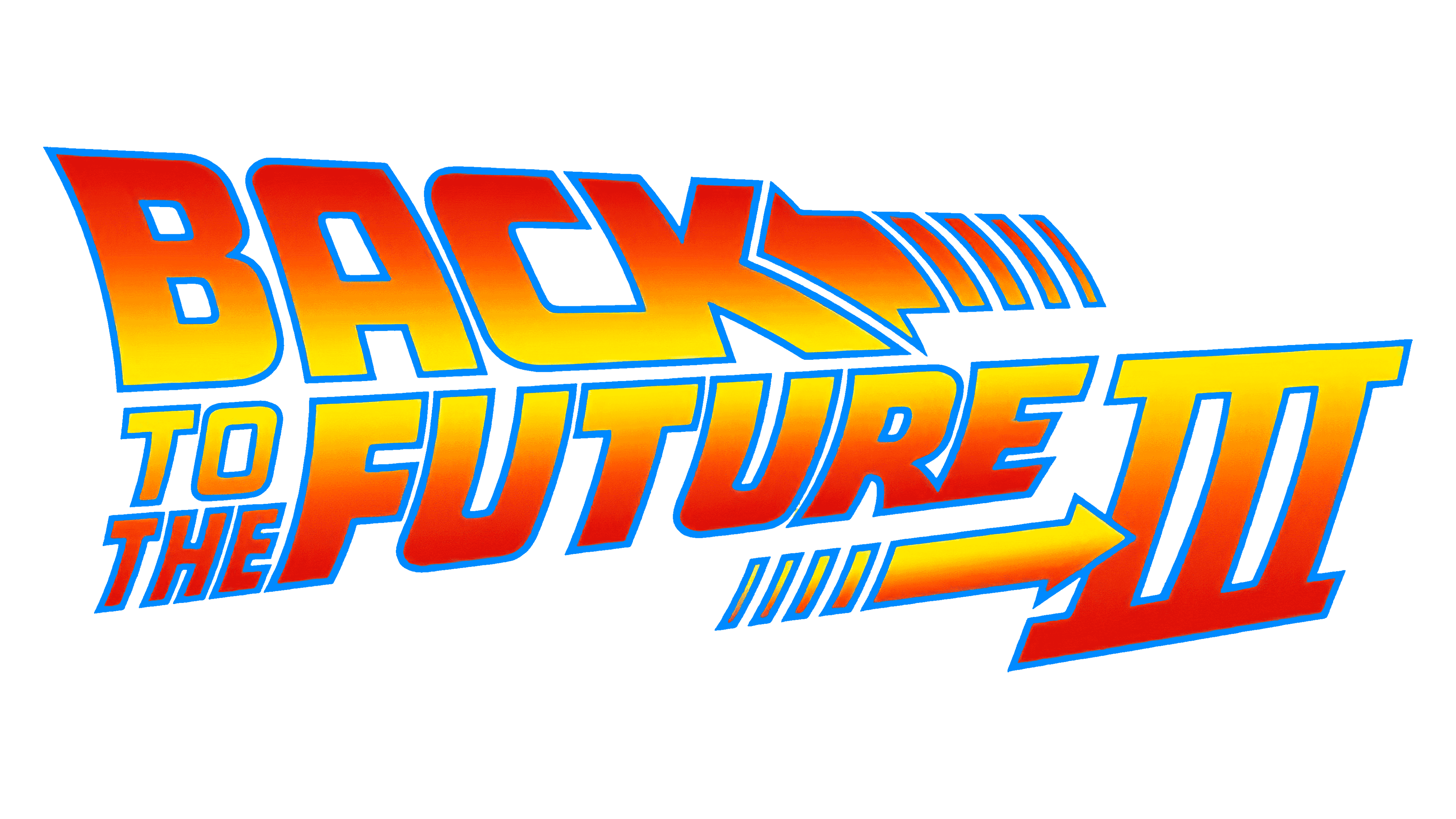
1990
The logo pulsates with a more intensified dynamism, “III” boldly emblazoned, signaling the sequel’s arrival. The hues deepen, gradients sharpen, encapsulating the film’s heightened stakes and futuristic allure. An arrow pointing right underscores progress, a visual nudge towards the unfolding saga ahead. This emblem heralds an escalated adventure through time, promising viewers an even more exhilarating cinematic ride.
