Bajaj Logo
Bajaj is an Indian company producing motorbikes and rickshaws. It was established in 1972 and now is one of the largest Asian brands in this professional sphere. Though the manufacturing of two and three-wheel vehicles is one of the most important areas of Bajaj’s business operations, they’re also involved in other types of business such as iron and steel production and selling, insurance care services, operations with finances, as well as travel and tourism management.
Meaning and history
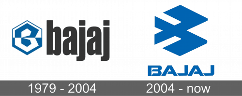
The Bajaj logotype and its whole corporate image haven’t undergone various major changes throughout the company’s history. One of the biggest changes was the redesign of 2004 when they changed its emblem and nameplate style. The name of the company and its history derive from the surname of Jamnalal Bajaj, a businessman, political leader, and industrialist who founded the family business in 1926 and developed it for the years to come.
What is Bajaj?
Bajaj is an international conglomerate, founded in India, 1927. They participate in various directions of industries and business. They manage operations on two and three-wheel vehicle development, production, and selling, helping with finances, insurance processes, tourism brokerage, and iron & steel manufacturing. This is one of the largest multi-purpose companies, which services and products are popular across the whole world.
1979 – 2004
The first logotype that was used by the brand appeared only in 1979. It was an inscription with the name of the brand written in a grotesque sans-serif typeface with very small gaps between black letters. To the left side of the nameplate, we can see the emblem, depicting a blue and white hexagon, divided broadwise into two sectors. Inside it, we can see the ‘B’ character with a shape close to a hexagon.
2004 – today
In 2004, the brand designers from Elephant Design agency decided to replace the old logotype with something new. The new logo is an image of two bold horizontal ticks with cut tails. The emblem is located above the inscription with the name of the company. It has a custom angular typeface with sharp lines of the sans-serif letters. The logotype doesn’t have any special background, which allows it to fit in many situations and on various signboards. The main color of the logo is blue, although you can find it colored black or white as well.
Font
In the logotypes, Bajaj Company used two different types and color schemes. The 1979 variant had a tall, ill-proportioned type with fewer gaps between bold lowercase letters, colored black. 2004 depicted a nameplate with a sharp, angular typeface with narrowed uppercase letters that had cuts on them.
Color
To the left from the inscription, in 1979 logo they put an emblem with blue and white shading. The 2004 redesign depicted solid blue brand symbol and the inscription below.
