Banana Republic Logo
Banana Republic stands as a renowned fashion retailer. Mel and Patricia Ziegler, a couple with vision, founded it. They chose California for its birthplace, aiming for a distinctive retail experience. Initially, their concept revolved around travel-themed clothing. They infused their collections with stories and adventures, targeting those who appreciated uniqueness. The brand’s essence combined style with a sense of adventure, appealing to a broad audience.
Meaning and history
Banana Republic’s journey began in 1978. The Ziegler’s unique vision for travel-inspired attire quickly set the brand apart. By 1983, Gap Inc. saw potential and acquired it, marking a pivotal moment. This acquisition transitioned the brand towards more mainstream fashion while retaining its original charm. Over the years, Banana Republic evolved, continuously adapting to fashion trends. Significant milestones include its global expansion and the launch of its online platform, further solidifying its presence in the fashion industry.
What is Banana Republic?
Banana Republic is a fashion retail brand known for its sophisticated and contemporary style. It caters to men and women who seek quality and elegance in their wardrobe. The brand combines modern designs with classic touches, offering a wide range of apparel, accessories, and personal care products.
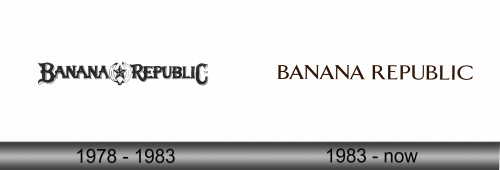
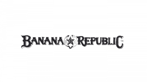
1978 – 1983
The logo features a distinctive pairing of two bananas cradling a star at its center, symbolizing both the brand’s name and its penchant for the whimsical. The bananas, rendered with a touch of realism, add an organic element to the design, while the star introduces a hint of aspiration and excellence. The bold, serif font of “Banana Republic” frames this centerpiece, reinforcing a balance between playful imagery and traditional sophistication.
1983 – Today
This iteration of the Banana Republic logo opts for a minimalist approach. It eschews embellishments for a clean, modern aesthetic. The typography is sleek, with sharp serifs and a uniform thickness that speaks of sophistication. The color palette is simple, utilizing contrasting hues for instant recognition. This logo embodies a refined, contemporary style, reflecting a matured brand direction.
