Barry University Logo
Barry University is a private catholic science research organization based in Miami-Shores, Florida. Founded in 1940 by the Adrian Dominican Sisters organization, Barry University is one of the largest catholic universities in the southeast of the USA. Being a part of the Archdiocese of Miami, the university offers more than a hundred educational programs granting bachelor, master, and doctoral degrees through six independent schools and two colleges.
Meaning and history
The university was born when Bishop Barry, a member of Adrian Dominican Sisters, headed the process of laying and blessing the keystone of the Cor Jesu Chapel in June 1940. He died in August, shortly before the college opened its doors.
Working on the college establishment, the Bishop partnered with his sister, Mary Gerald Barry, a then-leader of the Sisters who would become the college’s president. The following six presidents were members of the Sisters, and only the current 7th president, Mike Allen, is not part of this organization.
In 1981, the college officially became a university following the expansion.
What is Barry University?
Barry University is a private scholar organization founded in 1940 by Adrian Dominican Sisters and based in Miami. It offers more than a hundred academic degrees in various humanitarian and natural subjects via six schools and two colleges. It also has a large campus comprising 54 buildings, more than 7,000 students, and 1,000 academicians.
1940 – today
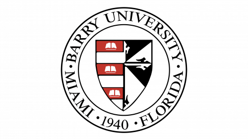
The official academic sigil of the university is a classic round with a shield inside it.
The outer ring of the seal displays the name placed centrally at the top. The lower part is occupied by the city where the university appeared, the year of its foundation, and the state’s name.
As for the sharpened shield inside the seal, it is split into two halves. The left part has a striped pattern, whereas the first, third, and fifth sections show white books, representing knowledge. The shield’s right segment represents a catholic crest, placed on the background of four triangles.
1981 – today
The official logotype of the university, used in marketing materials, features just the inscription on a black background.
Color
Black, white and red shades occupy the space in both the logotype and the seal. However, the designers used them differently. If the logotype is red for the text and white for its background, the seal shows black lines and letters placed on the white background (if there is one). The shield consists of the left half showing a striped white and red pattern with each section contoured black. The books on the red stripes are white. The left portion is split into four black-and-white triangles. Each triangle has its part of the catholic crest, colored oppositely.
Font
Both logotypes employ uppercase scripts, having different fatness and size of serifs. The seal shows a classic slim uppercase font with small yet sharp serifs and narrow inter-letter intervals. To depict the wordmark in the logo, the brand designers chose a script with even smaller gaps between the bolder characters. They have prominent serifs, looking more like angular rectangles.


