Battle for Dream Island Logo
Battle for Dream Island (BFDI) is an animated web series created by Cary and Michael Huang in the United States, debuting in 2010 on YouTube. Crafted with Adobe Flash, it’s a competition-based show featuring inanimate objects as contestants vying for the grand prize of Dream Island. The series is known for its unique blend of humor, engaging storylines, and a distinctive animation style, appealing to a broad audience beyond its initial target of younger viewers. BFDI stands out as a pioneering internet animation success.
Meaning and history
In 2010, Cary and Michael Huang launched “Battle for Dream Island” (BFDI) on YouTube, a novel web series from the USA. It features animated objects competing in challenges. The prize? A mythical Dream Island. The characters, ranging from fiery to leafy, bring humor and drama. The show’s charm lies in its simplicity and creativity. BFDI quickly gathered a diverse fanbase, thanks to its engaging plots and relatable object characters. Its success spawned sequels, expanding the BFDI universe. A blend of competition, strategy, and friendship, it redefined online animation. BFDI is more than a series, it’s a cultural phenomenon in digital storytelling.
What is Battle for Dream Island?
“Battle for Dream Island” is an innovative web series where animated objects with vibrant personalities embark on a quest for a coveted prize: Dream Island. Created by the Huang brothers, this pioneering show blends competition, humor, and unique storytelling, captivating viewers across the globe with its originality and charm.
2008
This logo exudes a playful charm, spelling out “Firey” with hand-drawn letters in a soft red gradient, suggesting warmth and energy. Each character is uniquely embellished with figures that resemble animated, personified flames, adding a whimsical touch. The artwork conveys a friendly and approachable vibe, inviting viewers into a creative and animated world.
2008 – 2009
The logo evolves into a more streamlined form with “TOTAL FIREY ISLAND” in bold, unadorned black lettering, conveying a minimalist aesthetic. The playful essence remains, anchored by the whimsical drawing of a character to the right, resembling a flame with a carefree, doodle-like quality. The character retains its anthropomorphic charm with stick-figure legs, symbolizing movement and liveliness. This design shifts towards a cleaner, more abstract style while maintaining the original’s spirited personality. It’s a fresh take, balancing simplicity with a dash of playful animation.
2009 – 2010
In this iteration, “Total Firey Points” is penned in a casual, freehand style, replacing the previous “Island” theme. The flame character, now encased within a square, gains complexity with additional lines, simulating a reflective surface or perhaps a container. This character’s playful spirit endures, with its stick-figure limbs suggesting a dance. The text’s irregularity adds a personal, almost intimate touch, as if sketched in a moment of inspiration. The logo maintains a balance between informal doodling and intentional design, echoing a homemade charm.
2010
The logo now reads “Total Firey Switch”, penned in a hasty, uneven script that suggests a dynamic, spontaneous creation. Gone are the illustrative elements, the focus is purely on the text, which leans slightly, adding a sense of movement. The words “Total” and “Firey” arch gently over “Switch”, emphasizing a change or pivot, possibly hinting at a new direction or feature. The absence of graphics concentrates the attention on the message, showcasing a minimalist shift from the previous designs, yet it retains the raw, sketch-like feel.
2010 – 2012
This logo leaps to a polished, 3D-like style with “Battle for Dream Island” in bold, layered letters, exuding a professional and sleek look. The use of a gradient blue fills the text with depth, while the green “for” adds a pop of contrast, enhancing readability. Shadows give the impression of the words floating above an invisible plane, suggesting a realm of possibility and adventure. This design marks a significant shift from hand-drawn to digital sophistication, reflecting a more established and branded approach. The logo’s evolution signifies growth and a step towards a more mainstream appeal.
2012 – 2013, 2023 – Today
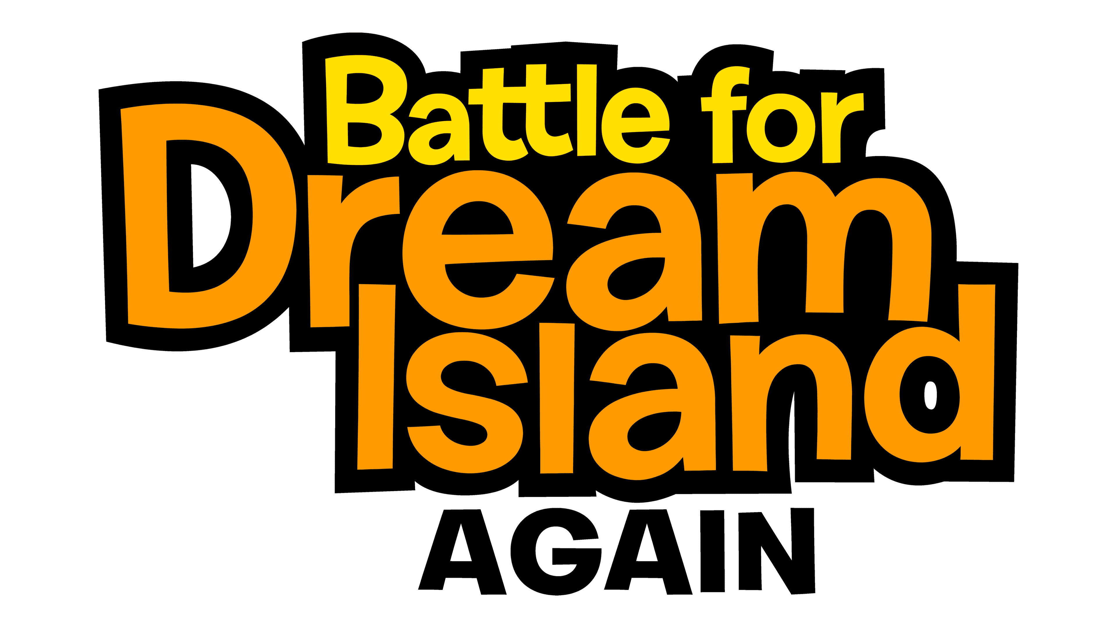
The logo for “Battle for Dream Island” pops with bold, chunky lettering in a vivid orange hue set against a deep black background. The text overlaps in a playful manner, creating a sense of depth and layering, which adds a dynamic, almost tactile feel to the design. This interlocking style not only captures attention but also symbolizes the interconnected nature of the show’s characters and storylines. The choice of orange gives off a vibrant, energetic vibe, resonating with the excitement and competition inherent in the show’s theme.
2016
The logo takes on an ethereal twist with a mirror-like inversion, “Battle for Dream Island” rendered in pale yellow outlines against a white backdrop. The letters float dreamily, their orientation inverted, creating a reflective effect as if on water or ice. This abstract approach is a stark departure from the solid, 3D style before, offering a subdued and enigmatic vibe. The design plays with perception, challenging viewers to look deeper, much like a riddle hinting at the fantastical nature of the ‘Dream Island’ itself. The subtlety of this design whispers mystery and invites curiosity.
2017 – 2020
In this logo, “Battle for B.F.D.I.” is spelled out in stark black, with a playful twist of characters from the series forming the letters. The whimsical figures, with their cartoonish limbs and facial expressions, inject a sense of fun and animation, evoking the lively spirit of the show. This design marks a return to the series’ roots, focusing on the quirky charm of its characters, and stands in contrast to the more abstract and minimalist previous version. The logo is playful, inviting, and full of personality, reflecting the creative essence of the series.
2020 (prototype)
This logo presents a stark transition to a more traditional text-based design, with “Battle for B.F.B.” displayed in a solid, serif font. The letters are shaded with a gradient of blue, creating a three-dimensional effect that adds depth and a touch of sophistication. The design reflects a mature evolution, possibly targeting a wider audience while maintaining the brand’s core identity through the consistent use of blue, associated with the series’ theme.
2020
The latest logo reincorporates character elements, blending the clean typeface of “Battle for B.F.B” with whimsical charm. A dotted outline of a star-like figure hovers to the left, while a cheerful cartoon character graces the right, adding a touch of playfulness. This design bridges the gap between professional and playful, signaling a fusion of serious branding with the series’ lighthearted nature. The simplicity of the black font against the stark white background ensures high visibility and a modern feel, embracing minimalism while celebrating the show’s animated roots.
2020 – 2021
Reverting back to a more character-centric design, this logo for “Battle for B.F.B.” showcases playful, cartoonish figures forming part of the text. The stark black outlines of the characters provide a lively contrast to the simple, bold font of the words “Battle for”. This design strikes a balance between the playful nature of the show and a clean, minimalist font style, creating a logo that’s both fun and clear. The characters seem to interact with the text, giving the logo a dynamic feel that hints at the animation’s playful energy.
2020 (prototype)
The logo holds onto its single-color allure, centralizing the character within the “B.F.B” acronym to capture focus. “Battle for” anchors the visual in stable typography, while the character’s puzzled expression injects quirkiness, echoing the series’ whimsical spirit. The design places the character at the heart, spotlighting the animation’s core and marking a subtle shift from the earlier side placement, yet preserving the clean, minimalist vibe.
2020 (prototype)
The logo transforms with vibrant green hues and a new subtitle, “THE POWER OF TWO”, emphasizing a fresh chapter or sequel. The text “Battle for Dream Island” remains at the top, but it’s the bold, skewed perspective of “THE POWER OF TWO” that grabs attention, implying dynamism and a new focus within the series. This energetic slant, combined with the bright color, gives the logo a lively, forward-moving appearance, suggesting excitement and growth in the show’s narrative. The design radiates with a sense of renewed vigor and the promise of novel adventures.
2021 – Today
The logo’s color shifts from vivid green to stark black, and the font style remains bold and skewed for dynamic impact. “Battle for Dream Island:” is smaller, making “THE POWER OF TWO” the dominant element, now in monochrome. This color change gives the design a classic, versatile appearance, perhaps indicating a tonal shift or a return to the series’ roots. The 3D effect has been toned down yet the text still gives off an energetic vibe, suggesting a continuation of the series’ momentum and excitement.
