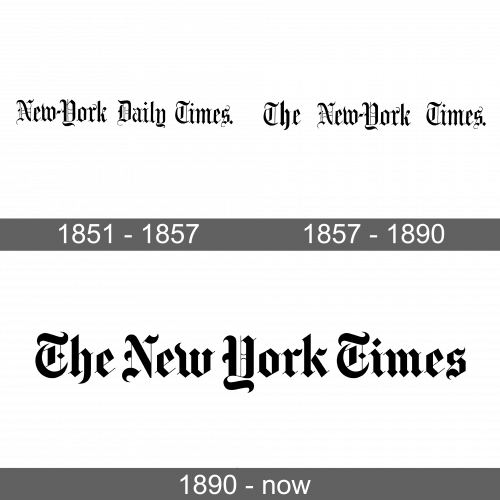
New York Times Logo
The New York Times is a reliable source of high-quality news, delivered every day. It is one of the world’s most popular and influential newspapers in the US, which survived many political and military upheavals and managed to maintain a high standard of quality of published materials despite everything. Respected by all, the New York Times rightfully deserves its status and respect. The phrase “All the News That’s Fit to Print” remains on every front page of the newspaper. This is a high standard that must be met, the legacy of Adolf Ochs.
Meaning and History
The New York Times was founded in 1851 by Colonel Raymond. He wanted to create a newspaper that would not spread stupid rumors and gossip, but be an adequate source of information for people. The once-respected New York Times was failing. Adolph Simon Ochs bought it in 1896 and did all he could to turn the failing publication into a national newspaper. By 1916, the newspaper’s circulation was close to 350 thousand. After he died in 1935, Adolf left a controlling stake to his son-in-law Arthur Hayes Sulzberger. Adolf’s grandson Arthur Ochs Sulzberger became the publisher of the New York Times in 1963. Today, the newspaper’s publisher is Adolf’s great-grandson Arthur Ochs Sulzberger Jr.
What is New York Times?
The New York Times is one of the most respected and monumental newspapers in the modern print world. Despite the powerful development of television and radio and online journalism, the newspaper continues to occupy an important place in the life of modern American society.
1851 – 1857
As they wanted their newspaper look something like The London Time, the founders went for a very elegant and sophisticated look for their logo. They chose a Gothic style font to print “New-York Daily Times.”. As seen from the later versions, the hyphen and the period at the end of the title were important parts of the name. The name was done in black, which further enhanced its classic and timeless look. It is interesting to note that the newspaper was published in black and white for much longer than any other newspaper.
1857 – 1890
As the newspaper was now published under a different title, the inscription was changed to “The New-York Times.”. The hyphen and the period were still preserved in this version. It appeared that there was more spacing between the words, which might be explained by the fact that the designers wanted to preserve the same length of the whole inscription as in the original. The fact that the font was not changed even a bit made the logo look almost identical to the first one.
1890 – Today
The font the company used from the very beginning was preserved. However, it was bold, which removed some of the thinner, delicate lines present in the other two logo versions. At the same time, the clean lines and all the details that are neatly drawn create a very cohesive look. The lettering was undoubtedly done by a perfectionist. The fact that the company removed the hyphen along with the period in the end not only made some of the subscribers not happy but also contributed to a more balanced look as the spacing between the words was now even and smaller.
Font and Color
The same Old English font has been used in all the versions of the newspaper logo. Until 1890, the letters looked more elegant as the later version was made bold and the lettering lost some of the beautiful, thinner strokes. The color was also preserved throughout the years. It was a classic, sophisticated black.


