Blogger Logo
Blogger is a free web service for creating and managing blogs. Launched by Pyra Labs in 1999, it was later acquired by Google in 2003. It allows users to design and publish their blogs with customizable templates. Blogger offers a simple interface, making it ideal for beginners. Users can post text, photos, and videos, and integrate with Google services like AdSense for monetization. It supports multiple accounts and offers privacy options. Despite newer platforms, Blogger remains popular for its ease of use and Google integration.
Meaning and history
Blogger, initiated by Pyra Labs, a brainchild of Evan Williams and Meg Hourihan, made its debut in 1999, marking a pivotal shift in digital storytelling. This platform revolutionized the way individuals shared narratives online, simplifying the process of blog creation and fostering a new era of personal and professional web expression. Its intuitive design allowed users, regardless of their technical savvy, to effortlessly broadcast their thoughts and experiences to a global audience, contributing to the surge of user-generated content online.
This platform swiftly captured the attention of internet users, becoming a cornerstone in the burgeoning blogosphere. It stood out with its straightforward post editor, customizable options, and the ability to craft a distinct online identity without needing coding expertise. Its significance skyrocketed in 2003 with its acquisition by Google, highlighting the escalating value of blogging in the digital realm.
Under the auspices of Google, Blogger received significant upgrades. It seamlessly merged with various Google services, notably AdSense, empowering bloggers to monetize their content. Google’s robust infrastructure also enhanced the platform’s reliability and performance, addressing earlier technical limitations.
Throughout its journey, Blogger has maintained a strong following, particularly among those valuing an uncomplicated, economical route to blogging. Its influence on digital communication is undeniable, setting the stage for contemporary blogging dynamics and inspiring subsequent blogging platforms. The advent of social media and diverse blogging tools brought new competitors, but Blogger retained its appeal due to its straightforward nature, dependability, and synergy with Google’s ecosystem.
Blogger remains an influential player in online content creation, particularly for those who appreciate its simplicity and Google’s support. It embodies the transformation of digital dialogue and the widespread accessibility of content creation on the web.
What is Blogger?
Blogger, a Google-owned web service, offers a platform for creating and managing personal or professional blogs with ease. Renowned for its user-friendly interface, it allows individuals to share their stories, insights, and creative content with the world through customizable blog pages, integrating seamlessly with other Google services.
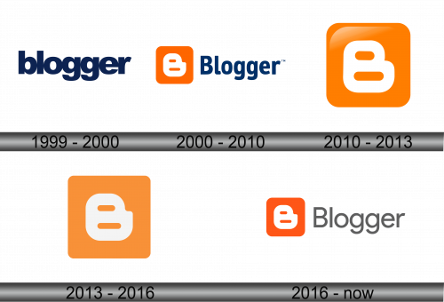
1999 – 2000
The logo is a minimalist and modernistic design, typified by a bold, sans-serif typeface. Its letters are lowercase, presenting an approachable and user-friendly image, characteristic of the brand’s philosophy. The color is a deep, uniform navy blue, exuding a professional yet inviting vibe. There is a subtle but noticeable roundness to the lettering, softening the overall look and adding a touch of friendliness. The logo’s simplicity makes it versatile, ensuring easy recognition and memorability, a testament to efficient branding in the digital space. Each character stands clear and unadorned, resonating with the platform’s straightforward and clean interface for content creation.
2000 – 2010
The logo evolution introduces a vibrant contrast with an orange square featuring a stylized white ‘B’, symbolizing the blogging platform’s essence. Adjacent to the icon, the word ‘Blogger’ is spelled out in a deeper shade of blue compared to the previous design, enhancing visual depth. The ‘B’ in the icon cleverly mirrors the ‘B’ of the text, creating a visual echo that reinforces brand recognition. This design leap reflects a more contemporary, web-centric branding approach, embracing both color and form to stand out in the digital landscape.
2010 – 2013
Zooming into a singular element, this iteration of the logo magnifies the ‘B’ icon, now standing alone against a vibrant orange backdrop. The stark white ‘B’, distinct and bold, fills the space, capturing immediate attention with its clean, rounded lines. The absence of text in this design places emphasis on visual identity, banking on the icon’s recognizability to represent the brand. In this iteration of the logo, the once crisp edges of the ‘B’ and its encompassing square are now softened, exuding a friendlier, more approachable feel. The color palette remains consistent with the previous vibrant orange, but the overall look is more subdued due to the introduction of gradient shading, adding a sense of depth and dimensionality. This subtle gradient creates a visual effect of light falling across the icon, suggesting a dynamic, evolving platform. The whitespace within the ‘B’ appears expanded, which enhances legibility and reinforces the focus on the central element. This design choice reflects a trend towards sleek, modern aesthetics in digital branding, focusing on simplicity and recognition over intricate detail.
2013 – 2016
The updated logo shifts to a flat design, embracing a modern trend in graphic aesthetics. It discards the gradient, opting for a uniform, solid orange that gives the logo a bold and contemporary look. The ‘B’ now possesses an even clearer presence, with its white hue standing starkly against the monochromatic background. This cleaner approach eliminates visual distraction, allowing the emblem to assert itself with renewed clarity in digital spaces. The design’s move to flat color reflects a digital industry gravitating towards simplicity and web-friendly graphics, emphasizing functionality and recognizability in a multitude of display contexts.
2016 – Today
The logo reintroduces the brand name with a fresh aesthetic, pairing the iconic ‘B’ emblem with the word ‘Blogger’. The ‘B’ retains its solid orange color, signifying energy and creativity, while the typeface of the brand name adopts a sleek, gray color that conveys modernity and sophistication. The font’s clean lines and open curves suggest accessibility and ease of use, core values of the Blogger platform. This design harmonizes the vibrant icon with a more mature and minimalist wordmark, creating a balance between familiarity and evolution. The gray color choice for the text offers a neutral complement to the orange, reflecting the platform’s versatile nature.

