BNP Paribas Logo
BNP Paribas stands out as a titan in the worldwide banking arena, offering a broad spectrum of financial offerings. Its operations span key global regions, with a strong focus on personal banking services, enterprise and investment strategies, as well as wealth management. The ownership structure is largely dominated by institutional stakeholders, underscoring its formidable footprint across continents. BNP Paribas has carved a niche for itself with a steadfast dedication to eco-conscious financial solutions, merging fiscal success with principled operations. This unique blend propels its worldwide clout and pioneering spirit within the fiscal domain.
Meaning and history
BNP Paribas, an eminent global banking entity, boasts a history marked by strategic alliances and expansive growth. Its origin lies in the fusion of two French banking giants: Banque Nationale de Paris and Paribas.
The formation of BNP in 1966 was a result of merging Banque Nationale pour le Commerce et l’Industrie and Comptoir National d’Escompte de Paris. This merger birthed a formidable banking force within France, which then extended its influence beyond national borders, adapting to the evolving global financial landscape.
Paribas, established in 1872 as Banque de Paris et des Pays-Bas, carved its niche in investment banking and trade finance. With its deep expertise in industrial and financial sectors, Paribas became an influential figure in the European banking arena.
The year 2000 marked a pivotal chapter in the history of these institutions when BNP and Paribas merged to form BNP Paribas. This merger was not just a significant event in European banking but also a landmark in global finance, creating one of the largest banking groups in the world. This newly formed entity merged BNP’s extensive retail banking network with Paribas’s prowess in corporate and investment banking.
Following the merger, BNP Paribas pursued a path of strategic and diversified growth, solidifying its presence in Europe and extending its reach to North America and Asia. Embracing the digital revolution, the bank invested heavily in technological advancements to enhance client services and operational efficiency.
The ownership structure of BNP Paribas has primarily been institutional. While the French government initially held a significant share, its gradual divestment opened doors for global institutional investors and individual shareholders to play a more prominent role.
BNP Paribas has navigated through various economic challenges, including global financial crises and shifts in regulatory landscapes. Its strategic focus on innovation and commitment to sustainable financial practices have been pivotal in its ongoing success and adaptability in the ever-changing world of finance.
BNP Paribas is a symbol of the transformative nature of the banking sector, blending traditional financial services with contemporary innovations in finance.
What is BNP Paribas?
As a titan of the banking world, BNP Paribas offers a vast array of financial solutions, encompassing everything from personal banking to corporate finance and wealth stewardship. Its footprint stretches from the cobblestones of Europe to the bustling cities of North America and the dynamic markets of Asia, symbolizing the convergence of age-old banking tenets with cutting-edge fiscal ingenuity. Attuned to the diverse demands of a dynamic global marketplace, BNP Paribas stands as a beacon of progress, bridging the gap between established financial practices and the frontier of economic innovation.
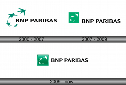
2000 – 2007
The logo of BNP Paribas is characterized by its simplicity and modernity. It features a series of four green stars arcing over the bold, capitalized letters “BNP PARIBAS” in black font. The stars appear to orbit the text, suggesting dynamism and global reach. The green color symbolizes growth, sustainability, and commitment to environmental responsibility. This emblem stands as a visual representation of the bank’s forward-thinking ethos and its role in the global financial landscape. Each star, with its five points, may also subtly hint at excellence and quality in service, resonating with the bank’s aspirations to lead and innovate in the banking sector.
2007 – 2009
The BNP Paribas logo presents a bold, contemporary design. It consists of a green rectangle framing four white stars, conveying a sense of movement and transformation. Next to this emblem, the name “BNP PARIBAS” is written in a black, sans-serif typeface that communicates solidity and professionalism.
Comparing this to the previous version, the green now serves as a background color rather than the color of the stars, which have turned white. This inversion introduces a striking contrast, enhancing visibility and recall. Additionally, the stars are positioned within a defined green rectangle, emphasizing structure and the concept of a window to global opportunities. The typographic choice remains consistent, maintaining the corporate identity, but the green square adds a new dimension, reflecting the bank’s growth and its focus on sustainable, green finance. This evolution in design speaks to the bank’s adaptive and innovative approach in the financial world.
2009 – Today
The BNP Paribas logo showcases a green rectangular backdrop with a quartet of white stars cascading diagonally, conveying progress and energy. The company name, “BNP PARIBAS,” is displayed in a stark black typeface, implying a modern and assertive brand identity.
Compared to its predecessor, this iteration introduces a softer green shade, offering a fresher and more vibrant appeal. The stars now possess a dynamic placement, suggesting a sense of momentum and upward movement, reflecting the bank’s aspiration for continual growth and innovation. This design subtly shifts from the static to the dynamic, from the traditional to the contemporary, symbolizing the bank’s agility and responsiveness to the changing tides of the global financial scene. The typographic styling remains consistent, maintaining brand recognition, yet the overall feel of the logo is more fluid, emphasizing the bank’s progressive ethos in a fast-paced world.


