Car Brands That Start With T
The allure of automotive logos transcends mere branding. These symbols are not just emblems of identity but encapsulate the essence, legacy, and aspirations of the brands they represent. This is particularly evident in logos of car manufacturers whose names begin with the letter “T.” From the iconic, minimalist elegance of Tesla’s emblem to the dynamic boldness of Toyota’s interlocking ellipses, each logo in this category tells a unique story.
Consider the historical depth of Tatra, one of the oldest vehicle manufacturers, with a logo that exemplifies modernity yet nods to a rich heritage. Or take Troller, a Brazilian manufacturer known for rugged off-road vehicles, whose logo conveys robustness and adventure. Then there’s TVR, the British sports car icon, whose logo reflects speed and agility, resonating with its high-performance vehicles.
These logos are more than just marketing tools; they are a fusion of art, design, and corporate identity. They connect on an emotional level with consumers, evoking feelings of nostalgia, aspiration, or affiliation. In this exploration, we delve into the stories behind these logos, unraveling the layers of history, design philosophy, and brand values that they embody. The letter “T” opens up a world of automotive excellence and innovation, each brand leaving an indelible mark on the industry through its distinctive logo.
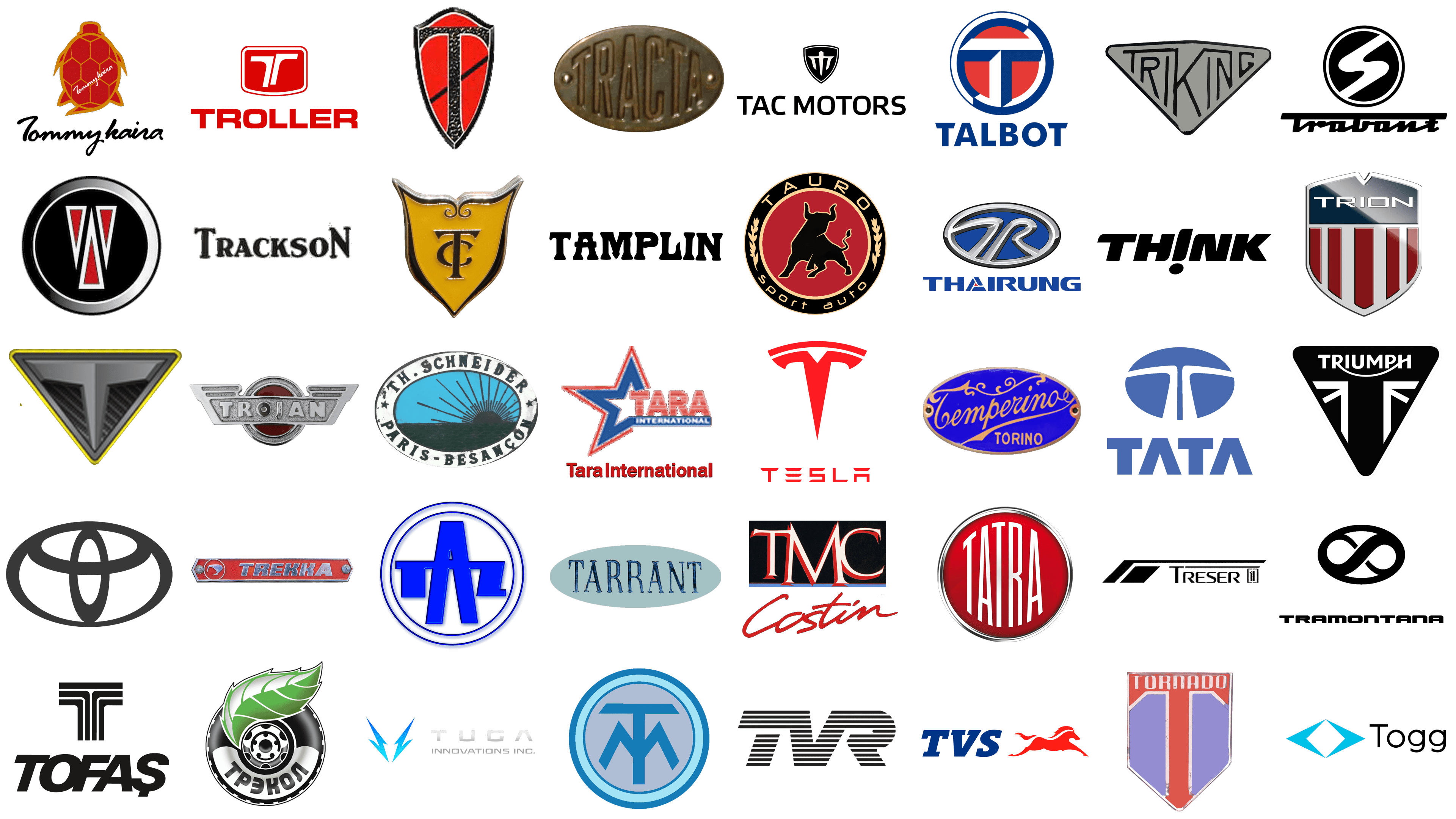
Talbot
![]()
Talbot, an automobile brand with a storied history, is celebrated for its diverse range of cars, from luxurious to sporty models, marking its presence in Europe and the UK. Its logo, a symbol of patriotism and heritage, features a circular design with a striking red, white, and blue palette. Dominating the center is a bold ‘T’, surrounded by a white ring, further encircled by a deeper blue, creating a layered effect that enhances its visual depth. Below this emblem, the word ‘TALBOT’ is inscribed in a clean, uppercase font, offering a stark contrast to the logo’s vivid hues, embodying the marque’s elegance and boldness.
Tamplin
![]()
Tamplin, a historic British brand known for its unique lightweight cyclecars, epitomizes early 20th-century innovation in affordable transportation. Its logo is a testament to its rugged and utilitarian essence, featuring the brand name in a bold, black, stencil-like font. This industrial, hand-stamped style of lettering, set against a stark background, conveys a sense of strength and mechanical integrity. The spaced-out letters of ‘TAMPLIN’ ensure striking visibility, reflecting the brand’s commitment to practicality and its mechanical roots.
Tara International
![]()
Tara International, a contemporary player in the automotive industry, emphasizes affordable and practical vehicle production for a broad market. Its logo, a dynamic red star symbolizing excellence and forward momentum, is enhanced with horizontal lines, suggesting movement. Below this emblem, ‘Tara’ is written in a bold, red font, asserting its identity, while ‘International’ follows in a smaller, complementary blue, mirroring the star’s color. This design, embodying a patriotic color scheme, illustrates the brand’s global aspirations and commitment to impactful, accessible transportation.
Tarrant Automobile
![]()
Tarrant Automobile, a trailblazer in Australia’s automotive industry, is celebrated for creating the nation’s first home-grown car. Its logo encapsulates this pioneering legacy, with ‘TARRANT’ rendered in a robust serif font that mimics the textures of brushed metal or stone, symbolizing resilience and timelessness. This is set against an elliptical background of soft pastel blue, offering a striking contrast to the typeface’s ruggedness. The oval shape adds a touch of classic elegance, reminiscent of the early days of automotive design where Tarrant established its foothold.
Tata Motors
![]()
Tata Motors, a prominent Indian multinational automotive manufacturer, ranks among the world’s largest vehicle producers, offering a diverse range of vehicles. Its logo features a sleek, stylized ‘T’ enclosed within a blue circle, evocative of a steering wheel and symbolizing the brand’s global reach. The design is modern and sharp, with the ‘T’ dividing the circle into symmetrical segments, representing precision and harmony. Below this, the name ‘TATA’ appears in a bold, sans-serif font, exuding a sense of strength and reliability that aligns with the company’s esteemed reputation.
Tatra
![]()
Tatra, one of the oldest vehicle manufacturers globally, hailing from the Czech Republic, is distinguished for its innovative air-cooled engines and unique rear-engine designs. The Tatra logo boasts a simple yet striking circular emblem, displaying ‘TATRA’ in white, bold letters set against a vibrant red background. The arrangement of the letters mimics a vehicle’s front grill, implying movement and a formidable road presence. Its minimalist design, marked by a sharp color contrast and geometric formation, mirrors the brand’s commitment to functional and aesthetically appealing design in their range of trucks and heavy vehicles.
Tauro Sport Auto
![]()
Tauro Sport Auto, a Spanish marque celebrated for handcrafted sports cars like the Tauro V8, blends classic design with contemporary performance. Its logo features a potent black bull mid-charge, set within a golden laurel wreath on a deep red backdrop, all encased in a bold black border. ‘TAURO sport auto’ is gracefully written in golden capitals along the border’s lower curve. The bull embodies strength and ferocity, echoing the brand’s powerful vehicles, while the laurel wreath harks back to classical victory, symbolizing the brand’s triumph in automotive excellence.
Tecnologia Automotiva Catarinense (TAC Motors)
![]()
At the heart of Brazil’s automotive innovation, Tecnologia Automotiva Catarinense, also known as TAC Motors, combines rugged functionality with contemporary design. The logo features a commanding shield emblem, within which a stylized ‘T’ stretches forward like a road vanishing into the distance, flanked by angular wings suggestive of agility and velocity. The logo’s monochromatic color scheme imparts a refined, modern aesthetic. This shield motif, a traditional symbol of protection, aptly reflects the durability and resilience of TAC Motors’ vehicles. Beneath this emblem, the brand’s name ‘TAC MOTORS’ is boldly set in a sans-serif font, projecting the company’s image as reliable and robust, in line with their range of formidable automotive offerings.
Temperino
![]()
Temperino, hailing from the rich tradition of Italian precision engineering and later venturing into motorcycles and automobiles, is a marque synonymous with innovation and exquisite craftsmanship. The logo radiates opulence and heritage, set against a backdrop of royal blue that speaks to the brand’s depth and reliability. The brand name ‘Temperino’ is elegantly scripted in golden cursive, a tribute to the timeless artistry of Italian design, while ‘TORINO’, signifying the company’s roots in Turin, is displayed in a complementary golden, sans-serif typeface. This luxurious emblem is a testament to Temperino’s enduring commitment to sophistication and excellence in the automotive world.
Tesla
![]()
Tesla stands as a vanguard in the realm of electric vehicles and clean energy solutions under the leadership of CEO Elon Musk. Known for revolutionizing the automotive landscape with its electric cars and cutting-edge technologies, Tesla’s logo encapsulates its pioneering spirit. The design is minimal yet impactful, centered around a stylized ‘T’ that is emblematic of an electric motor’s cross-section, highlighting the company’s dedication to electric vehicle innovation. The ‘TESLA’ brand name, rendered in an elegant red, uppercase font above the symbol, conveys a sense of sleek modernity and progressive vision. The red color choice is vibrant and energetic, resonating with Tesla’s ambitious mission to spearhead the global shift towards sustainable energy.
Th Schneider
![]()
Th Schneider, a prestigious early 20th-century French automobile manufacturer, was celebrated for its range of quality sports cars and luxury sedans. The logo features a serene landscape within an oval frame, depicting a sun rising over the horizon, illuminating the sky. ‘Th. Schneider’ is elegantly curved above this pastoral scene, with ‘Paris-Besançon’ below, honoring the brand’s roots in these French locales. The classical typography and picturesque center of the logo evoke a sense of craftsmanship and the dawn of automotive ingenuity.
Thai Rung
![]()
Thai Rung, the sole Thai-owned automobile manufacturer, is distinguished for modifying vehicles and producing original models, significantly impacting Thailand’s automotive industry. The emblem showcases a stylized ‘TR’ monogram within a silver and blue oval, reflecting unity and precision through the interlocking letters. The metallic silver and bold blue hues symbolize modernity and technological advancement. Above this emblem, the brand name ‘THAI RUNG’ is prominently displayed, asserting the company’s strong stance in the automotive sector.
Think Global
![]()
Think Global, a trailblazer in Norwegian electric vehicle manufacturing, is epitomized by its Think City car and a logo that boldly represents its mission. The logo’s design is ingeniously straightforward yet impactful: the word ‘TH!NK’ is displayed in stark, black, sans-serif letters, with a distinctive twist on the ‘i’ – inverted, its dot resting at the bottom. This creative inversion is more than a design choice; it symbolizes the brand’s commitment to overturning conventional automotive concepts, heralding a new era of eco-conscious, electric mobility. The inversion of ‘i’ is a metaphor for Think Global’s approach to innovation – challenging the status quo, rethinking urban transport, and emphasizing environmental stewardship. This logo, in its simplicity and visual wit, effectively captures the essence of the company’s dedication to sustainable, smart, and forward-thinking urban transportation solutions.
TMC Costin
![]()
TMC Costin, renowned for its Irish sports cars known for their lightweight, aerodynamic build, presents a logo that encapsulates its unique blend of elegance and performance. At its heart is the name ‘Costin’, rendered in a fluid, bold red script that conveys a sense of motion and speed. This is beautifully juxtaposed against the ‘TMC’ initials, set in a solid serif font against a deep black background, creating a striking visual contrast. This contrast not only grabs attention but also represents the fusion of traditional craftsmanship with modern dynamism. The red hue is a visual echo of the passion, energy, and performance prowess that define TMC Costin’s vehicles. This logo is a delicate balance of fonts and color, symbolizing the brand’s dedication to crafting sports cars that blend aesthetic beauty with high-speed performance, a true representation of style meeting speed.
Tofaş
![]()
Tofaş, a major force in the Turkish automobile industry and an integral producer of Fiat models, boasts a logo that reflects its contemporary ethos and innovative spirit. The logo features ‘TOFAŞ’ in a bold, black, modern typeface, crowned by a geometric emblem. This emblem skillfully uses negative space to form an abstract ‘T’ within a shield-like shape, divided into four distinct vertical segments. The emblem’s design is a masterclass in minimalist elegance, utilizing negative space not just as a design element but as a symbol of Tofaş’s innovative approach. This logo is a visual representation of Tofaş’s commitment to blending modern design with a pioneering approach to automobile manufacturing. It stands as a testament to the brand’s role in shaping Turkey’s automotive industry, signifying progress, modernity, and an unyielding pursuit of automotive excellence.
Togg
![]()
Togg, as a pioneering force in Turkey’s electric vehicle sector, showcases a logo that is a beacon of modernity and sustainable innovation. The emblem, a geometric marvel resembling a diamond, shines in a captivating shade of turquoise, a color that evokes thoughts of cutting-edge technology and a vibrant future. This emblem, with its crisp lines and polygonal form, is an ode to Togg’s commitment to precision engineering and forward-thinking design. Accompanied by the brand name in a sleek, sans-serif typeface, the logo embodies a vision of progress, where technology harmoniously coexists with environmental consciousness. The turquoise, a hue that sparks creativity and energy, encapsulates Togg’s ambition to drive Turkey into a new era of automotive excellence, one that champions smart, eco-friendly solutions in the world of electric vehicles. This logo stands not just as a brand symbol but as a testament to Togg’s role in sculpting a sustainable, technologically advanced future in the automotive landscape.
Tommykaira
![]()
Tommykaira, a revered name in the Japanese automotive world, is celebrated for its high-performance modifications and the iconic Tommykaira ZZ sports car. Its logo is a vibrant tapestry of heritage and speed, featuring a stylized turtle in a deep, passionate red. This turtle, an emblem of endurance and longevity, reflects the enduring quality and resilient nature of Tommykaira’s creations. Accompanying this symbol is the brand’s name in a fluid, racing-inspired script, conjuring images of velocity and agility. This combination of the turtle, symbolizing steadfastness and resilience, with the dynamic script, resonating with speed and performance, creates a visual narrative of Tommykaira’s philosophy: a fusion of enduring quality and exhilarating automotive experiences. The logo, in its simplicity and bold color choice, captures the essence of Tommykaira’s commitment to crafting vehicles that are not just machines, but embodiments of power, longevity, and the thrill of the open road.
Tornado
![]()
Tornado, a distinguished British sports car manufacturer, made its mark in the mid-20th century with vehicles like the Tornado Talisman, known for their stylish design and engineering excellence. The Tornado logo is a sleek, sharp-edged shield, bisected into blue and red halves, with the word ‘TORNADO’ boldly inscribed across the top in an uppercase font. The logo’s color contrast and angular design evoke a sense of dynamic movement and strength, resonating with the brand’s name and its legacy of creating high-speed, powerful cars.
Toyota
![]()
Toyota, a global leader in the automotive industry from Japan, is celebrated for its innovative production methods and a wide array of reliable, efficient, and technologically advanced vehicles. The Toyota logo is composed of three interlocking ellipses, symbolizing the unity between the hearts of Toyota’s customers and the company’s products. The negative space in the background hints at technological progression and limitless possibilities. The emblem’s symmetrical and interconnected design stands as a testament to Toyota’s commitment to global expansion and customer satisfaction.
Trabant
![]()
The Trabant, an emblematic figure of East Germany’s automotive scene, represented the ethos of the Eastern Bloc with its unique design, notable two-stroke engine, and innovative Duroplast body. The logo of the Trabant captures this distinctiveness in a design that is at once simple and profoundly meaningful. It features the brand name in a stylized, italicized script that conveys a sense of dynamism and agility, enclosed within a circular frame that suggests continuity and wholeness. This circle is further enhanced by a striking ‘S’ shape, adding an element of fluidity and movement, symbolic of the brand’s heritage in producing compact, efficient vehicles. The Trabant logo, in its focus on motion and forward progression, mirrors the car’s historical significance and its emblematic role in representing an era of automotive history defined by practicality and accessibility in the face of limited resources.
Trackson Company
![]()
The Trackson Company, a renowned entity in the construction equipment sector, was acknowledged for its robust tractors and pioneering track-based machinery, contributing to a transformative era in early 20th-century construction technology. The logo of Trackson encapsulates this rich heritage with a classic, timeless design. It showcases the company’s name ‘Trackson’ in a traditional serif font, evoking a feeling of reliability, strength, and an enduring legacy. The simplicity of the design, free from superfluous decorations, reflects the brand’s emphasis on utility and rugged durability. This logo serves as a visual testament to the company’s commitment to producing sturdy, innovative construction equipment, resonating with Trackson’s historical role as a stalwart in the realm of heavy machinery and construction innovation.
Tramontana
![]()
Tramontana, an esteemed Spanish automaker, is revered for its bespoke, high-performance sports cars, combining craftsmanship with technological prowess. The logo of Tramontana is a powerful representation of their commitment to the forefront of automotive design and customization. Dominated by an elegant infinity symbol, the logo encapsulates the brand’s philosophy of endless innovation and boundless possibilities in car design and performance. Beneath this, the name ‘Tramontana’ is rendered in a modern, sans-serif typeface, emphasizing the brand’s dedication to contemporary aesthetics and cutting-edge manufacturing techniques. This logo, with its minimalist yet impactful design, embodies the essence of Tramontana’s ethos: creating unique, meticulously crafted vehicles that push the boundaries of automotive engineering and design excellence.
Trekka
![]()
The Trekka, New Zealand’s only indigenous car produced in the 1960s, is celebrated for its simplicity and adaptability to the nation’s challenging terrain. Its logo is a vintage rectangular badge, featuring a stylized emblem that acknowledges the Trekka’s unique status in automotive history. ‘Trekka’ is written in a retro-style font that conveys ruggedness and practicality, matching the vehicle’s design ethos. The logo’s red background color embodies durability and energy, mirroring the qualities the Trekka brand is known for.
TREKOL
![]()
TREKOL, recognized for its amphibious all-terrain vehicles, presents a logo that captures the essence of its unique product range. The design features a green leaf overlapping a black tire, symbolizing a blend of robust off-road capabilities with environmental consciousness. The brand name ‘TREKOL’ is prominently displayed in bold capitals at the bottom of the tire, highlighting the company’s dynamic and adventurous spirit, in line with its reputation for manufacturing vehicles suited to the most challenging landscapes.
Treser
![]()
Treser, established by former Audi engineer Walter Treser, is known for its innovative car design and enhancements, especially in customizing Audi models. The Treser logo showcases a sleek, modern aesthetic, with a prominent diagonal line imparting a dynamic sense of movement. ‘Treser’ is spelled out in a sharp, uppercase font, complemented by a single vertical line on the left, adding a touch of sophistication. This minimalist design echoes the brand’s commitment to high-quality, forward-thinking automotive design.
Trident Cars
![]()
Trident Cars, a prestigious British sports car manufacturer, is renowned for its meticulously handcrafted, high-octane vehicles. At the heart of its brand identity is an iconic logo: a compelling black and white circle, with a masterfully stylized ‘W’ that cleverly forms the shape of a trident, paying homage to the company’s name. Within the ‘W’, fiery red accents blaze, injecting the logo with a sense of boldness and vivacity, echoing the spirited and robust nature of Trident Cars. The logo’s design is a fusion of sleek modernity and timeless elegance, encapsulating the luxuriousness and unique flair of Trident Cars’ sports vehicles. It’s a symbol of automotive excellence, representing a legacy of speed, power, and precision craftsmanship.
Triking
![]()
Triking, renowned for its innovative three-wheeled vehicles that marry the nimbleness of motorcycles with the stability of cars, boasts a logo that perfectly captures its unique market position. The logo is dominated by a bold triangular emblem, symbolizing strength and direction, within which the name ‘TRIKING’ is inscribed in robust, angular letters that resonate with the triangle’s sharp contours. This font choice mirrors the engineering precision and movement inherent in Triking’s design philosophy. The emblem’s dynamic angles and decisive lines embody the distinctive driving experience offered by Triking’s three-wheeled sports vehicles. This logo not only represents a brand but also an adventurous spirit, appealing to those who seek a unique blend of speed, comfort, and innovation.
Trion SuperCars
![]()
Trion SuperCars, an American automotive powerhouse, has carved its niche in the realm of high-performance luxury vehicles, epitomized by the famed Nemesis supercar. At the forefront of its brand identity is a striking logo featuring a shield, an emblematic representation of strength and guardianship, split into a compelling contrast of silver and crimson. Atop this shield, the name ‘TRION’ is emblazoned in a sleek, modern, sans-serif typeface, exuding contemporary elegance. This shield motif is more than just a logo; it’s a testament to the brand’s dedication to safety, resilience, and the formidable nature of its high-speed vehicles. The Trion logo encapsulates the essence of the brand – a fusion of cutting-edge technology, luxurious craftsmanship, and unmatched performance, setting a new benchmark in the supercar industry.
Triumph
![]()
Triumph, the renowned British motorcycle manufacturer with over a century of legacy, is known for its high-performance, stylish, and excellently engineered motorcycles. Its logo consists of a triangular emblem on a black background, embodying stability and strength. The brand name ‘TRIUMPH’ is written in white capital letters at the top. The central ‘T’ is adorned with white wings, adding a sense of elegance and aspiration. This design reflects the brand’s focus on victory and success, resonating with its standing in the automotive and sports industry.
Trnava Automotive Factories
![]()
Trnava Automotive Factories (Trnavské automobilove závody) in Slovakia is recognized for its significant contribution to the automotive industry, particularly in collaboration with major international car manufacturers. The logo features the stylized letters ‘TAZ’ enclosed within a double-ringed circle. The primary blue color stands out against the white background, while the geometrically bold ‘A’ suggests modernity and precision. The concentric circles add a layer of depth and continuity, symbolizing the brand’s ongoing commitment to innovation and development in the automotive sector.
Troller
![]()
Troller, a Brazilian automobile manufacturer, is celebrated for its rugged and dependable off-road vehicles, especially the T4 model, beloved by off-roading aficionados for its durability and performance. The logo features a bold red shield-like figure, with a stylized white letter ‘T’ slicing through the center, creating a striking contrast. Below the emblem, the brand name ‘TROLLER’ is presented in a bold, capitalized red font, echoing the emblem’s color. This design communicates a sense of sturdiness and adventure, reflecting the brand’s identity in the automotive or outdoor industry.
Tuchek and Spigel Supercars
![]()
Tuchek and Spigel Supercars, known for their high-performance, luxury supercars, is committed to advanced engineering and exclusivity. The logo displays a triangular symbol with a sleek, metallic grey ‘T’ at the center, outlined in yellow, potentially representing caution or high performance. The ‘T’ is enhanced with horizontal lines, imparting a feeling of motion or speed. This design is indicative of a brand that values innovation and might be associated with the technology or automotive sector.”
Tucker Corporation
![]()
Tucker Corporation, famously associated with the 1948 Tucker Sedan, was an American automobile company known for its groundbreaking features. The logo depicted is a medieval shield-inspired emblem, showcasing a bold ‘T’ in a gothic style font on a red background. The shield’s border has a textured pattern resembling metalwork, adding a sense of nobility and tradition. This logo suggests resilience and strength, fitting for a brand in the automotive or security industry.
TUGA Innovations
![]()
TUGA Innovations, a progressive player in the automotive field, is dedicated to creating advanced electric vehicles and sustainable transportation options. Their logo features a light blue, stylized lightning bolt, split into two symmetrical sections. Alongside the emblem, the name ‘TUGA INNOVATIONS INC.’ is displayed in a contemporary sans serif font. The logo’s color gradient and lightning bolt motif symbolize innovation and energy, aptly reflecting a brand focused on technology, electricity, and forward-thinking products.
Turcat-Méry
![]()
Turcat-Méry, an erstwhile beacon of French automotive luxury, left an indelible mark with its technical ingenuity and opulent vehicles. The logo, a symphony of blue and gray hues, captures this legacy within a circular emblem. The ‘TM’ initials are crafted in a distinctive geometric style, reflecting the fusion of artistic elegance and engineering precision. Enclosed in a tranquil blue border, the logo evokes the serene confidence of a brand that was once at the pinnacle of automotive craftsmanship. This emblem, in its poised simplicity, whispers tales of a bygone era where Turcat-Méry reigned as a paragon of luxury, its vehicles a harmonious blend of style, sophistication, and groundbreaking technology.
TVR
![]()
TVR, a name synonymous with British sports car excellence, presents a logo that is a visual echo of its design ethos. The ‘TVR’ inscription, bold and black, is ingeniously composed of horizontal lines that vary in length, creating a dynamic tapestry of speed and motion. This emblem captures the raw energy and exhilarating pace inherent in TVR’s vehicles. It’s as if the letters themselves are in a state of perpetual motion, mirroring the agility and vigor of the cars they represent. This logo is a testament to TVR’s philosophy of crafting vehicles that aren’t just machines, but animate embodiments of speed, thrill, and automotive artistry.
TVS Motor Company
![]()
TVS Motor Company, a titan in the Indian two-wheeler and three-wheeler market, boasts a logo that is a vibrant narrative of its brand ethos. The ‘TVS’ in bold blue is a declaration of reliability and innovation, while the accompanying red silhouette of a galloping horse is a powerful visual metaphor. This horse, captured in mid-gallop, is more than just a symbol of speed; it embodies the spirit of progress, the relentless pursuit of excellence, and the grace of power in motion. This emblem is a tribute to TVS’s journey — from producing humble mopeds to becoming a cornerstone in the Indian automotive landscape, continuously evolving, much like the spirited horse that symbolizes its drive and ambition.
Twombly
![]()
Twombly, an avant-garde player in the automotive sector, is celebrated for its unconventional approach to vehicle design, focusing on crafting distinct models laden with unique features. Its logo, a shield-shaped emblem, exudes elegance and sophistication. The interlocking ‘T’ and ‘C’ initials are set against a vibrant yellow backdrop, surrounded by a sleek silver border. This intertwining of letters is not just a display of artistic flair but also a metaphor for the brand’s commitment to integrating tradition with innovation. The decorative flourish at the top of the shield adds a touch of aristocratic grace, suggesting that Twombly may be entrenched in the luxury market. This emblem, with its classic design elements and bright, inviting color scheme, likely symbolizes a legacy of exclusivity, prestige, and a passion for bespoke automotive craftsmanship.
Tracta
![]()
Tracta, a trailblazer in the French automotive landscape, made its mark by pioneering front-wheel-drive technology and contributing significantly to early 20th-century automotive engineering. The brand’s logo is a testament to its historic roots: an elliptical, brass-like metal plate, where the name ‘TRACTA’ is embossed with raised lettering. The metal’s patina conveys a narrative of enduring tradition and industrial prowess. This logo, with its minimalist approach focusing solely on the brand name, communicates a philosophy of simplicity, functionality, and steadfast reliability. It’s a visual homage to the brand’s role as an innovator and a guardian of automotive heritage, reflecting its commitment to engineering excellence and the pioneering spirit of its era.
Trojan Limited
![]()
Trojan Limited, a key player in British automotive history from 1914 to 1965, earned its reputation by producing robust and cost-effective vehicles, like the iconic Trojan Utility Car. The brand’s logo encapsulates this legacy: the word ‘TROJAN’ is boldly set in metallic lettering, cradled within a winged motif reminiscent of classic automotive insignia. These wings, a symbol of speed and freedom, frame a central circular element with a striking red core, lending the logo a dynamic and eye-catching aesthetic. This design not only echoes the durability and resilience associated with the Trojan name but also aligns with the legendary and historical implications of its namesake. The logo, with its blend of metallic sheen and vibrant color, serves as a visual narrative of the brand’s storied past in the automotive industry, symbolizing its commitment to reliability, innovation, and accessible mobility.