Carlsberg Logo
Carlsberg is a Danish company producing the high-standard beer. It’s the second manufacturer of the beer in the world (After Anheuser-Busch InBev). The company’s brands include Russian best-selling beer Baltika, Danish Tuborg, and the beer Carlsberg itself, as well as many others.
Meaning and History
The brewery was founded in 1847 by the Danish entrepreneur J. C. Jacobsen. The name consists of two parts: the name of Jacobsen’s then-infant son, Carl, as well as the word bjerg (eventually changed to berg), which means ‘hill’. It is a reference to that the brewery was built on the hill over Copenhagen.
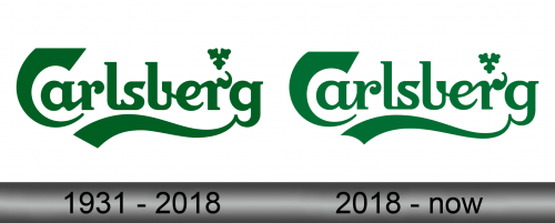
1931 – 2018
The current brand mark of the company takes a story from the year 1904, when it was drawn by Thorvald Bindesbol and suggested to the company leaders. His logo became official in 1931, when Carlsberg decided to remove its initial brand mark with the swastika on it.
So, the logo drawn by Thorvald Bindesbol depicts the green handwritten inscription, full of rounded letters and curious connections between them. There are many interesting features in the whole word, such as the small symbol above the inscription, which resembles the clover.
2018 – Today
In the year 2018, the same logo was a bit brightened, but the main structure remained unchanged.
Emblem and Symbol
The company also formerly used a swastika as part of their emblem (for no reason). In the 30s, they stopped doing it because it became quite unacceptable for political reasons to do it. So, the company had to introduce another mark that would be no less visible among the other companies’ brands.
