Budweiser Logo
Budweiser is the American lager brand, as well as the flagship brand of the Anheuser-Busch company – the biggest beer producer in America. Budweiser is also one of the oldest beer brands in this country, which is why it’s almost engrained into the American culture.
Meaning and History
![]()
Budweiser has been first sold in 1876. The people who founded Anheuser wanted to introduce Czech lagers into their assortment, and it’s partly why they called this beer ‘Budweiser’. It basically means ‘from Budweis’, and Budweis was a major beer-making city in Bohemia (now Czech Republic).
1876 – 1942
![]()
The beer was initially sold with these ‘labels’. Unlike the modern ones, these explained what you’d but in great detail. In practice, it was a piece of fancy paper with lots of words describing the product. The heading (and the largest part) was the ‘Budweiser Lager Bier’ written in cursive black letters.
There were also many more German phrases below, and they basically amount to how and where it was brewed.
1910 – 1945
![]()
The 1910 label was the same conceptually, except this one was colored (the first instance of them using the color red) and written in English. It was now a white space inside a red card. All the text was written in black over that white segment, while the red outer layer had the Anheuser symbolic above and the words ‘Genuine’ on each side.
1936 – 1947
![]()
Exuding a blend of tradition and modernity, this round-shaped logo elegantly displays the iconic Budweiser brand. In its heart, the name “Budweiser” stands proudly, written in a strikingly clear typeface. The winged emblem above it symbolizes limitless aspirations and the expansive journey of the brand. The overall white backdrop is interrupted gracefully by the crisp, contrasting contours. The central heraldic emblem, featuring a majestic eagle and the letter “A”, pays homage to Budweiser’s deep-rooted American lineage.
1945 – 1987, 2020 – Today
![]()
In 1945, the thing was remodeled, although the layout was very similar. They changed the text a bit and changed proportions to more vertical rather than horizontal.
1947 – 1948
![]()
Radiating in bold reds and vivid oranges, this rectangular logo captures attention instantly. “We Feature” prominently introduces the brand, exuding a sense of pride and prominence. Dominating the center is the unmistakable “Budweiser” inscription, showcasing its prominence. Below, “Draught Beer” emphasizes the beer’s crisp, freshly-poured essence. The crowning “A” at the pinnacle is a subtle nod to Budweiser’s regal stature in the beer kingdom. Its catchy slogan, “It Lives With Good Taste”, is a testament to the brand’s unwavering quality assurance.
1948 – 1952
![]()
Depicting a universally cherished moment, this circular logo captures two hands, detailed in an old-world artistic style, raising their Budweiser-filled glasses in a toast. The moment encapsulates joy, unity, and shared experiences. Encircling this scene is a brilliant red laurel, symbolizing honor, triumph, and the brand’s top-tier status. Front and center, the “Budweiser” inscription stands, flanked by the traditional acknowledgment of its origin, “Anheuser-Busch St. Louis, MO”, anchoring the brand in its storied past and enduring legacy.
1952 – 1955
![]()
In 1952, they introduced the first proper logo – the scale-like image with a deep blue outer line and the red innards. Inside, they had the brand’s name itself, followed by the now-iconic slogan of ‘King of Beers’ (it was used ever since 1910). These were then crowned above by a small Anheuser symbol of ‘A’ with an eagle in it.
Both the inscriptions and the Anheuser emblem were white.
1955 – 1957
![]()
We see a logo presenting the word “Budweiser” in vivid red typography, underlined by the phrase “King of Beers.” The design is framed within a sleek silver border and highlighted with a contemporary background featuring blue geometric motifs and multi-colored specks.
1957 – 1961
![]()
In 1957, they took the existing emblem and put it inside the black rectangular confines instead. The shapes inside were supplanted with a central bowtie-like red shape (the ‘Budweiser’ was in it) and several green and yellow (the colors of hop and beer) triangles above and below. Naturally, there was also a red Anheuser eagle in the blank space.
1961 – 1963
![]()
In 1961, they decided to get rid of the triangles and the Anheuser symbol. The bowtie was still there, but it was now surrounded by the vertical oval-like shapes of blue and brown. Naturally, they had to elongate the frame vertically to accommodate the new elements.
1963 – 1968
![]()
The dark frame persisted, but this time they narrowed it back down and filled it with just the word ‘Budweiser’. That being said, it was now comprised of differently-colored bright letters that were also skewed into different directions. In short, the new logo looked childish.
1968 – 1987
![]()
In 1968, they opted to just use the red bowtie with the white brand name inside it, just like before, except with weird shapes all around it.
1987 – 1999
![]()
Dominated by a striking red hue, this emblem centers around the bold blue “Budweiser” lettering. Surrounding the brand name are ornate elements, including a crown, hop foliage, and a heraldic shield. A blue ribbon pattern edges the logo, inscribed with details about the beer and its brewing heritage. The claim “WORLD’S LARGEST SELLING BEER” is emphasized at the bottom, trailed by the maker’s name, “Anheuser-Busch, Inc., St. Louis, Mo., U.S.A.”
1987 – 1994
![]()
In 1987, the designers decided to roll it away from the onlookers, which gave it a lot of volume and depth, as well as dark shadows beneath each letter and the red shape alike.
1994 – 1999
![]()
The 1994 saw the return to the normal perspective again. This time, they changed the writing. The name word became notably bigger and also tilted to the right just a bit. Also, below the main piece they put the words ‘Biere’ and ‘Beer’ in all red capital letters, separated by a dot.
The reason behind it was likely their desire to sell more beer in Canada, which is why they put the same word in French and English.
1996 – 1999
![]()
The 1996 logo was an experimental new logo that featured many red rectangles of various sizes overlapping one another, with the biggest one put right in the center. And that’s also where they put the name, although the new slogan of ‘Classic American Lager’ had to be squeezed in one of the bottom segments.
The top segments, however, accommodated the Anheuser-Busch eagle again; although this time they put one in the middle of a green circle (full of hops) and surrounded it by wheat ears.
The entire structure was also heavily outlined with deep blue.
1997 – 1999
![]()
The Budweiser logo prominently showcases a vivacious red bowtie shape, effortlessly capturing one’s attention. Emblazoned across this dynamic canvas is the iconic name “Budweiser,” written in a bold, all-cap white font. Every character is meticulously detailed with subtle shadows, granting a tactile depth to the design, as if the letters are gently rising from the background. The stark contrast of the pristine white against the fervent red symbolizes a perfect blend of purity and passion, reflecting the brand’s dedication to brewing excellence. The ® symbol, discreetly nestled to the bottom right, is a testament to the brand’s authentic heritage and global recognition. Through its clean and vibrant design, the logo embodies Budweiser’s commitment to tradition, while resonating with modern aesthetics, ensuring it remains timeless in the ever-evolving world of branding.
1999 – Today
![]()
Rendered in a vibrant shade of red, the name “Budweiser” is elegantly scripted across the canvas, embodying both sophistication and classic appeal. The flowing calligraphy, with its smooth transitions between letters, conveys a sense of heritage, suggesting a storied past and time-honored traditions. This design, in its simplicity, accentuates the brand’s long-standing reputation and commitment to quality. The presence of the registered trademark symbol subtly attests to the brand’s genuine legacy, ensuring its mark of authenticity.
1999 – 2010
![]()
Bearing a tapestry of rich details, this emblematic logo captures Budweiser’s grandeur and storied past. Set against a fiery red canvas, the design features heraldic elements like the majestic eagle and detailed motifs, each narrating tales of the brand’s American roots. The central medallion, showcasing the “A & Eagle” emblem, is a nod to the brewery’s foundational heritage. Beneath the brand’s moniker, the title “King of Beers” asserts its unmatched stature in the realm of brewing. Detailed illustrations of hops and grains, intertwined with the brand’s brewing tenets, offer a deep dive into Budweiser’s time-honored traditions and brewing artistry.
1999 – 2011
![]()
Several sharp changed happened here. They took the usual long-time logo, but skewed it to the right. They did the same with the letters inside, although they also took on a new cursive look, as well as grew in size (they now extend over the bowtie boundaries. The bowtie itself was given a new neon look with lots of stripes and shifting colors.
Lastly, the golden crown was added above the logo proper.
2011 – 2016
![]()
In 2011, they slightly removed the gradient, but added more volume instead. That resulted in the letters being turned form 2D white to 3D silver, while the bowtie received a new silvery frame, as if it’s a car badge.
2016 – Today
Since 2016, they mostly used the same logo as before, except without any volume, glint, shading or additional colors other than just red and white. It’s now the same logo, except plainer and without excessive elements.
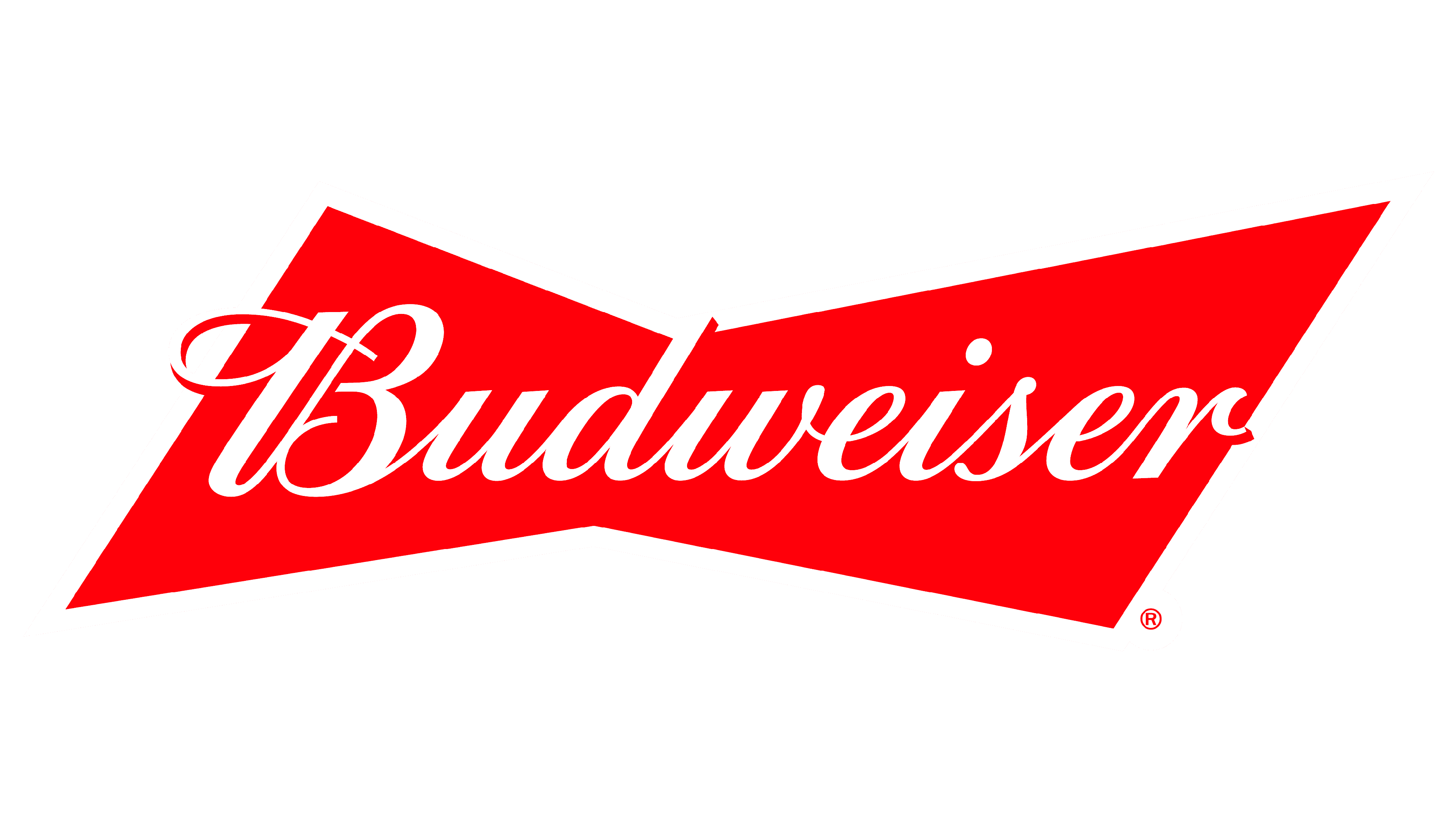
2017 – Today
![]()
The Budweiser logo displayed stands as a testament to the enduring power of branding and design. Bathed in a deep, captivating red hue, the logo sets a commanding tone that is both inviting and authoritative. Red, traditionally associated with fervor, intensity, and love, encapsulates the brand’s fiery spirit and its commitment to brewing excellence.
Centered on this rich canvas is the word “Budweiser” in a pristine white font, lending a stark contrast that is both visually pleasing and instantly memorable. The choice of white signifies purity, alluding to the brand’s dedication to producing beers of the highest quality. The font itself exudes a certain old-world charisma, a nod to the brand’s storied history and its journey from the past to the present.
Shaped in a distinctive bow-tie configuration, the logo design cleverly marries classic aesthetics with a dash of modern flair. It’s a reminder that while Budweiser respects its roots, it isn’t afraid to innovate and adapt. The registered trademark symbol, subtly positioned, underscores the brand’s authenticity and the protective guardianship of its cherished name. In sum, the Budweiser logo is a masterclass in design, seamlessly blending tradition with contemporaneity, and resonating with beer enthusiasts across generations.
Emblem and Symbol
There are many more variations of using these logos. Primarily, they vary heavily from bottle to bottle and from type to type. Some simply take the ordinary black brand name and put it onto the blank space in the middle of the can/bottle. Some subtypes, like Budweiser Budvar, have their distinct logos.


