Citibank Logo
Citibank, a subsidiary of Citigroup, stands as a global banking giant with roots tracing back to 1812 in New York City. Renowned for its extensive service portfolio, Citibank offers a range of financial products, from standard banking and credit services to asset management and securities brokerage. Operating in numerous countries, its vast network caters to millions worldwide. Over the decades, Citibank has evolved, embracing technological innovations to offer modern banking solutions while retaining its commitment to customer service and financial excellence. It remains a cornerstone in the international banking arena.
Meaning and history
Citibank’s story begins as the City Bank of New York, with its founding aimed at serving the city’s burgeoning financial sector. Over the next century, the bank witnessed the ebb and flow of American history, navigating financial crises, wars, and economic booms.
In the late 19th century, the bank underwent its first name change to National City Bank of New York, reflecting its growing stature. This period marked its initial international expansion, establishing branches in foreign territories like Buenos Aires and Shanghai, paving its path as a global financial entity.
The 20th century heralded significant transformation. In 1955, after mergers with First National Bank, it became The First National City Bank of New York. A mere decade later, to epitomize its global outreach and modernity, the bank embraced the name “Citibank”.
Innovation was a key theme for Citibank in the latter half of the 20th century. They pioneered the ATM, revolutionizing everyday banking, and introduced the concept of “24-hour banking.” Citibank was also among the first to venture into credit cards, launching the “Everything Card” in 1967, a precursor to today’s wide array of Citi cards.
By the 1980s, Citibank’s operations spanned the globe. However, it wasn’t immune to challenges. The bank grappled with Latin American debt crises and, in the 90s, faced significant real estate market pressures.
The early 21st century was another pivotal era. In 2002, under the umbrella of Citigroup, a conglomerate formed from a merger with Travelers Group in 1998, Citibank navigated the intricacies of a digital age, continuously adapting its services.
Yet, the 2008 financial crisis posed profound challenges. Like many financial institutions, Citibank required government intervention, receiving a substantial bailout. This period necessitated introspection and restructuring, with Citibank emerging more resilient.
Citibank represents a blend of rich history and modern innovation. As a subsidiary of Citigroup, it offers an extensive range of services to clients worldwide, standing testament to its adaptability, resilience, and commitment to financial excellence through the ages.
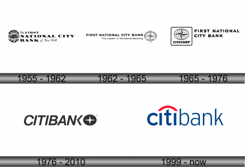
1955 – 1962
In 1955, a significant financial consolidation took place: The National City Bank of New York and First National Bank of New York united, birthing The First National City Bank of New York. This freshly minted institution unveiled a distinctive logo, partitioned into three sections. The design featured a mix of typefaces: a cursive style reminiscent of classic script adorned the words “The” and “of New York”, while the central phrase, “FIRST NATIONAL CITY BANK”, was set in a striking font characterized by slender serifs.
Adjacent to the text, on the emblem’s left side, a vivid illustration emerged. Two figures – a mariner and a woodsman – were seated by a spherical stone, accentuated by designs reminiscent of windmill sails and stout barrels. Perched atop the stone was a bird of prey, evoking a sense of wilderness. Further adding depth to the scene, a majestic vessel sailed across the backdrop, flanked by a dense woodland silhouette. The entire imagery was encased within an elliptical border, embellished at its zenith and base with a bounty of fruits, vegetables, and grains. Circling the artwork, the words “THE NATIONAL CITY BANK OF NEW YORK” were prominently displayed, while the bank’s foundational year, “EST. 1812,” lay subtly below the duo’s portrayal.
1962 – 1965
The financial institution’s complete designation was prominently displayed at the top, followed by the catchphrase, “The Vanguard in Global Banking”. To the right, creative minds introduced a revamped badge, shaping it like an elliptical coordinate system, comprising latitude and longitude lines. At its core, a contrasting black and white quad-directional emblem echoed a compass’s needle points, underscoring the bank’s global footprint and multifaceted operations. The phrase “FIRST NATIONAL CITY BANK NEW YORK”, omitting the “of”, was reiterated encircling this design, punctuated by twin pentagonal stars. An arrow traversed the ellipse, its tips jutting out both at the top and bottom, symbolizing dynamic movement and reach.
1965 – 1976
Creative experts opted for a refined approach, stripping away certain aspects and reimagining the logo’s layout. Positioned to the left was an elliptical design, intertwined with a coordinate mesh, crowned by a quad-directional emblem. Directly below, the name “CITICORP” made its mark. This segment of the design was neatly ensconced within a box featuring softened edges. Adjacent to this, on the right, the label “FIRST NATIONAL CITY BANK” was articulated over a span of two tiers, emphasizing clarity and a modern touch. This redesigned emblem showcased a harmonious blend of tradition and contemporary aesthetics, ensuring both recognition and a breath of fresh air.
1976 – 2010
The artistic team opted for a more streamlined design, eliminating certain features while reconfiguring the logo’s composition. To the left, an elliptical form, adorned with a coordinate matrix and a tetra-directional star, took prominence. Directly under this element, the inscription “CITICORP” found its space. This segment was elegantly encapsulated within a box bearing gentle, curved edges, marrying modernity with classic undertones. Adjacently positioned on the right, the descriptor “FIRST NATIONAL CITY BANK” was thoughtfully divided across two horizontal layers, enhancing readability and presenting a refreshed visual appeal to the brand’s legacy identity.


