CNN Logo
CNN is a major news outlet for American TV. For 40 years, it’s been amongst the most popular television channels in this country, and it’s even leaked to other countries – most notably, Canada. In essence, to Americans it’s very much what BBC is for the British.
Meaning and History
![]()
CNN first aired back in 1980 and was meant as a versatile news anchor as well as a generally informative channel for cable TV. The name directly derives from this fact – the acronym stands for ‘Cable News Network’, although now it’s also operating through satellites and even online broadcasts.
1980 – 1984
![]()
The initial logo design was a lot like the following styles. It was the acronym written in a single fluid and thick line painted black. In the middle of this line was a thin white inlay. This is supposedly meant to symbolize cabling – a thick insulator with a wire inside. However, they later changed the coloring, so the logo distanced from this concept.
1984 – 2014
![]()
They basically just repainted the logo to pale red to resemble a neon emblem. You can still discern something like the cabling in this image, although the concept of solely relying on cables was falling out of fashion very rapidly at that point.
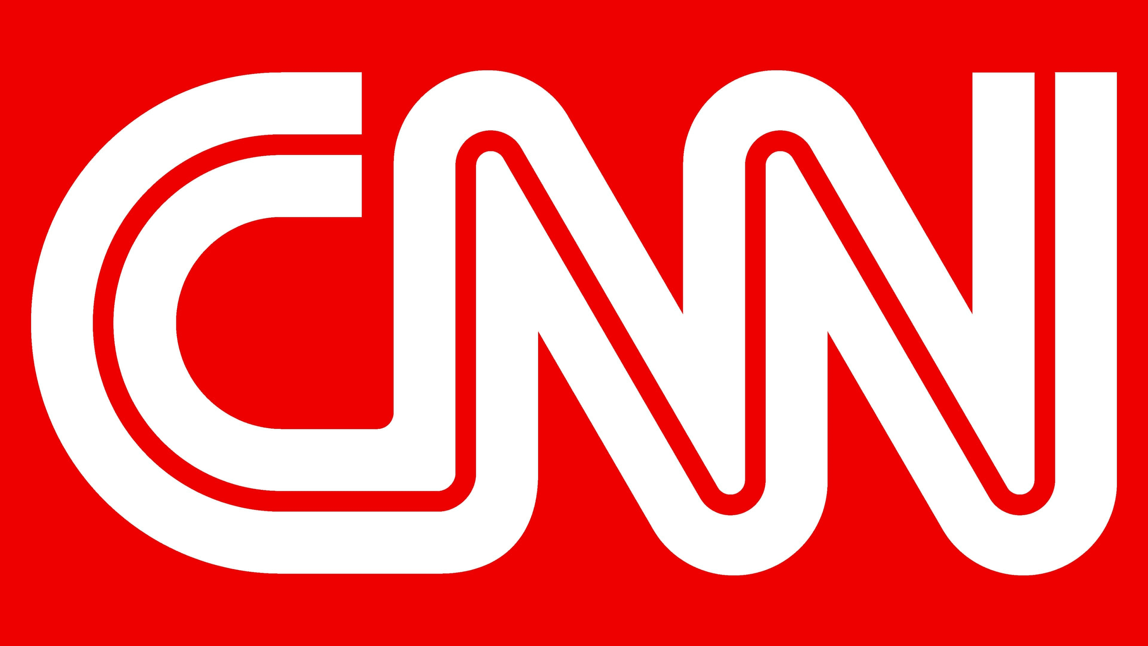
2014 – today
![]()
The first change in years, they basically just changed the colors again. This time, the paler red became a brighter, darker scarlet. Supposedly, it was done simply because this hue looks better.
Emblem and Symbol
Another popular CNN emblem is the CNN News symbol. For this one, they usually take the red rectangle, put a white version of the usual logo against it and then attach a longer black rectangle to the right side of it. They write the word ‘News’ in the plain white font there and also attach the card with the number ‘18’ to the corner.


