Cobra Kai Logo
Сobra Kai is a live action comedy-drama show based on the original ‘The Karate Kid’ films set by Robert Mark Kamen.
The show tells a story about Johnny Lawrence, once a successful athlete, but now a down-and-out man who takes odd jobs. He decides to open a Karate school ‘Cobra Kai’ with the same strict and tough rules and philosophy which it was once known for.
Meaning and History
On the logo introduced by Geronimo Giovanni for the series we can see the dangerous snake and the name of the show, in which hides the meaning of the emblem.
A classic Karate attack would be slow, accurate and heart-pounding, just like the snake’s jump, while the ‘Kai’ word can be translated from Japanese as ‘organization’, so ‘Сobra Kai’ logo is absolutely logical emblem for the show.
2018
![]()
The logo of the show (which was widely used for marketing of the series) represents the cobra snake in the defensive position hissing with the red tongue, preparing to spew its poison. The reptile has got the yellow outline contrasting with the circular background coloured in black so the snake looks like the part of the field.
The inscription represents the bright-red lettering greasy stroked with the yellow bold outline. It’s placed behind the snake to harmonically mix with the entire logo.
Emblem and Symbol
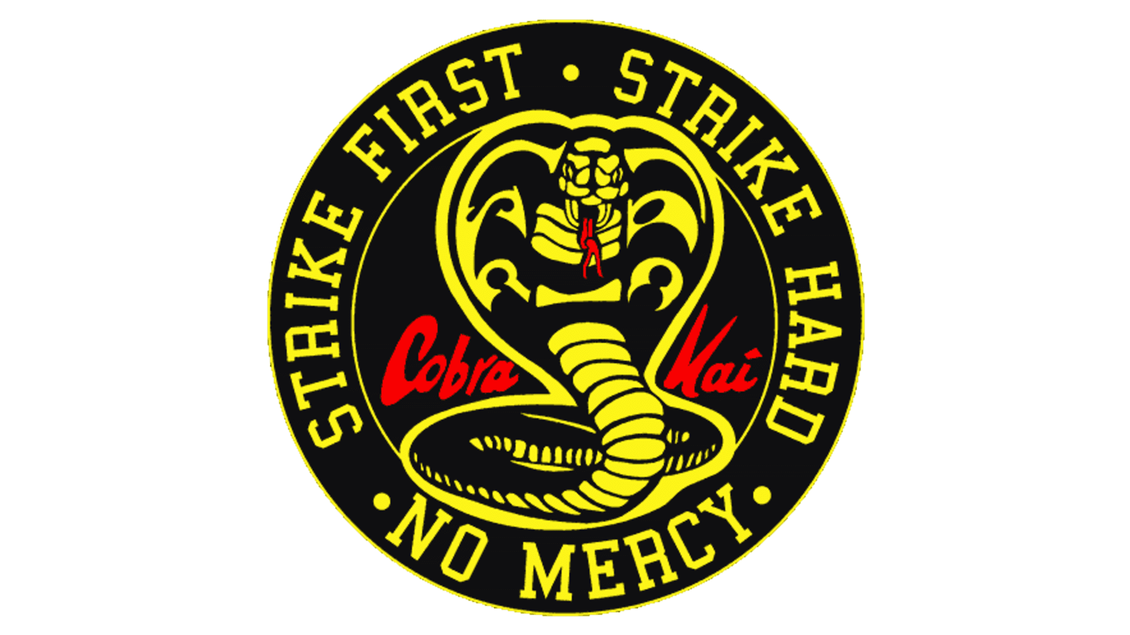
There’s an alternate version of the logo with the darker shades and the dark yellow encircling with the message on it:”Strike First, Strike hard, No mercy”. The inscription is also changed: it has the same dark yellow lettering, with no colour smashes.
As a previous one, this version of logo is close to the Asian culture and giving you the feeling of Karate fight.


