Comcast Logo
Comcast is the most profitable cable television company in the world and one of the most popular in the United States. It is one of the largest cable television and broadband operators in its home country, as well as one of the largest paid television operators in the world. Comcast owns film studios, news outlets, streaming services, and even theme parks.
Meaning and History
![]()
The Comcast company was founded in 1969 in the USA. Throughout its history, Comcast Corporation has acquired stakes in the most profitable and predominantly regional telecommunications assets. In 2011, the corporation set a course to diversify its business by acquiring a large stake in the NBCUniversal media group. In early 2012, the number of subscribers exceeded 18.5 million. The name “Comcast” is formed by combining the words “Communication” and “Broadcast”.
What is Comcast?
Comcast is a large international telecommunications conglomerate originally from America. It provides subscribers with internet and home telephone line services, as well as produces films and television content.
1969 – 2000
![]()
The company name is decorated with a stylized initial that was done in white and placed on a square shape with slightly arched sides. The full name itself was done using a rounded, geometric font with straight cuts, including the tops of the “M” and “A”. The whole logo was done in black with a white base, which created an image of a professional company. A conservative color choice and logo design created a truly timeless look that allowed the use of the logo for several decades without making any adjustments.
2000 – 2007
![]()
At the beginning of the new century, the company introduced a bold and bright color in the form of a second “C” that framed the first letter of the name. Unlike the original version, this logo used only lowercase characters, which gave the logo a slightly different feel and made the company look more approachable and friendly. The font has also been changed but still features thick strokes with straight cuts, creating a connection to the well-recognized brand image.
2007 – 2012
![]()
The update introduced in 2007 was quite minimalistic and many might not even noticed the changes. It consisted of an introduction of a new font. Accordingly, the last two characters had a slightly different appearance with the “S” being less curvy and the “T” having a diagonal cut at the top and a different end at the bottom. The red “C” that was placed around the first letters stayed unchanged.
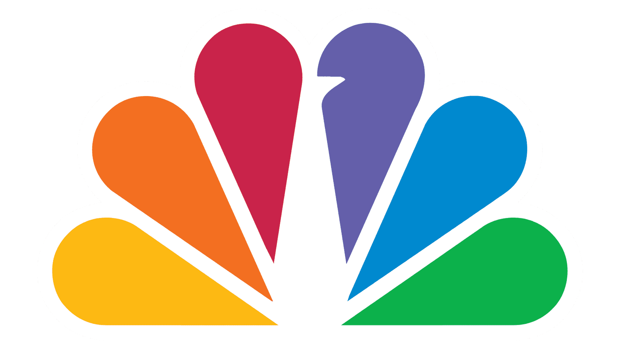
2013 – 2024
![]()
A visual identity was introduced in 2012 with a rainbow-colored fan placed above the name. It featured raindrop-like elements, which created a positive and welcoming mood. The font choice this time was slightly different as the designers chose a more refined sans-serif font and elongated characters. However, it was still done in black, which drew a connection to the earlier versions.
2024 – Today
![]()
The current logo combines the colorful peacock emblem with the word “COMCAST” written below it. The typeface is modern and sans-serif, lending to the readability and a no-nonsense, straightforward demeanor. The full-color logo suggests diversity and a wide array of offerings, possibly indicating the variety of services Comcast provides. The combination of a colorful emblem and understated text strikes a balance between a playful yet professional corporate identity. This logo could be viewed as a commitment to innovation while remaining grounded in its corporate roots.
Font and Color
The original logo featured a bold, sans-serif font that is close to Beachwood XWide Extra Bold or Microgramma Std Bold Extended or Microgramma Std Bold Extended. It was replaced by another sans-serif font somewhat similar to the Rescue font. The font in the next logo version had only a few differences and looked like Gilroy Semi Bold font. The latest logo version has Museo Sans Rounded 300 font or font from the Intervogue Family fonts.
For the first thirty years, the company used a formal black-and-white color palette to create a timeless and professional brand image. The introduction of a red ingested some life and excitement and reflected the company’s passion for what it was doing.


