Credit Suisse Logo
Credit Suisse is a prominent financial services company. Alfred Escher founded it in Zurich. He aimed to finance the rail network and boost the local economy. The firm originally focused on providing loans to businesses. Over time, it expanded into a major global banking institution.
Meaning and History
Credit Suisse was established in 1856. Its creation by Alfred Escher in Zurich marked the beginning of significant financial developments in Switzerland. Initially, the focus was on funding the expanding rail infrastructure, which was crucial for economic growth at the time. By the 1900s, it had begun to offer more comprehensive banking services, including savings accounts and investment products. The 20th century saw Credit Suisse playing a key role in global financial markets, expanding its operations worldwide. In the late 20th and early 21st centuries, it merged with several other financial institutions, significantly broadening its service range. These strategic mergers helped solidify its position as a global banking powerhouse.
What is Credit Suisse?
Credit Suisse is a global bank headquartered in Zurich, Switzerland. It provides various financial services including wealth management, investment banking, and asset management. The bank serves clients ranging from individuals to large corporations and governments.
1968 – 1976
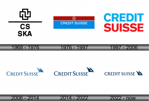
The logo displays a bold, geometric emblem above a horizontal line, with the letters “CS” and “SKA” below it. Its design conveys stability and connection, using stark black on a white background for contrast. The typeface is simple and modern, suggesting a professional and straightforward approach. The overall design reflects a blend of tradition and innovation.
1976 – 1997
This logo contrasts with the previous one, featuring a vibrant red and blue backdrop, symbolizing dynamism and trust. The emblem, positioned in the red band, is a white cross composed of interlinked squares, signifying connection and Swiss heritage. Below, “CREDIT SUISSE” stands out in bold white letters against the blue, promoting clarity and impact. The dual color scheme resonates with the Swiss national flag, underscoring the bank’s roots and global reach. This design is straightforward yet striking, with a clear message of solidity and reliability.
1997 – 2006
The logo has undergone a significant shift, eschewing graphic emblems for a typographic approach. “CREDIT SUISSE” is written in alternating colors: blue for “CREDIT” and red for “SUISSE.” The colors retain a connection to the Swiss flag, symbolizing stability and strength. The font is sans-serif, which communicates modernity and accessibility. This design focuses on the name itself, ensuring immediate brand recognition. It’s a move towards minimalism, emphasizing clarity and a global corporate identity.
2006 – 2014
In this evolution, the logo embraces a singular blue tone, symbolizing trust and depth. The text “CREDIT SUISSE” appears in a classic serif font, indicating heritage and reliability. Adjacent to the text, a graphical element resembling a sail emerges, suggesting progress and forward movement. This emblem hints at navigating through challenges, apt for a financial institution. The design is clean, with a focus on tradition, yet it carries an undertone of innovation and agility. The logo embodies a maritime spirit, steering towards the future while anchored in its past.
2014 – 2022
The logo maintains its previous color palette, continuing to feature a deep blue. The serif font refines the typography, infusing sophistication into the design. Designers have stylized the sail-like graphic, sharpening its lines to emit modernity and a progressive stance. Its placement at the name’s end symbolizes forward direction and momentum. This minimalist aesthetic aligns with contemporary design principles, focusing on simplicity and elegance. Overall, the logo presents a marriage of tradition with a modern outlook, reflective of a progressive financial entity.
2022 – Today
This logo iteration retains the deep blue hue, synonymous with professionalism and stability. The typeface now switches to a sans-serif font, suggesting modernity and a sleeker profile. The emblem, reminiscent of a sail, is more abstract and angular, aligning with contemporary design trends. Positioned at the end of the text, it gives a subtle nod to progress and agility. The overall look is cleaner and more streamlined, reflecting a modern, forward-looking institution while maintaining its nautical inspiration. This design balances legacy and evolution, with an eye on the future.


