Daewoo Logo
Daewoo, a South Korean company, emerged from a conglomerate vision. Kim Woo-jung, the founder, initiated it in Seoul. Aimed at diversifying into various industries, Daewoo had a broad focus. It included automobiles, electronics, and heavy industry. Its creation marked a significant move towards industrial expansion in South Korea.
Meaning and History
Founded on March 22, 1967, Daewoo quickly expanded beyond its initial scope. It became a global conglomerate by the 1980s, entering markets from electronics to shipbuilding. However, the Asian financial crisis of 1997 hit Daewoo hard, leading to its dismantling in 1999. Key divisions were sold to international corporations. For instance, General Motors acquired Daewoo Motors, marking an end to Daewoo’s era as a conglomerate but not to its brand legacy. The name “Daewoo” signifies “Great Universe” in Korean, reflecting the founder’s ambition for the company’s global reach and influence.
What is Daewoo?
Daewoo once stood as a colossal South Korean conglomerate, touching numerous industries. Today, it lives on through various subsidiaries absorbed by global companies. Its legacy continues to influence sectors like automotive and electronics, symbolizing ambition and the complexities of global business dynamics.
1967 – 1974
The logo presents a striking monochrome design, exuding a sense of balance and modernity. Two bold, black arcs rise and curve inward, framing a sleek, white pillar. This central pillar, an implied letter ‘D’, stands out against the contrasting arcs, suggesting stability and strength. The arcs converge into a circle, symbolizing unity and continuity. This minimalist yet powerful emblem captures the essence of sophistication with a touch of timeless elegance, reflecting an identity rooted in innovation and forward-thinking. It’s a visual embodiment of precision and simplicity, leaving a lasting impression of the brand it represents.
1974 – 1978
The updated logo introduces vibrant royal blue hues and an emblematic sunrise motif. Multiple vertical lines form an abstract fan shape, signifying expansion and growth. The ascending lines suggest a company on the rise, aspiring to new heights. Below, the word “DAEWOO” anchors the design in solid, capitalized letters, enhancing brand recognition. This iteration is more dynamic and visually complex than its predecessor. It evokes the dawn of innovation and the promise of a new day. This design conveys progress and the breadth of Daewoo’s industrial capabilities, emphasizing the company’s forward momentum.
1978 – 1994
This iteration of the Daewoo logo retains the radiant fan design but simplifies the color palette to a single shade of blue. The sunrise motif, now a deeper blue, conveys a bolder presence, symbolizing clarity and depth. The company name below maintains its capitalized form, offering a grounded contrast to the energetic emblem above. This logo refinement underscores a mature, confident brand identity, indicative of an established presence in the industry. The unified color scheme enhances the logo’s memorability, reflecting Daewoo’s consolidated strength and vision.
1994 – 2002
In this evolution, the logo simplifies to a lighter, airy blue. The sunrise motif transforms into an abstract, stylized tulip. This design suggests openness and approachability, contrasting the previous logo’s vertical emphasis. The tulip’s three petals also imply a trinity of values: quality, innovation, and growth. The font of “DAEWOO” below shifts to a modern, rounded style, reinforcing the brand’s friendliness and accessibility. This logo variant conveys a softer, more contemporary image, in tune with the evolving ethos of the company.
2002 – 2016
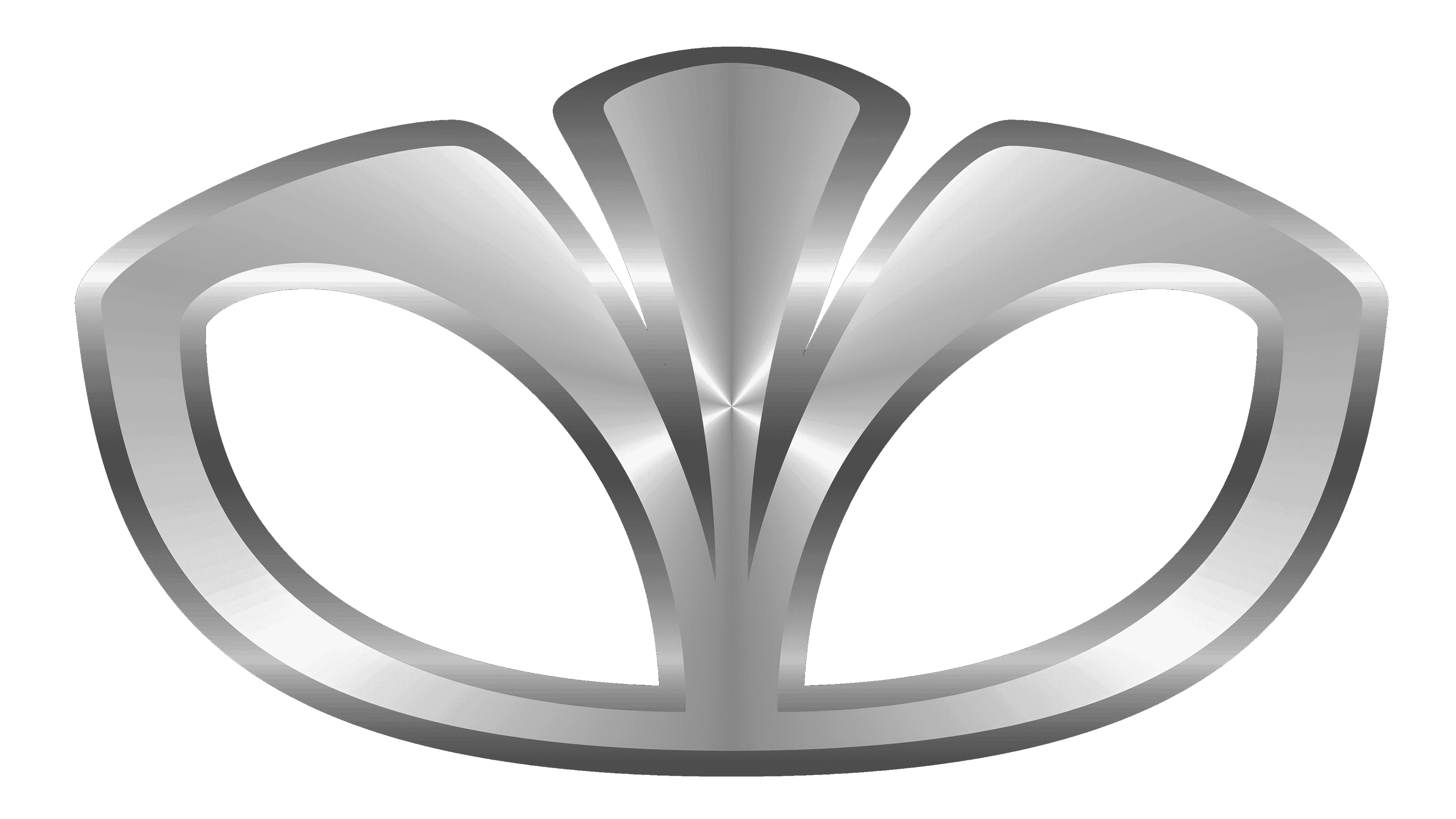
The latest logo shifts to a metallic gradient, giving it a three-dimensional and sophisticated look. The abstract tulip is now streamlined, resembling a crown or a stylized flame, suggesting regal quality and dynamic energy. This design represents a significant leap, focusing on the luxury and advanced engineering associated with the brand. The metallic sheen conveys a futuristic and premium appeal, resonating with high-end markets and modern aesthetics. This logo is a marked departure from the simpler, flat designs of the past, positioning the brand as forward-thinking and refined.
