Denver Broncos Logo
There are many professional football clubs the US can be proud of and Denver Broncos is one of them. These players proved to be quite successful in the AFL. This club has eight major members featured in the Pro Football Hall of Fame. The club changed owners several times, with Pat Bowlen leaving the team to three trustees who ought to find a new owner. In the early 2000s, the team moved to Invesco Field at Mile High and has been playing there for over 20 years.
Meaning and History
Founded in 1960, the players immediately joined the American Football League. After the two associations joined forces, it became an official member of the NFL. Several years later, they made the playoffs for the first time since their foundation and qualified for Super Bowl. The two victories in a row (1997, 1998) with another Super Bowl being won in 2016 are rightfully considered achievements to be proud of. The team is also a six-time NFL Champion and has many other accomplishments that make its fans proud.
What is Denver Broncos?
The Denver Broncos is the name of the football team in the United States. The Broncos play pretty well and are very stable. It’s funny that the mascot of this team is a live horse: a snow-white horse named Thunder. It is depicted on the team’s helmets and flag.
1960 – 1961
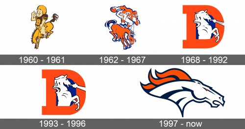
A caricature drawing of a football player on a horse served as the first logo. It was done in yellow, light beige, and brown. The horse rider has cowboy boots and looks very content, while the horse is kicking its back feet up. There is big letter “B”, which stands for the team’s name, is depicted on his T-shirt.
1962 – 1967
The logo still had a cartoon drawing of a horse and football player theme. However, the player was now standing on the horse and ready to throw the ball. He looked like someone you would not want to compete with. With visible teeth, the horse also acquired some character. The color palette was changed to blue, orange, and white.
1968 – 1992
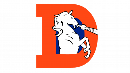
A big, orange letter “B” served as the base of the logo. The space inside was dark blue and the upper half of a white horse standing upright was drawn in the center with its feet and head overlapping the letter. The horse had minimal details, but the steam coming out of its nostrils, narrowed eyes, and an open mouth made it look feisty and powerful.
1993 – 1996
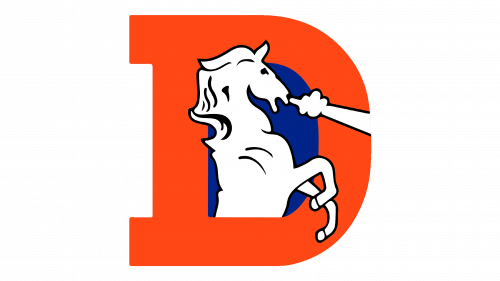
The logo was updated. Although the horse had a very similar shape as in the previous version, there were some differences. The horse acquired a friendlier and more graceful appearance, mainly due to the eyes that looked completely different. The steam also lost the details and now was a simple outline.
1997 – Today
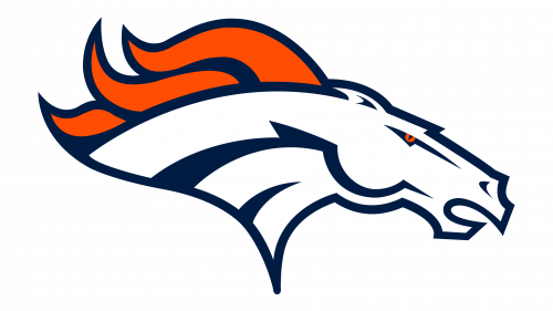
A powerful and fierce horse represented the team since 1997. It was a head of a real mustang, and the red eye along with the red mane and an open mouth made it look full of energy. The animal was drawn in such a way that it looked as if it was running. Thick, dark blue lines were used to draw the outline and details inside the emblem. The head itself was white. Such contrasting colors gave the logo a professional and bold look.
