Disney Princess Logo
The Walt Disney Company owns the Disney Princess media franchise. Andy Mooney created it. The franchise began in the United States. It appeals to young audiences by reimagining classic characters from Disney animations. Each princess character showcases specific values and embodies virtues such as kindness, bravery, and intelligence.
Meaning and history
The Disney Princess franchise was officially launched in 2000. Its creation was spurred by a realization during a Disney on Ice show. Andy Mooney noticed many young girls wearing homemade princess costumes, signaling a market for official merchandise. Over the years, the line expanded to include more than a dozen characters from various Disney films. Notable dates include the addition of Mulan in 1999 and Tiana in 2009, broadening the franchise’s diversity. The franchise continues to evolve, with new characters and stories adding depth to the brand.
What is Disney Princess?
Disney Princess is a franchise comprising select female heroines from Disney’s animated films. The brand includes characters like Cinderella, Ariel, and Belle. Each princess promotes themes of courage, love, and perseverance.
1999
The logo features the word “Princess” in elegant, flowing, dark blue cursive letters. Above the “nc” in “Princess”, the word “Disney” appears in a whimsical, bright red, smaller font. The “D” in “Disney” has a distinctive, looping design, adding a playful touch. The overall design is simple yet sophisticated, capturing the magical essence associated with Disney princesses. The contrasting colors of dark blue and bright red create a striking visual appeal. Exuding a sense of royalty and charm, the logo perfectly represents the Disney Princess brand.
1999 – 2000
In the new logo, the font for “Princess” has shifted to a more traditional serif style. The letters are more uniform and less cursive compared to the previous version. The dark blue color remains, providing consistency. The word “Disney” retains its whimsical, bright red font. The playful loop in the “D” of “Disney” is maintained, preserving brand identity. The overall design is cleaner and more formal, reflecting a timeless elegance while keeping the magical essence intact. The new layout enhances readability and visual appeal.
2000 – 2002
The new logo adopts a vibrant pink color scheme, creating a lively and playful look. The “Disney” text is now in a bold, whimsical font, with the characteristic looping “D” more prominent. The word “Princess” is written in uppercase, smaller, and positioned below “Disney”. It features a simple sans-serif font with a star-like symbol replacing the dot over the “i”. The entire design is enclosed in an oval pink border, adding a cohesive frame. A large, semi-transparent “P” in the background enhances the layered effect. This design is modern, dynamic, and visually appealing, exuding a youthful charm while maintaining elegance.
2002 – 2008
In this updated logo, the oval border has been removed, creating an open and airy design. The vibrant pink color remains consistent, maintaining its playful and energetic tone. The “Disney” text is still in a bold, whimsical font with a prominent looping “D,” but it is now more streamlined and slightly italicized, giving a dynamic feel. The word “Princess” is still in uppercase, positioned directly below “Disney”, and features a minimalist sans-serif font. The star-like symbol over the “i” in “Princess” is more pronounced, enhancing the magical element. The large, semi-transparent “P” in the background has been removed, simplifying the overall appearance. This design is modern, clean, and elegant, effectively capturing the enchanting essence of the Disney Princess brand while ensuring readability and visual appeal.
2008 – 2009
The new logo reintroduces an oval border, now with a reflective, metallic finish, adding a touch of sophistication. The vibrant pink background gradient enhances the visual depth and richness. The “Disney” text retains its whimsical, bold, italicized font, but appears slightly more polished and refined. “Princess” is written in a clean, uppercase sans-serif font, directly below “Disney”, with a more prominent star-like symbol dotting the “i”. A decorative silver tiara with a heart-shaped jewel crowns the top of the oval, emphasizing the royal theme. This addition reinforces the princess identity, making the logo more elaborate and ornate. The overall design exudes elegance, magic, and regality, capturing the enchanting essence of the Disney Princess brand with enhanced sophistication and visual appeal.
2009 – 2011
In this logo iteration, the metallic tiara is enhanced with a larger, central heart-shaped jewel and additional smaller red gems, adding opulence. The oval border remains, but it now has a more polished, reflective metallic finish. The vibrant pink gradient background is retained, maintaining its rich visual appeal. The “Disney” text remains bold and whimsical, but with a slight glow, enhancing its prominence. “Princess” is still in uppercase, positioned below “Disney,” in a sleek, sans-serif font. The star-like symbol over the “i” is slightly more pronounced, emphasizing the magical element. The overall design is more luxurious and polished, exuding a regal and enchanting aura, perfectly capturing the timeless elegance and magical charm of the Disney Princess brand. The enhancements in jewel detailing and text glow add depth and sophistication, making the logo more captivating and visually striking.
2011 – 2014
In this version, the tiara is upgraded with a larger, more dazzling heart-shaped jewel and two additional, prominently placed gemstones. The tiara’s design features intricate silver scrollwork, adding elegance and sophistication. The oval border now has a shimmering, iridescent finish, enhancing its luxurious feel. The vibrant pink gradient background is more pronounced, adding depth and richness. The “Disney” text remains bold and whimsical but now has a subtle, silver outline, making it pop against the background. “Princess” is still in uppercase, positioned below “Disney”, in a sleek, sans-serif font. The star-like symbol over the “i” is now more prominent, adding a magical sparkle effect. The overall design is more opulent and eye-catching, exuding a regal and enchanting aura. The enhancements in jewel detailing, iridescent border, and text outline add depth, sophistication, and visual appeal, perfectly capturing the timeless elegance and magical charm of the Disney Princess brand.
2014 – Today
The logo transformation introduces a dramatic change in shape and style. The oval frame is replaced by a more dynamic, shield-like design with ornate edges. The vibrant pink gradient background is retained, now adorned with subtle sparkles, adding a touch of magic. The tiara atop the shield features a central heart-shaped jewel, flanked by intricate silver scrollwork. The “Disney” text remains whimsical and bold, positioned centrally at the top. “Princess” is now in a larger, elegant serif font, with a small crown dotting the “i”. The overall design exudes a regal, fairy-tale charm, with enhanced depth and texture. The shield-like shape and decorative elements add a majestic feel, perfectly encapsulating the enchanting essence of the Disney Princess brand. The combination of whimsical typography, rich colors, and intricate detailing creates a visually stunning and captivating logo, embodying the timeless allure and magic of Disney princesses.
2021 – Today
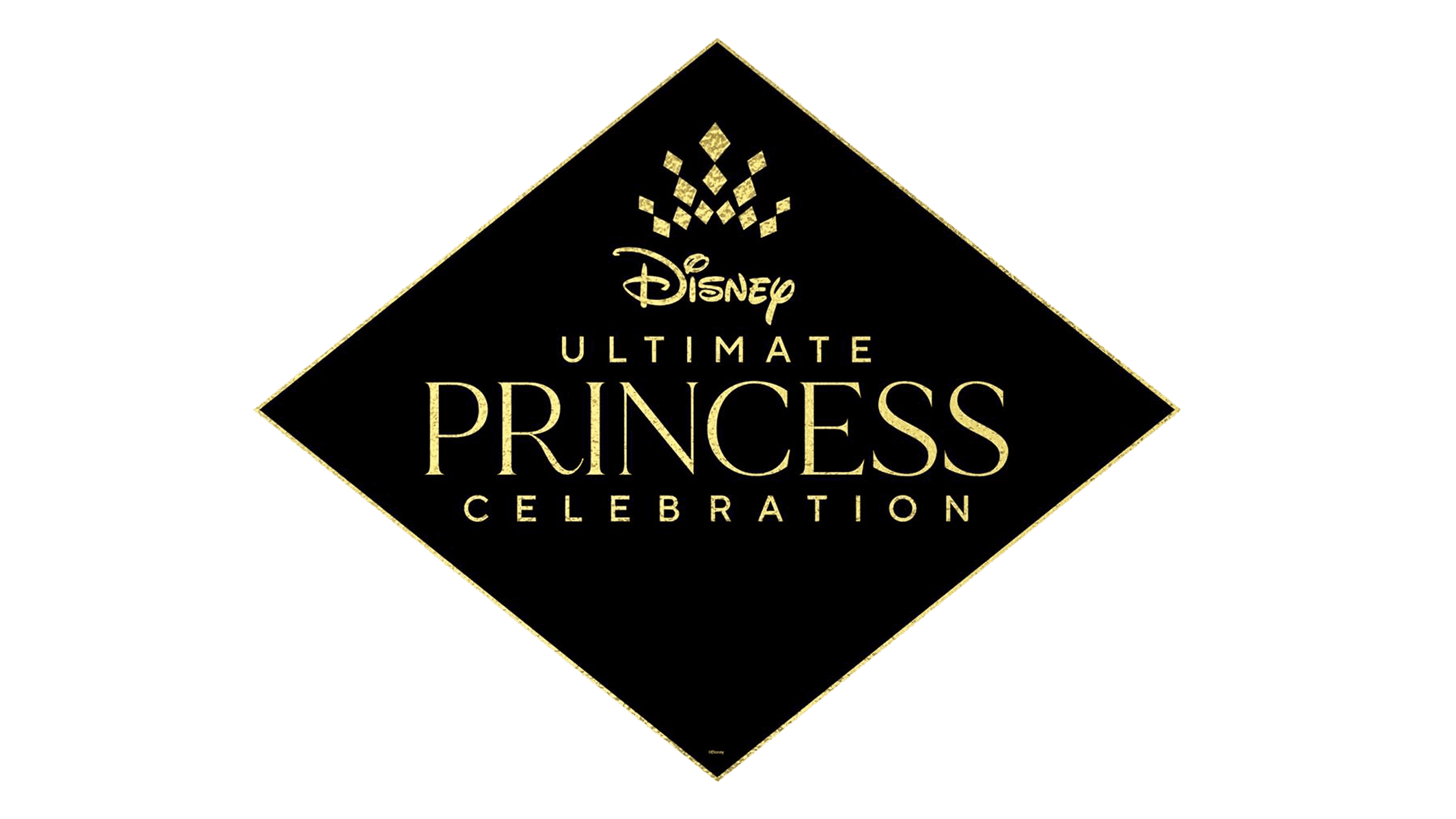
The latest logo introduces a striking departure from previous designs, adopting a minimalist, sophisticated black and gold theme. The background is now a solid black diamond shape with a thin gold outline, exuding elegance and luxury. The “Disney” text remains whimsical but is smaller and positioned centrally at the top. Below “Disney”, the words “Ultimate Princess Celebration” are displayed in uppercase, with “Ultimate” and “Celebration” in a sleek, sans-serif font, while “Princess” is in a larger, elegant serif font. Above “Disney”, a stylized gold crown made of geometric shapes adds a regal touch. The design is clean and modern, emphasizing sophistication and grandeur. This logo captures the essence of a high-end celebration, reflecting the timeless elegance and prestige associated with the Disney Princess brand. The use of black and gold signifies luxury and exclusivity, making it visually striking and memorable.


