Dora the Explorer Logo
“Dora the Explorer” is an animated TV series primarily aimed at preschoolers. It features a young, adventurous girl named Dora, who embarks on quests in an imaginative, tropical world. Accompanied by her talking backpack and a monkey named Boots, Dora solves puzzles and overcomes challenges. The show is unique for its interactive format, encouraging young viewers to participate in Dora’s adventures by answering her questions or repeating phrases. This bilingual series also introduces basic Spanish vocabulary, promoting language skills and cultural awareness among its audience.
Meaning and history

“Dora the Explorer” is a captivating animated TV series centered around Dora, a spirited and clever young girl with a love for discovery. Joined by Boots, her animated monkey companion, Dora ventures through a lush, fantastical world on various missions. Each episode presents a new adventure, filled with interactive challenges and puzzles, where Dora directly engages with the audience, asking for their help to navigate paths or solve riddles.
A standout feature of the series is its educational and interactive format. Dora not only takes her viewers on thrilling adventures but also introduces them to basic Spanish vocabulary, merging entertainment with language learning. This bilingual aspect serves as an early introduction to language skills and cultural diversity.
Dora’s character embodies qualities like bravery, empathy, and intelligence, making her an inspiring figure for young viewers. The show also explores diverse cultures and traditions, subtly teaching children about the importance of embracing differences. With a mix of delightful characters, including the crafty fox Swiper and Dora’s adventurous cousin Diego, the series emphasizes values like cooperation, friendship, and persistence.
The narrative of “Dora the Explorer” stands out in children’s television by harmoniously combining fun storytelling with educational elements, cultural awareness, and viewer interaction. This innovative approach not only amuses but also educates, leaving a lasting impression on its young audience by instilling essential life lessons through each of Dora’s exploratory journeys.
What is Dora the Explorer?
“Dora the Explorer” is an imaginative animated series that narrates the adventures of Dora, a resourceful and curious young girl, along with her monkey friend Boots. Renowned for its interactive and educational storytelling, the show blends lively adventures with the introduction of basic Spanish phrases, fostering both linguistic skills and cultural curiosity in young viewers.
1999
The logo radiates a playful and adventurous spirit, instantly capturing attention with its bold, whimsical lettering. Dominating the top, the name “Dora” is presented in a vibrant green hue with subtle shading, suggesting a three-dimensional effect, as if ready to leap out of the image. Beneath, “the explorer” is spelled out in a rainbow of colors ranging from a warm yellow to a fiery red, each letter dancing with an energy that hints at the joyful escapades of the titular character. The font, with its soft edges and irregular angles, conveys a sense of movement and childlike wonder, mirroring the dynamism and fun of the animated series it represents.
2000 – 2003
This vibrant logo for “Dora the Explorer” is framed by a lush, green foliage backdrop that echoes the show’s theme of adventure and discovery in nature. The letters of “DORA” stand prominently in the foreground, each character a different color—bold purple, sky blue, fiery orange, and leafy green—symbolizing the variety of experiences in Dora’s world. The word “the” is neatly integrated into a directional arrow, reinforcing the exploratory motif, while “EXPLORER” is spelled out in a playful, pink font that exudes excitement and fun.
Sitting atop the composition is the “Nick Jr.” logo, with its iconic orange splat and blue butterfly, indicating the network’s nurturing environment for children’s programming. The overall effect is one of cheerfulness and an invitation to learn and explore, much like the educational and adventurous spirit of the show itself. This logo is not only a brand identifier but also a visual summary of the series’ essence—colorful, lively, and always ready for a new journey.
2003 – 2012
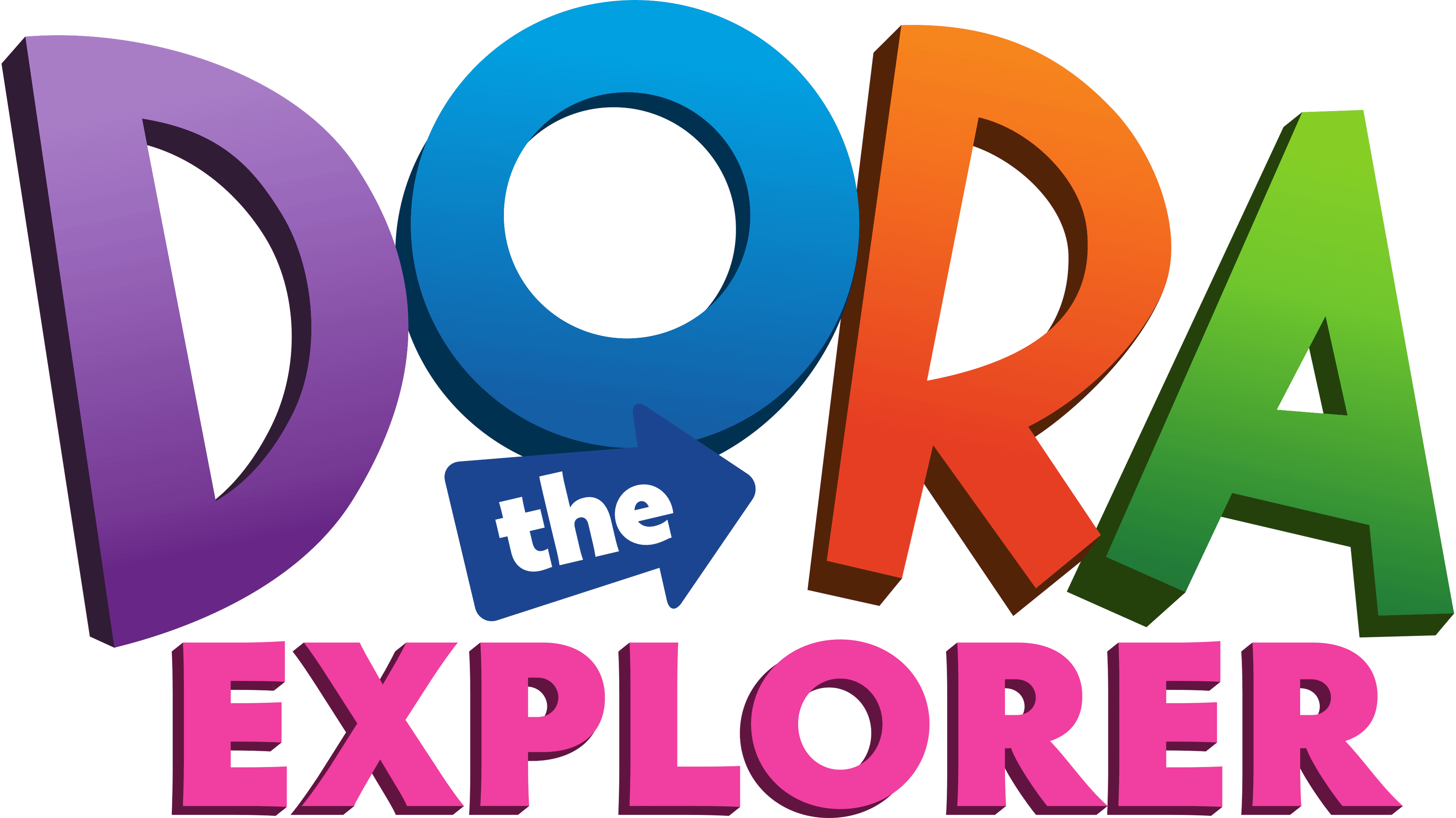
This iteration of the “Dora the Explorer” logo sports a refreshed color scheme and design tweaks from the previous version. The ‘D’ opens the name with in a violet, reminiscent of a tropical sunrise. The ‘O’ in oceanic blue, ‘R’ in a zesty orange, and ‘A’ in a verdant green retain their solid colors but with a more pronounced, clean-cut look.
The word “the” is now housed within a blue arrow, pointing recht, suggesting looking back to past adventures or knowledge gained. “EXPLORER” stretches out below in a bold, fuchsia pink, signaling the fun and discovery that lies in each episode.
This logo removes any shadowing, opting for a flatter, more modern design that emphasizes clarity and a contemporary feel. The font for “EXPLORER” has been slightly italicized, adding a sense of action and forward movement, in tune with the show’s dynamic nature. The overall look maintains the playful and adventurous spirit, with a cleaner, more striking visual that appeals to the young audience’s sense of exploration and curiosity.
2012 – 2015, 2019 – Today
In this latest logo of “Dora the Explorer,” the evolution in design maintains the essence of adventure and youthful vibrancy while introducing more refined changes. The colors of the letters in “DORA” have shifted slightly—the ‘D’ is now a softer purple, and the ‘R’ has transitioned from orange to a more coral hue. These color adjustments provide a subtle nod to the depth and variation found in a child’s expanding world.
The arrow encapsulating “the” has been colored a more pronounced shade of blue, creating a better contrast against the purple and setting a clear direction that signifies the navigational aspect of the show. Additionally, the “EXPLORER” text has moved from a solid pink to a gradient that flows from pink to a light magenta, giving the logo a modern gradient look that’s popular in contemporary design.
The typeface remains consistent with the previous logo, preserving the recognizable and beloved brand identity. However, the shadow effect has been refined to a more minimalistic style, which adds to the logo’s modernity. This refreshed logo represents continuity and change, mirroring the show’s ongoing journey of exploration and learning.
2014 – Today
In the evolution of the “Dora the Explorer” logo, this version introduces a strikingly fresh palette and design elements that set it apart from its predecessors. The letters in “DORA” have been infused with a gradient, giving a dynamic feel of sunrise and sunset, reminiscent of the start and end of an adventure. The ‘O’ is now adorned with a whimsical flower, possibly signifying growth and learning.
The word “the” has been simplified and is now in lowercase, creating a sense of accessibility and friendliness. The font of “EXPLORER” has seen a significant transformation to a lighter, more streamlined typeface in a calming teal, contrasting with the more vibrant colors above.
This logo has shed the shadow effect, opting for a clean, flat design that aligns with contemporary graphic trends. The overall look is more playful and modern, with a hint of sophistication that suggests a broadening of the show’s appeal. The design choices in this iteration of the logo reflect a brand that continues to evolve while remaining true to its core themes of exploration and discovery.


