Fairy Tail Logo
Fairy Tail is a popular manga series issued in Japan since 2006 to 2017. It’s eventually become immensely popular even abroad, helped in part by the release of a fully-fledged anime series in the year 2010. Both take place in a fictional magical world where wizards compete and find adventures as part of one magic guild or the other.
Meaning and History
The first issue of the manga came out on August 2, 2006. The name is obviously derived from the concept of a fairy tale – oral or written composition that features magic and magical creatures, mostly aimed at the child audience. But it’s also the name of the central guild in the manga world, Fairy Tail.
2006 – today
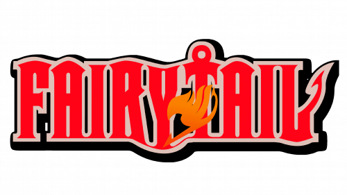
The logo is composed of 9 red letters making up the name of the series. It was both used for the manga and the anime. Many of these letters are styled as houses or towers – tall, thin and blocky structures with roof-like tops.
Some letters – primarily the ‘T’ and ‘L’ sprout peculiar sea-inspired shapes out of their bodies. Much of the narrative revolves around seas, so it’s not surprising.
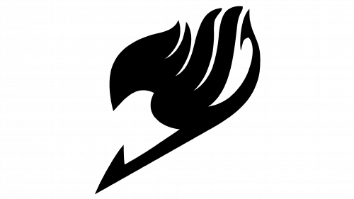
They also depicted a fire-like symbol in front of the text – this symbol is also used independently to identify the series.
Emblem and Symbol
The series (including the show and the mange) are often signified by a fire symbol seen in front of the text on the official logo. It’s actually supposed to be a bird, with a keen head on the left and the fiery tongues resembling the wings. These are references to the plot of the series.


