Forbes Logo
Most often, the Forbes brand is associated with lists of the richest individuals who periodically appear on the pages of the publication. The magazine also writes about success and failure stories of entrepreneurs, new ideas for business and investment, and publishes authoritative ratings. Forbes has access to CEOs, politicians, and opinion leaders and gets information from the most knowledgeable sources.
Meaning and History
Forbes magazine appeared in the year 1917, and a year later, the first richest people list was published. It was created by Bertie Charles Forbes. This man was born in 1880 in the family of a tailor from Scotland, the sixth of ten children. Thanks to his own talents and diligence, Bertie became America’s most famous financial journalist. He boldly hurled his criticisms at influential people, which editors deleted. Perhaps this was one of the reasons that prompted Forbes to launch his own magazine. At first, he planned to call it Doers and Doings, but friends suggested that Forbes give the magazine his last name. By 1920, Forbes magazine became the country’s leading business publication. In 37 years, Forbes has created a publication that brought hundreds of thousands in net profits a year, his extravagant son turned it into an entire empire, and the founder’s grandson made Forbes a recognizable brand all over the world.
What is Forbes?
Forbes is an American business magazine, one of the most authoritative and well-known economic publications in the world. The magazine received recognition thanks to its bold investigations in the business world and objective assessments of events, as well as various lists and ratings published by it. Among them, the most famous was the list of world billionaires.
1917 – 1918
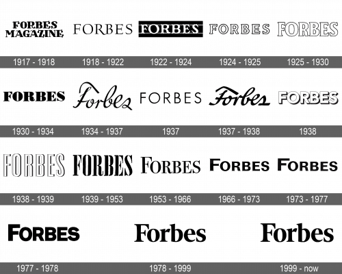
This is the only logo that had “Magazine” added to the name of the publication in the logo. Both lines were done using the same typeface with very elegant serifs. It reminds of medieval scripts.
1918 – 1922
This version does not look as fancy but still looked quite sophisticated. It featured all uppercase letters and pointy, bracketed serifs. The different thicknesses of the strokes along with an elongated leg of the “R” added even more interest. There were no other elements in the logo.
1922 – 1924
This version reminds of the original, mainly due to the use of bold lines and prominent serifs. The inscription was printed in white, though, and placed on a black, rectangular background with two thin lines running right above and below the inscription. It looks powerful and impressive just like the articles published in the magazine.
1924 – 1925
The logo was given a new spin as only a thin black outline around the white letters. It was still a serif font, but it looked more serious as the lines and serif were now straight.
1925 – 1930
The updated emblem was more refined and featured smoother curves. The larger letters and closer spacing made the emblem reflect the strong and dominant position of the publication.
1930 – 1934
Sharper lines and angles along with the black color of the letters set this logo apart from the one used earlier. The company continued to use a bold, serif typeface, although a different one, and all capitalized letters for its logo.
1934 – 1937
This version looks the most different than any other seen earlier. It not only uses an elegant, fine cursive typeface but also has only the first letter capitalized. It surely brought more attention to the publication.
1937
A logo that looked a lot like a sans-serif version of the emblem created in 1918 was used for a short period almost 20 years later.
1937 – 1938
After testing a new brand image, the designers brought back the stylish logo they developed earlier. It was noticeably bolder than the 1934 version and featured smoother cuts.
1938
The company never seized to introduce new logos. The stable position of the magazine on the market is supported by a confident, bold logo. The white, sans-serif letters not only had a thin but also a wide, black shadow.
1938 – 1939
The look of the previous logo was elevated by stretching the letters vertically and adding a thin vertical line on the left. This white line also had a thin, black outline, which further enhanced the dynamic and interesting appearance of this new brand image.
1939 – 1953
The new logo seemed to be stenciled on a white background. The black letters had long, pointy serifs and thick strokes. It looked powerful, yet there was something fancy about it.
1953 – 1966
The redesign presented cleaner, smoother lines and no gaps characteristic of the stencils. In addition, the first letter was enlarged to create an appearance of a capitalized letter. Until this logo, the company typically stuck to all capitalized.
1966 – 1973
A Univers font was used for this new publication signature. It was bold, powerful, and had tiny, pointy serifs. The company still had the name of the magazine as the only element of its emblem. Moreover, they continued to use black and white as their main colors.
1973 – 1977
This logo is almost identical to the previous one. The only difference is the lack of serifs, which made the logo look cleaner and more powerful.
1977 – 1978
A minor modification was introduced in 1977. The new font looked a lot like the previous one. The leg of the “R” was now straight, though, and the strokes got significantly thicker. It was another strong brand image.
1978 – 1999
A stylish, serif font was introduced shortly after the last redesign. The long, sharp serifs added a sophisticated touch, creating an image of a luxurious brand. At the same time, they were combined with rounded, smooth elements and high-contrast strokes.
1999 – Today
Although the new logo had a different style of serifs, which did not look as sharp anymore, there was one more thing that set it aside from all the other versions. For the first time in history, the publication decided to use color. It was not bright, but rather a muted blue. It was a great way to reflect the authority and stability of one of the oldest magazines.
Font and Color
Until 1999, the publication used classic black and white colors. After that, its logo was done in a blue color with a grayish tint. When it comes to fonts, the company frequently changed the typefaces it used for its logo. However, they always looked elegant and sophisticated. In some cases, it was a bold, serif typeface, while other logos featured finer, cursive writing.

