FSU Logo
With a long history, this university truly focuses on academics and has multiple top schools in the nation. It also has the number one travel abroad program in the US. The university is committed to excellence in teaching, research, creativity, and service. Students of the institution have an opportunity to live on campus. Over 60 percent of applicants are admitted to the university, but it is also worth bearing in mind that FSU’s acceptance rate can vary significantly depending on the chosen faculty.
Meaning and History
The history of the university began in 1851 when two seminaries were founded. Over the years, the university has grown. Today, FSU is a large research university. Located in the state of Florida, it is the national pride of this region. The main buildings are located in Tallahassee and have an infrastructure that is simply incredible in scope. In particular, there are about 110 different laboratories, research institutes, training centers.
What is FSU?
Florida State University is one of the reputable institutions of higher education. It is consistently ranked among the top educational institutions in the United States. The university annually enters the top 5% of the leading universities on the planet.
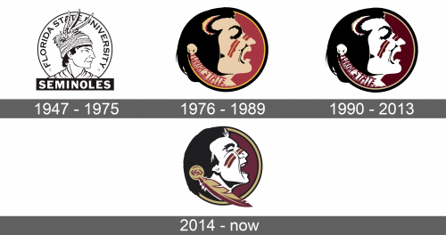
1947 – 1975
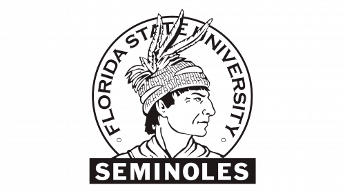
A native American with a headpiece typical for Seminole Tribe located in Florida was chosen to represent the university. He was facing right and had a serious and determined look. The headpiece featured feathers. Behind the head of the man, there was a round white circle with a thin black outline. The name of the university was written inside the circle following its curve. It was done in large uppercase letters using a simple classic font. On both ends of the name, there was a small round circle. Right under the man, it stated “Seminoles” in thick white letters that contrasted well against the black color of the rectangle that served as a base for the name of the tribe.
1976 – 1989
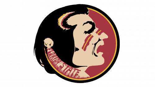
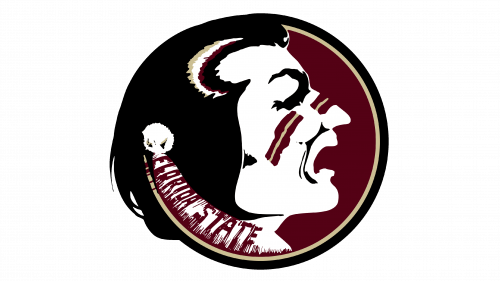
A portrait of a man from the Seminole tribe was completely redrawn. Besides vibrant colors being introduced to the emblem, there was no more name of the tribe. The name of the university done in crimson also blended in with the beige feather that had crimson details. The man had red and yellow stripes painted on his cheeks, nose, and even hair, which was complemented by a crimson-colored solid circle that served as the base for the portrait. It was visible only on one side, though, as the black hair and face were covering a big portion of it. The circle had a thin yellow followed by a slightly thicker black outline.
1990 – 2013
The updates introduced in the 90s mainly touched the color palette. The beige was swapped for white, while the yellow now looked beige. The red color became a very deep crimson color. These changes completely transformed the look of the emblem. It acquired a more timeless and professional look.
2014 – Today
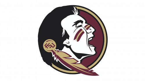
The logo was redrawn and the Native American character got a more defined chin, teeth, and other facial features. He looked brave and undefeatable. The feather that was going down from his ear following the chin line also got a very defined shape. The full name of the university was removed and an abbreviation was added instead. The border of the circle was also switched to a thicker beige line that was framed with black lines. The hair has undergone some changes too. Although the emblem was changed, it maintained a very recognizable image and managed to make it more modern.
