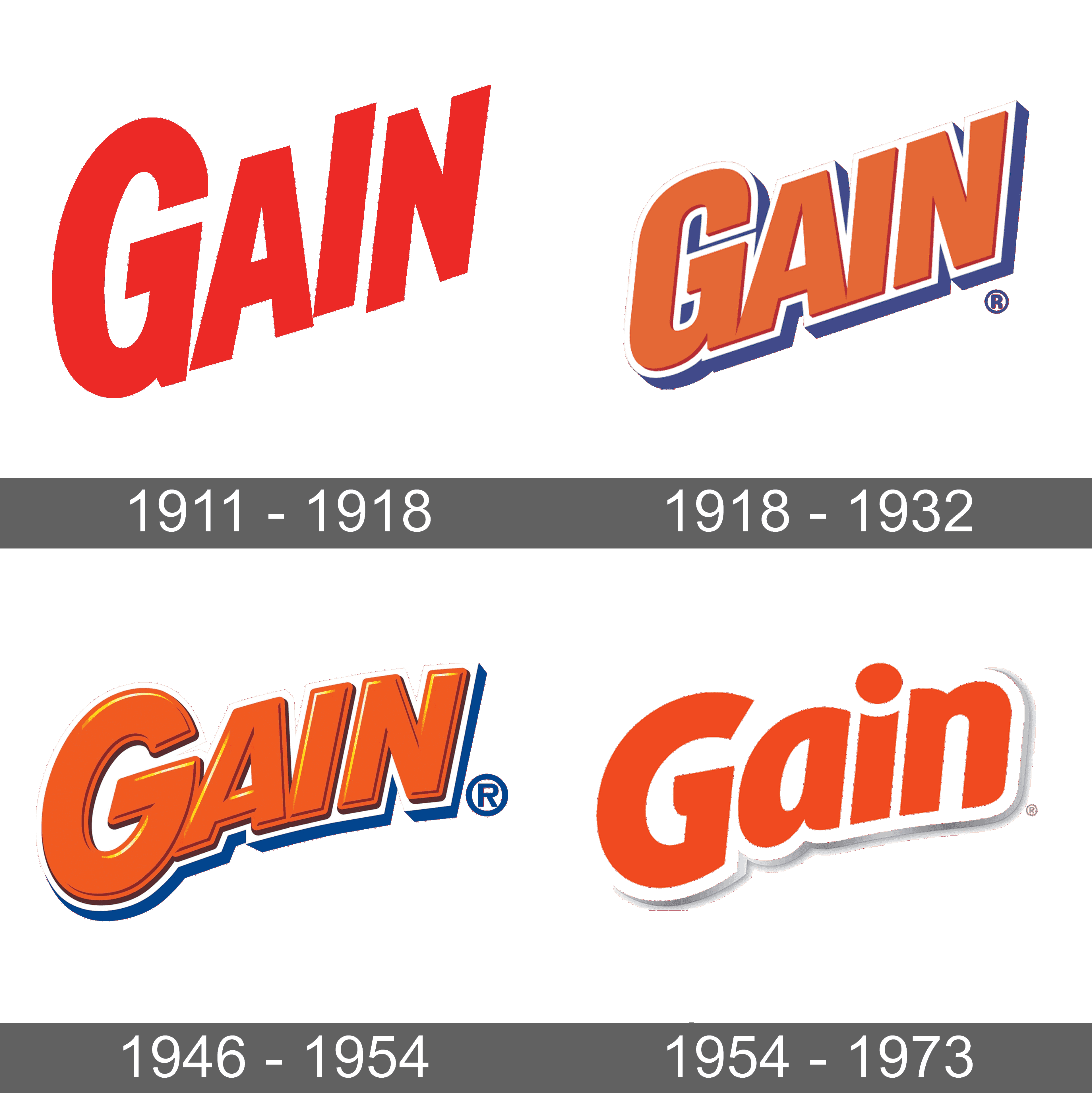
Gain Logo
Powerful Gain Original Liquid Laundry Detergent thoroughly removes dirt from clothes and leaves them smelling fresh. Gain Flings! Laundry Detergent Pacs are the most popular washing capsules in the USA. Each tablet has a stain remover, detergent, and a little fragrance. With the help of Gain Fireworks In-Wash Scent Booster, another popular Gain product, the laundry will smell better for longer. Gain’s laundry detergents and fabric softeners come in a variety of aromas, such as Tropical Sunrise, Moonlight Breeze, Apple Mango Tango, and, of course, the beloved Original.
Meaning and History
![]()
Procter & Gamble launched Gain, a powdered laundry detergent with enzyme-driven stain removal properties, in 1969. Gain did, however, choose to redefine the brand in 1981 to emphasize its fresh aroma. The brand grew to include fabric softeners and liquid detergents in the 1980s. In late 2007, Procter & Gamble announced Gain as its 23rd Billion Dollar Brand.
What is Gain?
Gain is a laundry detergent and fabric softener brand known for producing effective, affordable cleaning solutions for everyday use. Gain is constantly coming out with new scents and products, such as its enduring and well-liked Original scent.
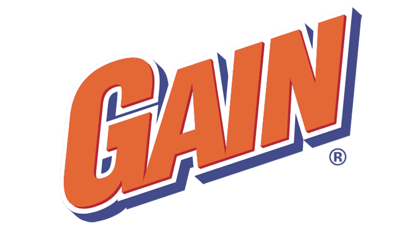
1969 – 2002
![]()
From the very start, the company decided to go for a bold red for its logo. There are no other elements besides the name, which does not diminish its impressive look. The name is placed on a diagonal and printed using a bold, sans-serif typeface. It is worth noting that the letter “I” is set slightly higher than the baseline. It creates an illusion that the letter is pushed out, just like the dirt and stains are removed with the help of Gain products.
2002 – 2005
![]()
The logo was updated only more than 30 years after the original was created. First of all, the company changed the color palette to orange, white, and blue. It looked softer and the blue color reflected the quality consistency and trustworthiness of the brand. The designers also leveled out the baseline and x-height, although the name was still printed on a diagonal. The logo acquired a more balanced and put-together appearance.
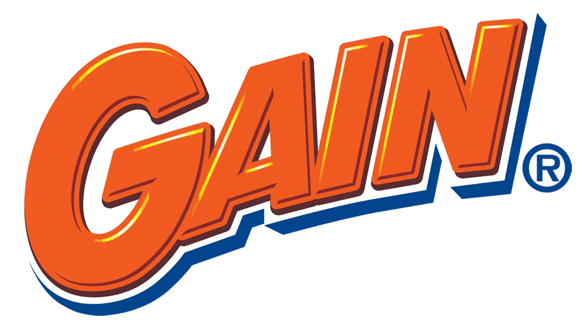
2005 – 2012
![]()
The three-dimensional effect introduced a few years earlier was enhanced in this version. The designer also added volume to the actual letters in addition to the blue shadow. Besides changing the font to a slightly more rounded one, they also wrote the name on a curved line instead of a straight diagonal. The orange color got bolder. The overall logo has a warm, welcoming feeling with notes of excitement.
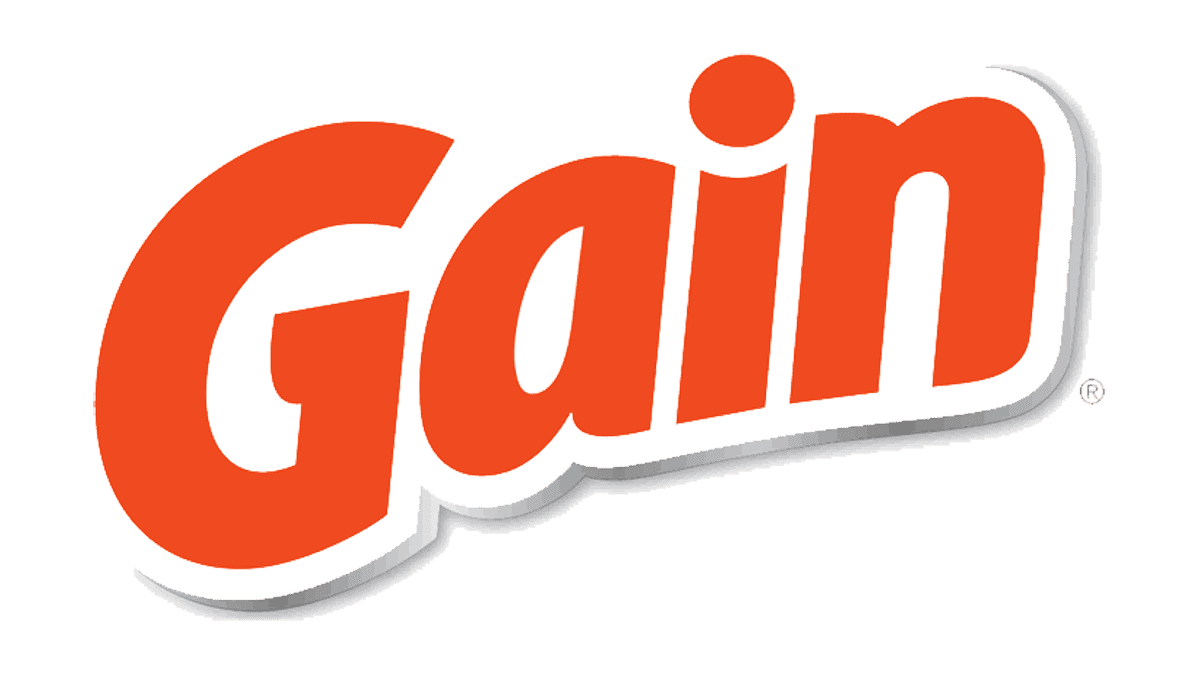
2012 – Today
![]()
The company continued to use a logo that consisted only of the brand’s name set on a diagonal. Moreover, it still featured an orange and white color palette, although the blue is gone here. The designers used a light gray instead of blue to create a shadow effect. The font has changed completely and the inscription had only the first letter capitalized. The letters look rounder and smoother with a solid orange stroke. The logo turned out even more minimalistic and friendly.
Font and Color
Over the years, the shade of orange has changed but its meaning has stayed pretty consistent. The orange color, which has been used since 2002, creates feelings of freshness and happiness. This is exactly what the company wanted the consumer to associate the brand with. The company also introduced blue at the beginning of the new century. The color is meant to reflect the long history of the brand, its reliability and trustworthiness.
The original logo features a very simple sans-serif font with straight, bold strokes and clean and straight terminals. It closely resembles the Gallinari Extrabold Condensed Oblique font. For the next 10 years, the company used almost the same font, making slight adjustments during the update. Up until 2012, the logo featured all caps, which enhanced the bold look of the logo. Then, the company turned to another sans-serif font. It looks like Contra Sans ExtraBold Italic font but with rounded terminals.