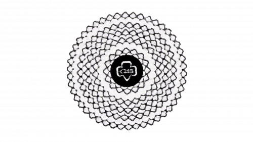
Girl Scout Logo
Scouting teaches useful skills that can help to work in and lead a team, be considerate of others and take an active public position. For girls, emphasis is placed on strengthening female social significance. In addition, scouts are taught practical survival skills. Scouting teaches how to give first aid, do things with your own hands, cook food and take care of one’s belongings. Besides these activities, scouts are famous for their cookies, which were initially sold to raise some funds for the program.
Meaning and History
The scout organization originated in England in 1907. Its founder was Robert Baden-Powell. The movement came to the USA thanks to William Boyce. Initially, it included only boys, Boy Scouts, but later, girls were also accepted into scouts. Five years later, Juliette Gordon Low, also known by her nickname “Daisy”, initiated the Girl Scouts group. It was formally approved by Congress in 1950. The leaves typically seen in the logo are meant to symbolize their three main goals.
What is Girl Scout?
This is an organization that brings together girls. Scouts mainly take part in developmental programs that help them improve themselves, explore, create projects, engage in outdoor activities, etc. The organization has a clear hierarchy and a system of awards and distinctions. Any child can become a scout, regardless of nationality, wealth, health, and education.
1912 – 1920
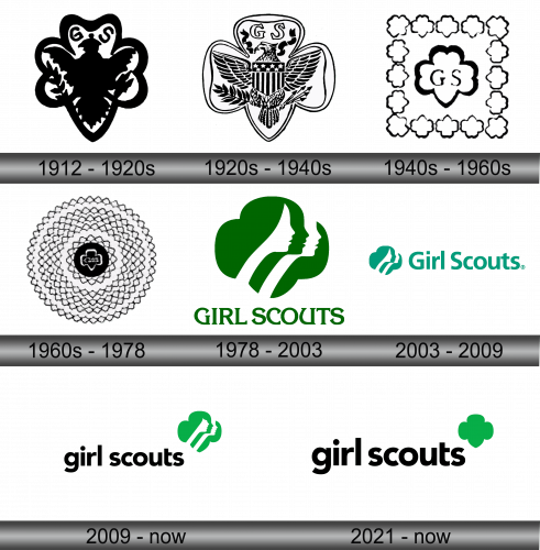
An outline of a three-foil clover served as the basis for the emblem. The line was black and quite thick. Inside, it had a symmetric silhouette of an eagle with an olive branch and arrows in its claws. To the left and right of the eagle’s head, there was an abbreviation of the organization. The black and white color of the emblem as well as its symmetrical look created a professional feel.
1920 – 1940
Soon, they redrawn the logo and added more details. The lines were no longer as thick thanks to a white coloring inside. It was more clear that the logo featured an eagle with an olive branch in one claw and several arrows in the other. The name abbreviation was now above the eagle and framed by two black ribbons on both sides. The more prominent addition was a flag that resembled the American flag with stars and stripes. It was positioned right in the center, overlaying the eagle. There is a lot of symbolism behind each element in the emblem, which includes strength, national pride, and victory.
1940 – 1960
In 1940, a very simplified version of the emblem was presented. It featured the same clover leaf, only it had a thick outline and only the initials in the center. In addition, the emblem was framed by smaller clover leaves that created a square around it.
1960 – 1978
The emblem creators went even further and place the emblem on a black circle while making the clover leaf outline and initials white. The circle was framed by multiple rings of even smaller clover leaves drawn very close together. It likely symbolized the growing number of girl scouts. The emblem resembled a flower of some kind.
1978 – 2003
This version is more recognized nowadays. It depicts a four-leaf clover with exactly the same profiles of three girls. The emblem itself is green with white being used for two of the profiles, while the girl in the center is drawn using the negative space technique. “Girl Scouts” is written in all uppercase serifed letters of the same green color.
2003 – 2009
The emblem changed color to minty green and was placed on the left side. A different font was used to write the name, which now only had the first capitalized letters and no longer featured serifs.
2009 – Today
The emblem was updated once again with a change in the font being used for the name. It featured black, lowercase lettering. The emblem was moved to the upper right corner above the name and changed color to a more natural shade of green. The hairline and facial features were also redrawn.
2021 – Today
The Girl Scout institution was endowed with a symbol that echoes a design variant from the 1920s. It features a shamrock leaf composed of three lobes, the previous incarnation of female profiles in side view having been omitted from this rendition. Additionally, the creators have sculpted the bottom portion to resemble another segment of the leaf, adding a nuanced aesthetic touch to the overall design. The accompanying text has been amplified in size, rendering the shamrock to appear somewhat diminutive in comparison. This modern redesign symbolizes a return to historical roots while adapting to contemporary aesthetic preferences and emphasizing the organization’s evolving identity and enduring values. The enhanced inscription aligns with modern design principles of visibility and prominence, ensuring the organization’s name stands out, while the revised clover leaf symbolizes unity and tradition. The absence of the female faces perhaps suggests a focus on the universal principles and values of the organization rather than individual representation, emphasizing inclusivity and collective identity.
Font and Color
The latest logo features a modified version of the Avenir Black typeface with clean lines and diagonal cuts for some letters. Previously, the logo featured a sans-serif font, as well as a typeface with pointed serifs that were combined with straight and curved lines that created a very unique inscription. For over half a century, the logo was black and white. It was not until 1978 that the organization introduced the green color, variations of which have been used ever since.

