Google Play Logo
Google Play is a content store that sells only digital goods. This is a service that provides access to many applications running on the Android system. Google Play is really a very unique service where each user will find a lot of interesting apps for themselves. Besides apps, users can buy there not only applications, but also movies, music, books, audiobooks, and subscriptions to various services.
Meaning and History
The main purpose of Google Play, which first appeared in late 2008, is to be a place where Android users can download apps and games. It used to be called “Android Market” as it featured only Android apps and games. As Google expanded it and the Android Market began to include music, e-books, and movies, Google renamed it Google Play in early 2012. Currently, Google Play has about 3,500,000 different applications. They are not developed by Google itself. They are sold by third parties. In order to place their program in this service, the developer needs to pay a fee.
What is Google Play?
Google Play is an online app store developed by Google for Android devices. Moreover, all Google digital content can now be found on Google Play.
2008 – 2011
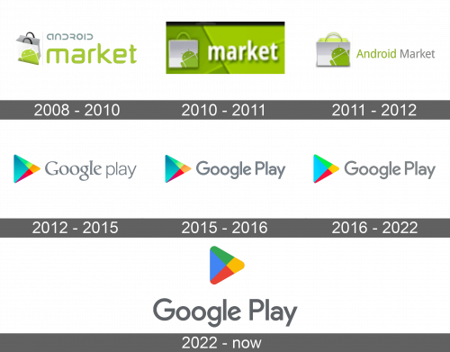
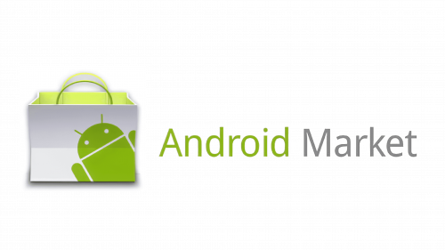
The green word “Market” was the first thing that one saw on the logo as it was bright and featured large lowercase letters. Above it, the logo had the word “Android”, which was done in gray color and smaller font. All the letters resembled a “U” shape in one way or another, which served as a reference to the icon featured on the left. To the left of the wordmark, the logo had an opened, white shopping bag with black handles. It had a robot character peeking from the bottom right corner done in the same green color as the word “Market”.
2010 – 2011
The logo represents the Android Market, the precursor to today’s Google Play Store. The logo features the Android robot peeking out of a shopping bag, which cleverly combines the concepts of shopping and the Android platform. The logo is set against a vibrant lime green background, a color that’s come to be associated with the Android brand. The word “market” is written in a friendly and accessible lowercase font, which reinforces the marketplace’s role as a hub for apps, games, and content. The soft edges of the typeface make the logo feel approachable and user-friendly, inviting consumers to explore the variety of offerings.
2011 – 2012
The shape of the shopping bag was updated, so it was not as tall and there was a visible horizontal bending line. It still had a robot in the bottom corner, but it was a darker green color. The inside of the bag was changed to a light green color, and the handles were also green. The wordmark was now written in one line. With the first letter being capitalized, the words were done using a simple font. In addition, now the word “Android” was green, while the “Market” was done in light gray.
2012 – 2015
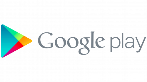
A completely new logo was introduced after the name change. It featured a “Google play” wordmark done in gray, bringing the color from the previous version. The word “Google” was bold and was done using a familiar font. To the left, the shopping bag was replaced by a triangular “Play” button icon. It was colored in blocks that featured gradients of blue, green, red, and orange colors.
2015 – 2016
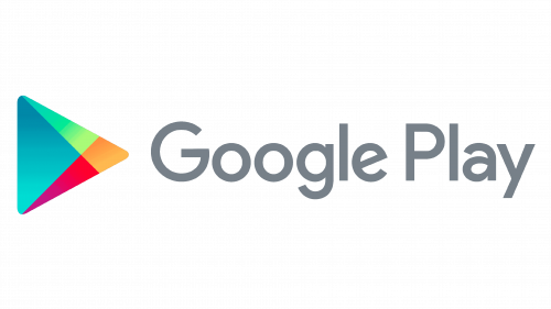
As Google changed the font used for its main logo, the logo for Google Play was also updated. This time, both words were capitalized and written using the same font. The play button with rounded corners was kept unchanged.
2016 – 2022
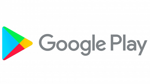
In 2016, the play button underwent some changes. The most noticeable one was switching from color gradient to plain colors. In addition, the corners looked more rounded. The wordmark stayed the same.
2022 – now
The new logo signifies the evolution of the Android Market into Google Play. The logo is sleek and modern, featuring the Google Play triangle, which is reminiscent of a play button, colored in the signature Google colors: blue, red, yellow, and green. This design element effectively communicates the idea of media and entertainment. The word “Google” is in its distinctive sans-serif typeface, which is instantly recognizable and conveys reliability and authority. “Play” follows in a simpler, lighter font, emphasizing the fun and enjoyment that the platform provides. This logo is not just a name, it’s a call to action—to play, explore, and enjoy the digital content within.
