Haikyuu Logo
“Haikyuu!!” is a renowned Japanese anime series, spotlighting the exhilarating world of high school volleyball. It trails the journey of Shoyo Hinata, whose love for the sport ignites after watching a championship match on TV. Despite his shorter stature, Hinata’s formidable determination propels him to strive for his goal of becoming a top player. This series is celebrated for its engaging depiction of the intricacies of volleyball, captivating character development, and its inspiring exploration of teamwork and perseverance, resonating widely with audiences globally.
Meaning and history
“Haikyuu!!,” conceived by Haruichi Furudate, began its journey as a manga series in 2012 in Weekly Shōnen Jump. It unfolds the odyssey of Shoyo Hinata, a high schooler with a fervent passion for volleyball, despite his shorter height. Hinata, inspired by “the Little Giant,” aspires to reach the pinnacle of high school volleyball. The series mirrors his relentless pursuit and the camaraderie and rivalries born in the process.
The anime adaptation made its debut in 2014, quickly amassing a global following due to its compelling characters and authentic portrayal of the sport. The anime intricately explores themes of resilience, determination, and the spirit of teamwork, making it a standout in the sports anime genre. The series was lauded for its ability to resonate with viewers, making them feel deeply connected to the characters’ emotions and journeys. It spurred various adaptations, such as video games and movies, extending its impact further.
The series unfolds in several seasons, each delving into the progress of Hinata and his teammates in their quest to be the best. The characters confront diverse challenges and evolve both in skills and in personal growth, intensifying the overall narrative. The anime’s realistic and dynamic depiction of volleyball matches coupled with character-driven plots ensures its status as a seminal work in the genre.
Every phase of “Haikyuu!!” reflects a meticulous blend of sports action and human elements, making it a remarkable narrative that continues to inspire and resonate with fans, maintaining its enduring popularity in the diverse world of anime.
2012 – 2020
The principal insignia of this renowned media franchise displays its name utilizing the characters of the Japanese katakana alphabet: “ハ イ キ ュ ー.” This phrase can be dissected into two segments: “ハ イ” and “キ ュ ー.” Interestingly, in Japan, its connection to volleyball is rather indirect. The term “ハ イ” is a loanword from English, originating from “high,” maintaining identical meaning and pronounced “hai.”
The succeeding word “キ ュ” incorporates the intricate kyu (級) character, expressed in katakana, an alphabet the Japanese employ to streamline text, particularly on minimalistic insignias or emblems. It symbolizes the proficiency level attained by an individual in their respective activity. The character “ー” articulates as an extended sound, rendering the accurate pronunciation as “kyuu.” Hence, the manga’s title translates literally as “high level.”
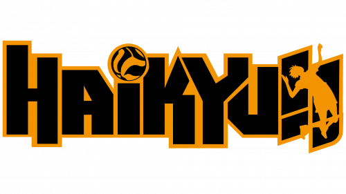
For the English-speaking aficionados of “Haikyuu!!”, there exists a logo iteration in a comprehensible language. The English inscription adheres to a stylistic semblance to its Japanese counterpart, with every component comprising broad, black rectangular streaks. However, in the original, the orange outline is perceptibly more refined compared to the adaptation.
The English representation of this media franchise exudes a more refined aura. The characters and exclamation marks are vertically aligned, maintaining an upright posture, with few deviations in some crossbars and diagonals. Specific stripes protrude beyond the foundational line. Superseding the dot above the “i” is an orange and black ball, the sole lowercase letter amid uppercase counterparts. This logo variant integrates additional black shadows, imparting a floating illusion to the word.
The “Haikyuu!!” Japanese symbol encapsulates the manga’s title in its native language, articulated in the katakana alphabet, enabling readability for those unfamiliar with intricate hieroglyphs. Regarding the English emblem, it stands as an adaptation conceived for an international audience, incorporating an emblematic volleyball, reflecting the central theme of the narrative, thereby adding an illustrative element that resonates with the thematic essence of the story, rendering it a versatile piece in the franchise’s symbolic repertoire.


