HBO Max Logo
HBO Max, owned by WarnerMedia, is a prominent streaming service offering a broad range of entertainment, including series, movies, and exclusive content. It caters to diverse audiences, serving various genres and original productions. Currently, its primary market is the United States, with plans for international expansion. HBO Max consolidates content from brands like HBO, Warner Bros., and New Line Cinema, providing a rich entertainment experience to its subscribers. The service is notable for its commitment to quality and innovation in the evolving streaming landscape.
Meaning and history
HBO Max, launched in May 2020, is under the ownership of WarnerMedia, itself a subsidiary of AT&T Inc. The platform is a culmination of HBO’s evolutionary journey in the streaming space, beginning with HBO Go and HBO Now. It was developed to unify various WarnerMedia properties into a single streaming service, incorporating content from brands like Warner Bros., DC, CNN, TNT, TBS, truTV, Cartoon Network, and more.
The creation of HBO Max marked a significant step in WarnerMedia’s strategy to compete in the crowded streaming market, offering a diversified and extensive library of films, series, and original content. The platform blends the established prestige of HBO programming with a vast array of content appealing to a broader audience, from timeless classics to contemporary hits.
Though HBO Max had a complex introduction due to existing contractual relationships and initial limitations on platform availability, it managed to consolidate its position, reaching a wide-ranging audience. The service focuses on maintaining HBO’s legacy of quality while expanding its catalog and reaching different audience segments, emphasizing the continuous evolution and adaptation in its operational journey.
The platform has evolved its content production, investing heavily in original programming and exclusive streaming rights to distinguish itself from competitors. With its strategic content acquisitions and consistent emphasis on quality and diversity, HBO Max is maneuvering through the changing media landscape, aiming to meet the varying preferences and needs of the global audience.
In the ever-evolving streaming landscape marked by fierce competition and changing consumer preferences, HBO Max is focusing on innovation, user experience, and content variety to secure its standing and drive its growth in the industry. Its history is relatively brief but marked by rapid development, ambitious initiatives, and a continuous quest for excellence in entertainment.
2019
In the middle of 2019, WarnerMedia Corporation introduced an initial logo for its streaming service. The acronym “HBO” was prominently displayed at the top, encapsulated within a rectangle featuring rounded corners, rendered in a stark black hue. This component was notably nearly thrice as diminutive compared to the term “max,” positioned directly beneath it. The frame and “max” were characterized by a gradient fill, blending hues of blue and purple seamlessly. Notably, the purple hue transitioned smoothly into a red shade at the extremities of the extended character “x” located on the right. The design choices made in the preliminary logo were emblematic of the service’s intent to marry boldness with versatility, seeking to create a visual representation that would resonate with a diverse audience. The distinct coloration and typography were aimed at encapsulating the innovative and expansive spirit of the platform, reflecting its commitment to delivering a myriad of content that spans various genres and appeals to a broad spectrum of preferences. The introduction of this logo marked a pivotal moment in the service’s branding journey, setting the tone for its future endeavors in the competitive streaming landscape.
2020 – Today
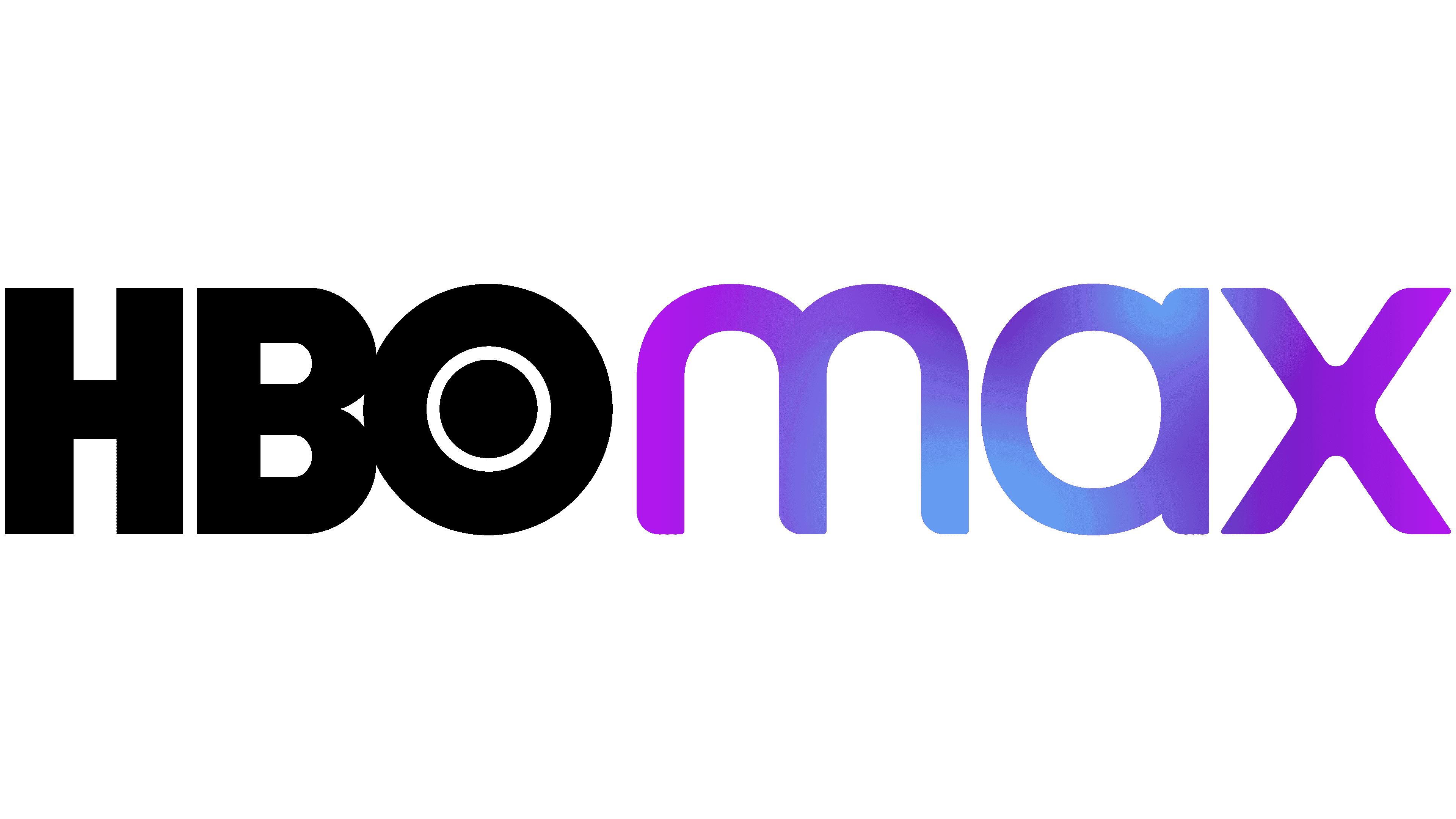
The initial logo failed to gain traction—by October 2019, a revamped version, crafted by the experts at Trollbäck+Company, surfaced on social media platforms. This rendition also became the primary emblem during the service’s 2020 launch. Now, both components of the brand name align uniformly, sharing identical dimensions. The acronym “HBO” preserves its foundational aesthetic, characterized by robust, dark contours, minimal spacing between letters, and a circular feature within the “O.” Contrastingly, “max” undergoes a transformation yet maintains its lowercase stature. The creators refined the contours, truncating the extended lines and minimizing the elongated “x,” rendering “max” less literal in its presentation.
The portfolio of New York’s acclaimed agency, Trollbäck+Company, articulates that the principal objective for the designers was to forge a distinctive and memorable brand identity. They adeptly integrated elements reflecting HBO Max’s rich heritage, incorporating a component reminiscent of the distinguished HBO Original Programming emblem, thereby infusing the new design with a sense of legacy and recognition. This blend of modernity and tradition aimed to encapsulate the expansive and diverse content array offered by the service, ensuring a balanced representation of innovation and heritage in the ever-evolving streaming realm. The redesign aimed to harmoniously blend the established reputation of HBO with the fresh, expansive appeal of the Max extension, symbolizing a vast array of content offerings.
