HubSpot Logo
HubSpot is a Cambridge-based information technology company founded in 2005 by two MIT students Brian Halligan and Dharmesh Shah. The firm specializes in the development of software, used in SMM, SEO, customer relationship management, market analytics, and many other fields of marketing. Besides free marketing tools, it offers paid-for plans enabling premium tools for working with customers.
Meaning and history
![]()
Hubspot appeared in 2005 thanks to two fellow graduates of MIT, Brian Halligan, and Dharmesh Shah. They believed that businesses could develop and succeed with a conscience that what’s good for revenue has to be good for clients. Studying at MIT, they had come to the so-called ‘inbound’ concept saying that customers no longer liked all these interruptive offers trying to reach for their attention.
As a result, the two graduates created a start-up aiming to develop a large-scale system uniting tools for engaging customers ethically and respectfully. A hub for all marketer’s tools in the future, Hubspot was the name they chose for the company.
What is HubSpot?
HubSpot is a software developer headquartered in Cambridge. Founded in 2005 by two MIT students Brian Halligan and Dharmesh Shah, now HubSpot is a branched ecosystem offering various marketing instruments, used for marketing in the social network, search engine optimization, content management, generation of leads, and others. There are free tools and paid-for subscriptions enabling premium solutions to marketers.
2005 – 2016
![]()
A gray inscription containing the brand name was the initial logo. The letterforms had a classic semibold style without serifs. There were no straight lines in the symbols ‘u’, ‘b’, and ‘p’. The customized letter ‘o’ with three bars highlighted the wordmark. Every bar had a dot rapped to the shining at the edge. Bars were unequal in size, and the longest emerged diagonally from the top.
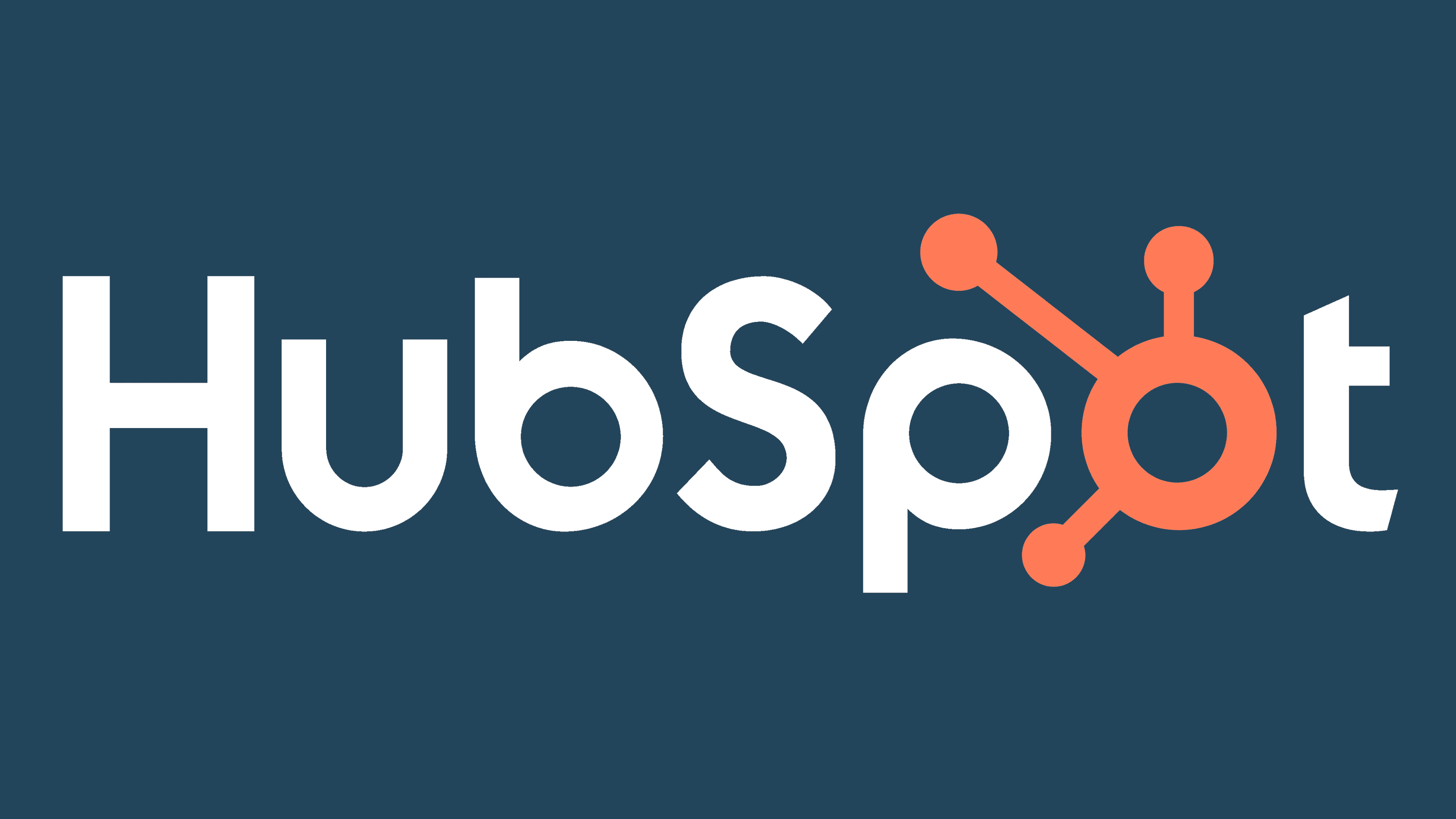
2016 – today
![]()
Afterward, the wordmark and custom ‘o’ were painted dark blue and orange, respectively. However, this is not the only renewal For example, the letter ‘u’, ‘p’, and ‘b’ became a bit fatter, so the empty spaces inside them became smaller and even more rounded. The brand designers have also downsized the character ‘o’, so it fits the other letters, and removed the shining at the ends of the bars.
Color

The official color code of the Hubspot logotype consists of dark blue and dark orange. Marketers believe that the orange is often associated with happiness and makes customers feel enthusiastic and creative. The blue, in its turn, stands for comfort, clarity, and confidence.
Font
The brand designers have used a sans-serif typeface with streamlined letterforms drawn with semibold lines. These sans-serif scripts often become a choice by the technological businesses that want their wordmarks to look minimalistic, refined, and modern.


