Hulu Logo
Hulu is an American streaming service supported by Disney. You would mostly watch TV on demand here, but there are also other options. Like many of its counterparts, Hulu is a subscription platform, meaning you’ll have to pay a monthly subscription fee to be able to continue using it.
Meaning and History
Hulu was launched in 2007 by Comcast and Disney. The background for the name is interesting, because the bosses took inspiration from the Chinese mythology, where the word ‘hulu’ refers to a type of pumpkin that would traditionally be hollowed out and used to store precious items. They liked it very much.
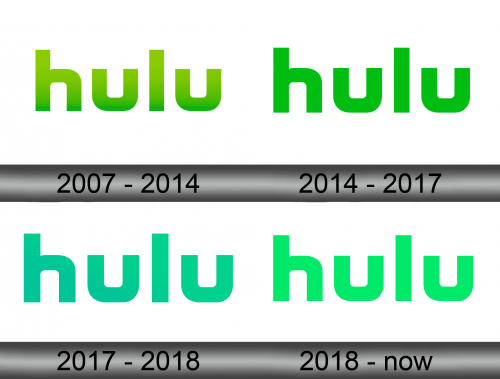
2007 – 2014
The form of the emblem introduced in 2007 actually stayed with the company for years to come. It is a collection of square and blocky (except for ‘l’, naturally) lowercase letters, and there was largely nothing else around. For 7 initial years, it was grass-green, but with a lot of shading and gradient.
2014 – 2017
By comparison, the 2014 change saw the green shade darken and lose the shading completely. Nothing else, except the coloring, change – and that much was true for the next 2 iterations.
2017 – 2018
In 2017, they changed the coloring to the dark azure instead of the previous green. They didn’t particularly like that, because a year later they changed it again.
2018 – today
In 2018, they mostly kept the same coloring, but gave it a lot more green tint. It was now only vaguely blue, although the previous attempt was somewhere in-between blue and green on the specter.
Emblem and Symbol
Hulu is prominent for not having any secondary icons at all. They only really use their lettering for branding. Even the mobile apps of this broadcaster use the same style, but often change coloring. The usual trick is to make the letters white while surrounding them with the green shade currently in use for the real logo.


