Hunter X Hunter Logo
Hunter x Hunter is a Japanese anime. Somewhere far away, there is a world where the hunters exist to perform all sorts of risky tasks to capture criminals and search for lost treasures in the unknown, dangerous places. The main character is a boy named Gong. His father was a hunter but disappeared many years ago. Gong believes that if he follows in his father’s footsteps and becomes a hunter, sooner or later he will meet him again. However, the character soon realizes that achieving his goal is much more difficult than he could have imagined. During his journey, Gong meets Kurapika, Leorio, and Killua, with whom he sets foot on the dangerous path of a hunter.
Meaning and History
The first anime adaptation of the original manga by Togashi Yoshihiro called Hunter X Hunter was done back in 1999. This anime takes viewers into a world that vaguely resembles ours. In it, people become hunters for a wild, rare game, treasure heads, etc. There was a remake of the anime in 2011, which aired until 2014. Some fans are sure that they do not make such a good anime as they did back in the day, while others believe the 2011 remake has a more complete story. The author got an idea for the name from a Japanese show where the same word was repeated twice.
What is Hunter X Hunter?
Hunter X Hunter is a manga story that was turned into an anime series twice. Both series have their fans and have been aired about 10 years apart.
1998 – Today
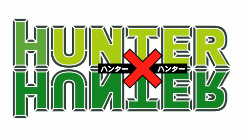
Although the logo designer did not go all out when creating the logo and made the manga title a centerpiece, there is one interesting detail. The two words were stacked on top of each other with the bottom word being a mirror image of the other as if it is reflected in the water. At the same time, it is not a mirror image when it comes to colors. The top word had “H” done in bright green color while the other letters were yellow. The bottom word was done in the same green as the “H”. All the letters had a delicate outline. A red cross or “X” was positioned in the center between the two “T’s”. Behind it, there was a thin black strip with the Japanese name done in white.
2011 – 2014
The TV series that aired starting in 2011 had a different logo. It was not something completely new as it simply played with the color scheme of the original emblem. The top word was completely white, while the bottom had a gradient with red being at the bottom and orange at the top. The cross changed to dark green with a thin white and black outline. The outline around the letters was also updated to dark orange. Thin black lines on the outline gave the letters a 3D look.

