Jacobs Logo
Jacobs is a staple coffee brand for many Europeans, the most popular varieties of which are instant and ground. It’s a German brand from Bremen presently owned by Kraft Foods. Most people in America don’t have much to say about it, but Jacobs is generally beloved in Europe – particularly, in its Eastern part.
Meaning and History
The brand originated in Bremen in 1895 at the hands of one Farhad Jacobs. Since then, the business mostly stayed in the family hands, although several times over it was bought off by larger corporations. At the moment, they are solely owned by the American food corporation Kraft Foods.
1944 – 1964
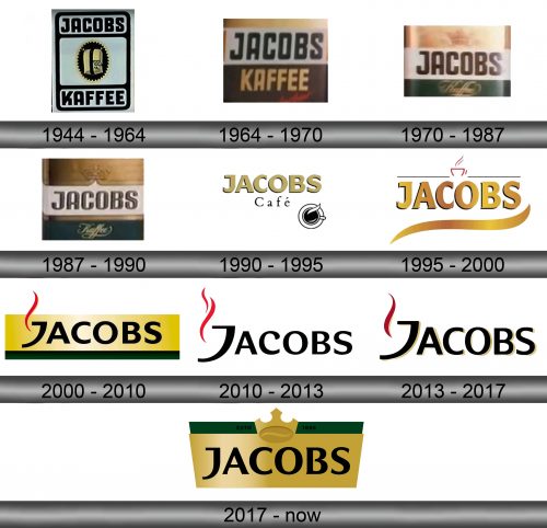
The original logo was basically a label. They took a tall, grey rectangle and infused it with lots of black details, including words ‘Jacobs’ in the top section, ‘Kaffee’ (‘Coffee) in the bottom section, as well as an image of a coffee-filled sack inside a black oval in the middle. The sack itself was beige, which was also reminiscent of coffee.
1964 – 1970
In 1964, they opted to use a simpler logo. It was now a rectangular space, divided into two horizontal sections of white and brown. They put the words ‘Jacobs’ in black and ‘Kaffee’ in beige into these respective zones. The font was just as blocky and imposing as before.
1970 – 1987
Basically, they decided to use the ‘Jacobs’ part written over the white strip and add stuff to it. Firstly, there was a golden crown above the thing, as well as a smaller word ‘Kaffee’, written in yellow, elegant letters over the dark green section.
1987 – 1990
Not much changed, except the letters became rather slimmer, as well as received a bit more volume. It expressed in the slightly increased shading around them.
1990 – 1995
The 1990 logo was mostly words. The ‘Jacobs’ was carried on from the previous designs, except not it’s rather fatter and beige. The other word was the black ‘Café’ written in a much thinner, slightly serif font. The final touch was the white cup of black coffee (or at least how it looks from above).
1995 – 2000
Fascinatingly, the name inscription mostly stayed the same. They changed it to a sort of glinting golden color and added a little stroke of gold with the same effect below. Doubtless, it was supposed to act as the ‘aroma’ image. Crowning it all was a thin black line with a red cup outline in its middle.
2000 – 2010
In 2000, they introduced a new look for their name element. The letters were now squatter and not as sharp. The color also changed to black. The rest of the logo was just a rectangle background divided into two sections: a large golden one reserved for the wordmark, and a smaller underlining green area.
There was also what was supposed to be a red wisp of steam coming out of the ‘J’.
2010 – 2013
The background was removed, and the remaining parts were somewhat altered. The font in general became more artistic, and the capital letter grew in size. The only other notable difference is the red wave to the left – it found itself a smaller friend.
2013 – 2017
In 2013, they returned to the lettering style as seen in the 2000 variant, except there was still no background. The smoke lost its friend, and most things received a slight shadow cast to the right.
2017 – today
The 2017 logo brought back the green-and-yellow shape, except shuffled it so the green is now on top, neighbored by a new crown image, as well as a little black inception year remark. The writing still occupied the golden area, except the font became more official and ordinary than before.
Emblem and Symbol
The recent Jacobs emblems are almost identical to the labels they put on their Krönung/Monarch coffee. Obviously, it’s their most popular variety, but there are also others. For instance, many of the ‘Night&Day’ coffee cans still use the pre-2017 designs, accompanied by a blue background.
