Japan Car Brands
In the bustling world of automotive industry, the allure of Japanese car brands stands unparalleled, marked by an enduring legacy of innovation, precision, and a deep-rooted philosophy that intertwines functionality with aesthetic appeal. This unique blend has not only propelled Japanese vehicles to the forefront of global markets but has also ingrained their logos into the collective consciousness of consumers worldwide. These emblems, more than mere symbols, encapsulate the essence of the brands they represent, telling stories of heritage, ambition, and the relentless pursuit of excellence.
As we delve into the fascinating realm of Japanese automotive logos, we uncover layers of meaning and design philosophy that reflect the meticulous attention to detail and the harmonious balance between tradition and technological advancement characteristic of Japanese culture. Each logo, from the elegantly simple to the intricately complex, serves as a beacon of the brand’s identity, embodying values of reliability, durability, and forward-thinking innovation that Japanese car manufacturers are celebrated for.
This exploration offers an insight into how these logos have evolved over time, adapting to changing market dynamics while staying true to their core principles. It reveals how Japanese car brands have navigated the fine line between maintaining a recognizable visual identity and embracing modernity, ensuring their logos remain relevant and resonant in an ever-competitive global arena.
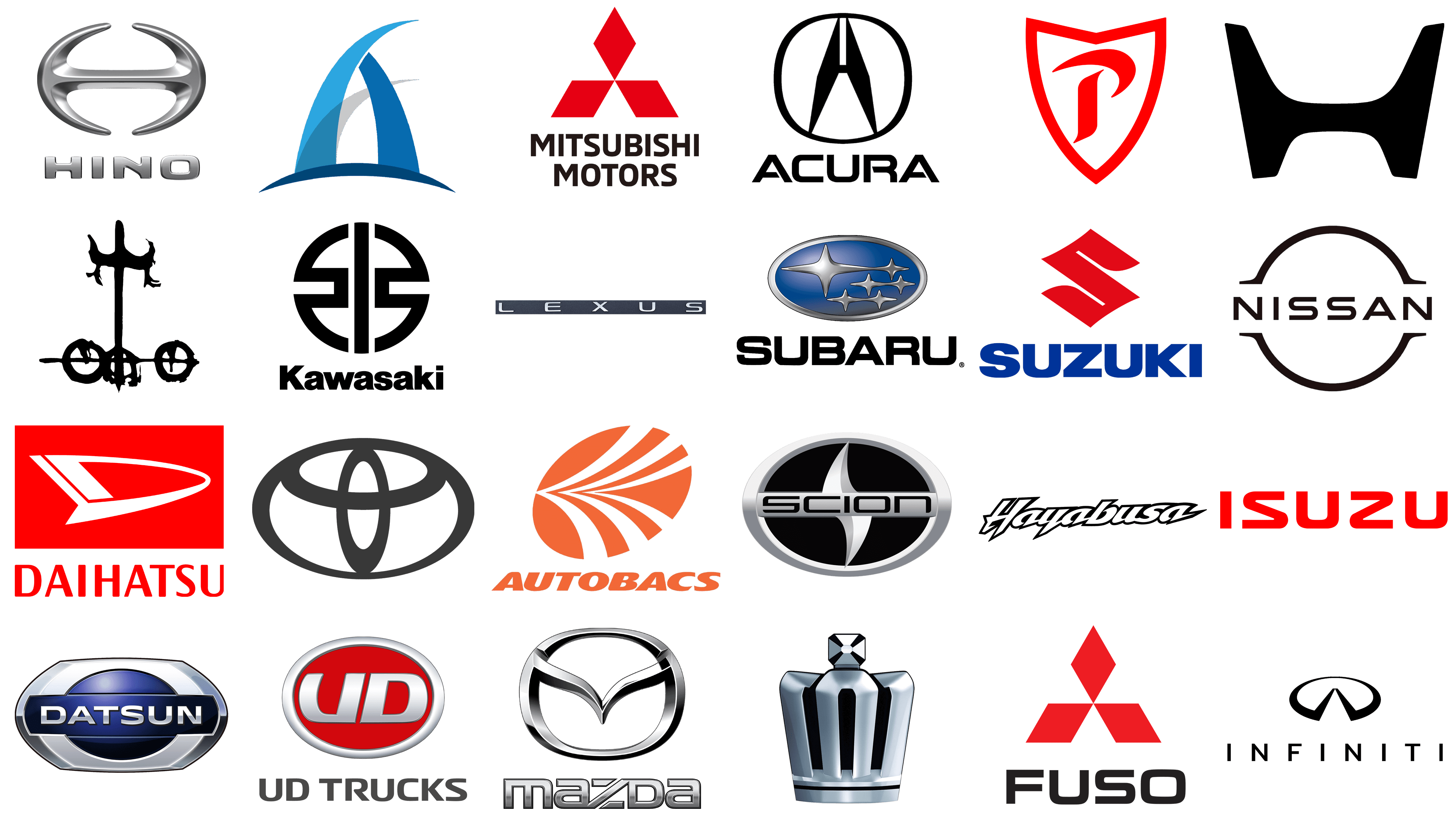
Acura
![]()
Established in 1986, Acura has made its mark as Honda Motor Company’s luxury vehicle division, captivating the American market with high-performance cars that merge cutting-edge technology with sophisticated design. This pioneering brand was among the first to introduce Japanese luxury vehicles globally. Its logo embodies minimalism and symmetry, featuring a stylized ‘A’ within a circle. Utilizing a simple black and white palette, the logo’s design – with two peaks converging at the top and connected by a horizontal line – symbolizes stability and balance. This emblem represents Acura’s commitment to modernity, sophistication, and the utmost in precision and quality.
Aspark
![]()
Entering the automotive scene with a splash, Aspark’s electric supercar, the Owl, boasts one of the fastest acceleration times globally, underscoring the company’s dedication to leading in electric vehicle technology and performance. The logo captures the essence of speed and fluidity with a dynamic ‘A’ that hints at maritime themes. A dark blue, sail-like figure merges with a light blue wave shape at a single point, creating a logo that breathes agility, connection to water, and meticulous precision through its sharp lines and curves.
Autobacs
![]()
Since its inception in 1947, Autobacs Seven Co., Ltd has evolved from a humble automotive parts retailer in Japan into a global powerhouse of auto parts and accessories. This growth reflects Japan’s deep-seated car culture and unwavering commitment to automotive superiority. The company’s logo, vibrant and full of motion, suggests a stylized sun or spinning fan. An orange circle, divided into uneven segments that suggest movement and growth, radiates outward. The segments’ varied widths add a dynamic quality, while the straightforward, bold typeface of “AUTOBACS” below lends a grounded, stable feel to the design.
Daihatsu
![]()
As a Toyota Motor Corporation subsidiary since 2016, Daihatsu shines in the compact car market, known for its innovative and dependable vehicles tailored for urban life worldwide. The brand’s logo stands out with a bright red backdrop and features a white, abstract shape that hints at a stylized ‘D’. This sleek, aerodynamic design suggests motion and is complemented by the boldly written “DAIHATSU” in a clear, sans-serif font below, confidently showcasing the brand’s identity.
Datsun
![]()
Reintroduced by Nissan in 2013, Datsun, initially founded in 1931, targets emerging markets with its budget-friendly and dependable vehicles. These cars embody Nissan’s commitment to quality and innovation, aiming to improve mobility in these regions. The logo, with its metallic finish, features a silver oval outline encircling a central ellipse that splits into a dark blue top and a silver bottom. The “DATSUN” name stands out in a modern, sans-serif font across the middle, giving the logo an industrial and contemporary appearance.
Hayabusa
![]()
Suzuki’s Hayabusa, synonymous with the GSX1300R motorcycle, stands as a testament to Suzuki’s engineering prowess, offering unparalleled speed and maneuverability. It has become an emblem of motorcycle innovation. The brand’s logo, focusing on the name “Hayabusa” – Japanese for “peregrine falcon” – uses sharp, forward-leaning typography to evoke a sense of speed and agility. The design, primarily black with dynamic accents, mimics the bird’s rapid flight, emphasizing the motorcycle’s swift performance.
Hino
![]()
Hino Motors, Ltd., a Toyota Motor Corporation subsidiary, is dedicated to producing commercial vehicles and diesel engines, such as trucks and buses, upholding a commitment to durability, quality, and environmental care. Its logo features a metallic, three-dimensional ‘H’, reminiscent of hands joined or a road extending into the distance. The “HINO” brand name is displayed below in a bold, uppercase, contemporary font, signifying strength and progress. The logo’s metallic gloss enhances the brand’s high-end feel, underscoring its commitment to excellence and resilience.
Honda
![]()
Since its establishment in 1948, Honda has emerged as a leading force in the automotive and motorcycle sectors, celebrated for its cutting-edge engineering, eco-conscious initiatives, and a diverse product line ranging from efficient vehicles to robotics. This reflects Honda’s pursuit of “The Power of Dreams”. The brand’s logo, a bold, black emblem, simplifies to a stylized ‘H’. Its thick lines, which widen at the ends, project a durable and stable image, embodying Honda’s reputation for reliability and innovation.
Infiniti
![]()
Introduced in 1989, Infiniti represents Nissan’s entry into the global luxury car segment, offering a mix of performance, cutting-edge technology, and opulence aimed at delivering an unparalleled driving experience. The brand’s logo, featuring a sleek, black double-arch above the “INFINITI” name in a crisp, sans-serif font, symbolizes endless possibilities, echoing the brand’s name and vision. This design projects a luxurious and contemporary image, perfectly aligning with Infiniti’s emphasis on innovation and sophistication.
Isuzu
![]()
Since its founding in 1916, Isuzu Motors Ltd has carved a niche as a leading manufacturer of commercial vehicles and diesel engines, building on a legacy of innovation to supply robust, reliable vehicles for businesses and individuals globally. Its logo showcases the “ISUZU” name in bold, red letters, emphasizing strength and reliability. The red color underscores the brand’s vibrancy, passion, and dynamic approach to its identity.
Kawasaki
![]()
Kawasaki Heavy Industries, Ltd. encompasses more than its renowned motorcycles, engaging in the production of aerospace and defense equipment, ships, and industrial robots, with its bikes celebrated for their speed, power, and engineering finesse. The logo features a bold, black symbol with a circle divided into four parts by intersecting lines, suggesting precision and robustness. The name “Kawasaki”, presented below in a simple, sans-serif font, reflects the brand’s straightforward and powerful identity.
Lexus
![]()
Launched by Toyota in 1989, Lexus has achieved worldwide recognition as a luxury car brand, known for its commitment to quality, innovation, and luxury. The brand is celebrated for striving for perfection and creating vehicles that seamlessly integrate technology, comfort, and eco-friendliness. Its logo, marked by the “LEXUS” name in a slender, modern sans-serif font colored in a refined shade of grey, exudes understated elegance against a darker grey backdrop. This minimalist design and focus on typography highlight Lexus’s dedication to luxury and meticulous attention to detail.
Mazda
![]()
Since its inception in 1920, Mazda Motor Corporation has set itself apart with a distinct approach to automotive design and technology, prioritizing vehicles that deliver a joyful and immersive driving experience. This dedication is anchored in its innovation, sustainability efforts, and the spirited “Zoom-Zoom” philosophy. The Mazda logo, featuring a stylized ‘M’ encased in an oval, with wings uplifted to form a V, symbolizes the brand’s aspiration to reach new heights. Rendered in a silver, chrome-like finish, the logo radiates sophistication and a forward-looking stance. The word “MAZDA”, in a capitalized, sans-serif font below the emblem, grounds the logo with a sense of stability and reliability.
Mitsubishi
![]()
Mitsubishi Motors Corporation, founded in 1970, has consistently contributed to the automotive landscape with a focus on pioneering electric and hybrid vehicle technologies, underscoring a commitment to a sustainable automotive future and excellence. The company’s emblem, featuring three red diamonds arranged to form a larger diamond, embodies confidence and vitality. The bold, black, sans-serif typography of “MITSUBISHI MOTORS” beneath the emblem enhances the logo’s authoritative and impactful presence.
Mitsubishi Fuso
![]()
As a member of Daimler Trucks, Mitsubishi Fuso Truck and Bus Corporation specializes in the production of commercial vehicles, including trucks and buses. The brand emphasizes the durability, reliability, and eco-friendliness of its offerings, aiming to meet the global demands for quality and sustainable transportation. Its logo, mirroring the parent company’s design, showcases three red diamonds forming a larger diamond shape, symbolizing the brand’s connection to Mitsubishi’s legacy. The name “FUSO”, presented in bold, black, sans-serif letters below the emblem, reinforces the brand’s distinct identity in the commercial vehicle sector.
Mitsuoka Motors
![]()
Founded in 1968, Mitsuoka Motors distinguishes itself in the automotive industry by manufacturing vehicles that combine modern technology with traditional, classic styling. This unique blend underscores the brand’s dedication to individuality and craftsmanship. The logo, reminiscent of a heraldic emblem, features a complex design with a crest-like figure, extended wings, and wheels, suggesting luxury and custom automotive craftsmanship. The emblem’s stark black silhouette against a white backdrop ensures a bold and memorable visual identity, reflecting the brand’s commitment to uniqueness and tradition.
Nissan
![]()
Founded in 1933, Nissan Motor Co., Ltd. has evolved into a leading force in the global automotive industry, particularly noted for its strides in electric vehicle technology, exemplified by models such as the Leaf. Nissan’s dedication to pushing the boundaries of automotive technology, safety, and environmental sustainability has positioned it at the forefront of the shift towards cleaner transportation options. Its logo features a straightforward yet impactful design – a solid circle intersected by a thick horizontal line, with the “NISSAN” brand name embedded in a robust, uppercase sans-serif font within this line. The emblem’s minimalist aesthetic speaks to the brand’s commitment to clarity, precision, and automotive excellence.
Prince
![]()
Before its merger with Nissan in 1966, Prince Motor Company stood out as a prominent Japanese car manufacturer, celebrated for its luxury and high-performance vehicles, including the legendary Skyline, which has continued to thrive under Nissan’s stewardship. This collaboration has fused performance with innovation, producing iconic vehicles that continue to captivate car enthusiasts around the globe. The Prince logo boasts a bold, red hue, invoking passion and vigor. Resembling a knight’s crest, it signifies protection and strength. The central figure, a sleek, red “P” with a flourish, conveys motion and excellence, evoking the swift arcs of a tennis racket in play. Its design is modern yet timeless, symbolizing both heritage and innovation in sports. The sharp angles and smooth curves strike a balance, reflecting precision and agility.
Scion
![]()
Launched by Toyota in 2003 and discontinued later, Scion targeted the North American youth market, distinguishing itself through affordability, customizable options, and unique designs. This approach aimed at capturing the preferences and trends of a younger demographic, making Scion a notable venture in automotive marketing. Its logo, characterized by a silver oval with a symmetrically divided ‘S’ forming an arrow-like figure, embodies speed, precision, and a modern ethos. The “SCION” name, presented in sleek, futuristic uppercase letters beneath the emblem, mirrors the brand’s innovative and youthful appeal.
Subaru
![]()
Subaru, under the Subaru Corporation (formerly known as Fuji Heavy Industries), is renowned for its adoption of boxer engines and symmetrical all-wheel-drive systems. This focus on safety, reliability, and distinctive engineering solutions appeals to driving enthusiasts who demand performance across various conditions. The Subaru logo, with its oval framing a constellation of six stars (representing the Pleiades star cluster) in silver against a blue gradient, underscores the brand’s heritage and vision. The “SUBARU” name, in bold, black, uppercase letters below the emblem, firmly establishes the brand’s identity, contrasting with the emblem to highlight Subaru’s commitment to quality and innovation.
Suzuki
![]()
Since its foundation in 1909, Suzuki Motor Corporation has carved a niche for itself in the global automotive market, offering an extensive range of products from motorcycles and compact cars to outboard motors. This broad product lineup reflects Suzuki’s dedication to innovation, affordability, and catering to the diverse mobility needs of people worldwide. Its logo features a stylized ‘S’ that evokes the image of a red river. This design symbolizes reliability and a respect for tradition. Below this emblem, the “SUZUKI” brand name is displayed in blue, uppercase letters in a straightforward, sans-serif font, grounding the logo with a sense of stability and clarity.
Toyota
![]()
Toyota Motor Corporation, established in 1937, has risen to become a leading force in the automotive industry, renowned for its manufacturing efficiency, reliability, and commitment to sustainability. The Toyota logo, recognized worldwide, consists of three interlocking ellipses that signify the unification of the hearts of the customers and the company, within the larger goal of global technological advancement and limitless future possibilities. This emblematic design encapsulates Toyota’s ethos of continuous improvement and environmental responsibility.
Toyota Crown
![]()
The Toyota Crown, first launched in 1955, represents the epitome of Toyota’s luxurious and innovative engineering, offering a blend of luxury, reliability, and a commitment to excellence. This prestigious sedan line has continually evolved to meet and exceed consumer expectations through the generations. Its emblem, a three-dimensional stylized crown with a metallic finish, exudes sophistication and superior quality. The design’s regal appearance, with its sharp tips and pronounced center, underscores Toyota’s leadership and esteemed status in the automotive world.
UD
![]()
UD Trucks Corporation, formerly known as Nissan Diesel, stands out in the Japanese automotive industry for its specialization in commercial vehicles and diesel engines. The company prides itself on its reliability, fuel efficiency, and commitment to environmental sustainability within the logistics and transportation sectors. Its logo, characterized by a red oval containing the white letters “UD” – an acronym for “Ultimate Dependability” – and encircled by a silver ring, reflects the brand’s global aspirations and dedication to excellence in the heavy-duty truck market. Below this emblem, the “UD TRUCKS” name is presented in a simple, yet bold typeface, affirming the brand’s strong identity.